The art of Agostino Arrivabene

arrivabene1.jpg

Lo psiconauta (2006).

arrivabene2.jpg

Capriccio con ruderi di città ideale (2003).

arrivabene3.jpg

Vanitas su zolla di viole (2006).

I’ve tagged this as “gay” since the first painting is featured in the controversial Arte E Omosessualita’. Da von Gloeden a Pierre et Gilles at the Palazzo della Ragione, Milan. That exhibition has caused as stir with Catholics who demanded that Paolo Schmidlin’s Miss Kitty, which shows the current Pope in drag, be removed.

Whatever Agostino Arrivabene‘s sexuality he’s no slouch with a paintbrush, and all the sections on his site are worth looking at. The “Paesaggi” section features some architectural caprices, there’s a section of vanitas works and a fair amount of artistic quotation; I spotted references to Piranesi, Boulée and George Minne, among others.

Elsewhere on { feuilleton }
The fantastic art archive

Previously on { feuilleton }
Vanitas paintings
Giant Skeleton and the Chocolate Jesus

Masonic fonts and the designer’s dark materials

golden_compass.jpg

The trailer for The Golden Compass turned up this week, the first part of Philip Pullman‘s His Dark Materials trilogy, and I can’t help but note that the film’s designers have chosen Jonathan Barnbrook’s Mason font for the titles and the rest of the typography. This isn’t so surprising given that Mason has been used on the covers of several editions of the books already but I wonder if this flush of even greater popularity will spell (as it were) the end of a stylish typeface.

hdm.jpgMason (originally named Manson) was one of Barnbrook’s earliest published type designs, appearing in 1992 via the Emigré foundry, and over the past fifteen years has been widely imitated and become the default font for fantasy works, especially book jackets. The attraction for the genre is obvious in the way the design uses elegant and traditional serif letterforms that have been amended slightly to give them a distinctive quasi-ecclesiastical flavour, with flourishes derived from Greek, Renaissance and Biblical letters. The Gothic arch of the letter A has also helped make the font a popular choice for New Age or occult books. Mason was designed as a set of serif and sans serif variations but it’s Mason Serif Regular which is used the most. (The cover for The Science of His Dark Materials shown here is using both the sans serif variation and Mason Regular Alternate.)

Distinctive fonts take a while to get around and I don’t recall seeing Mason until at least 1994. From 1995 to 2000 it began to appear everywhere, even in newspaper ads for a while, before finding a permanent place in the book world. The trouble with this kind of ubiquity is that the novelty the design once possessed quickly vanishes and it begins to runs the risk of becoming a design cliché. Many typefaces go this way, especially in the publishing world where the choice of typeface is often dictated by genre expectations. So Orbit-B and its variants used to signify “science fiction” or “the future” in the 1970s, Caslon Antique and Rubens have become associated with horror while FF Confidential has been over-used for crime novels.

Continue reading “Masonic fonts and the designer’s dark materials”

Chiaroscuro II: Joseph Wright of Derby, 1734–1797

wright1.jpg

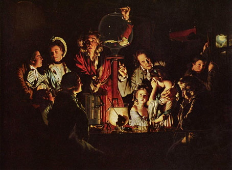
An Experiment on a Bird in the Air Pump (1768).

As promised, one of my favourite chiaroscurists. The impression Joseph Wright’s work made on me at the age of 13 was one of many revelations from my first visit to the Tate Gallery. The paintings which struck me most of the older works there were all of the Romantic or late-Romantic era: Turner, Francis Danby, John Martin, Philippe de Loutherbourg and Joseph Wright’s enormous An Experiment on a Bird in the Air Pump, which is now housed in the National Gallery. The National Gallery site has this to say about the picture:

A travelling scientist is shown demonstrating the formation of a vacuum by withdrawing air from a flask containing a white cockatoo, though common birds like sparrows would normally have been used. Air pumps were developed in the 17th century and were relatively familiar by Wright’s day. The artist’s subject is not scientific invention, but a human drama in a night-time setting.

The bird will die if the demonstrator continues to deprive it of oxygen, and Wright leaves us in doubt as to whether or not the cockatoo will be reprieved. The painting reveals a wide range of individual reactions, from the frightened children, through the reflective philosopher, the excited interest of the youth on the left, to the indifferent young lovers concerned only with each other.

The figures are dramatically lit by a single candle, while in the window the moon appears. On the table in front of the candle is a glass containing a skull.

As with many paintings, the online reproductions do little justice to the subtlety of Wright’s rendering of light and shade. This remains his most famous picture although he made another on a similar theme, A Philosopher Giving a Lecture on the Orrery (below) and, like Godfried Schalcken, he has at least two studies of people viewing statues by candlelight, a common practice at that time for the way the light gave classical sculpture a spurious life. Wright’s painting of The Alchymist is another popular work, turning up frequently in occult encyclopedias. Being a native of Derby he also became (along with de Loutherbourg) one of the first painters to depict the beginnings of the Industrial Revolution whose flaring furnaces provided an ideal subject for dramatists of flame and shadow.

Before leaving the tenebral world, I’ll note that Claire left a message to say that issue 24 of Cabinet Magazine has a feature on shadows in art, symbolism and philosophy.

Continue reading “Chiaroscuro II: Joseph Wright of Derby, 1734–1797”

Chiaroscuro

baglione.jpg

Heavenly Love and Earthly Love by Giovanni Baglione (1602–1603).

Chiaroscuro\, Chia`ro*scu”ro\, Chiaro-oscuro\, Chi*a”ro-os*cu”ro\, n. [It., clear dark.] (a) The arrangement of light and dark parts in a work of art, such as a drawing or painting, whether in monochrome or in colour. (b) The art or practice of so arranging the light and dark parts as to produce a harmonious effect.

Following from the earlier post about shadows in art, some favourite examples by masters of chiaroscuro. Another artist not represented here will be the subject of a post of his own in the next couple of days. The Dutch painter Godfried Schalcken (below) was the subject of the horror tale Schalcken the Painter by Joseph Sheridan Le Fanu, a story memorably filmed by Leslie Megahey for BBC television in 1979. Horror and the chiaroscuro effect belong together, as Fuseli’s Nightmare demonstrates, and many of Schalcken’s paintings seem even more curious and sinister after you’ve read Le Fanu’s story.

Update: John Klima points us to Hal Duncan‘s excellent story, The Chiaroscurist, which you can read at Electric Velocipede.

Continue reading “Chiaroscuro”