The art of Ian Miller

ian_miller9.jpg

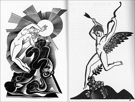
From the Hollywood Gothic series (1984).

Jeff VanderMeer has a great post about artist/illustrator Ian Miller at io9 which prompts me to write a few words about his work myself, something I’ve intended for a while.

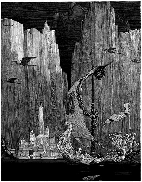
Miller is indelibly linked for me with HP Lovecraft on account of his covers for the Panther Horror editions of the 1970s, the first Lovecraft volumes I bought. His sinister and minutely detailed ink drawings were a big inspiration when I started to draw seriously myself, unsurprisingly when my own drawings possessed a similar quantity of detail and macabre atmosphere. I still think his cover for William Hope Hodgson’s The House on the Borderland (below) is one of the most successful anyone has produced for that novel. His Mountains of Madness cover, while not being a direct illustration, perfectly encapsulates the feel of much of Lovecraft’s later fiction.

Jeff’s post has a wide range of work which I’ve avoided duplicating. The items shown here are all scans from my own library. More of Miller’s Lovecraft illustration will appear in the forthcoming Artists Inspired by HP Lovecraft from Centipede Press, along with several pieces by yours truly.

ian_miller4.jpg

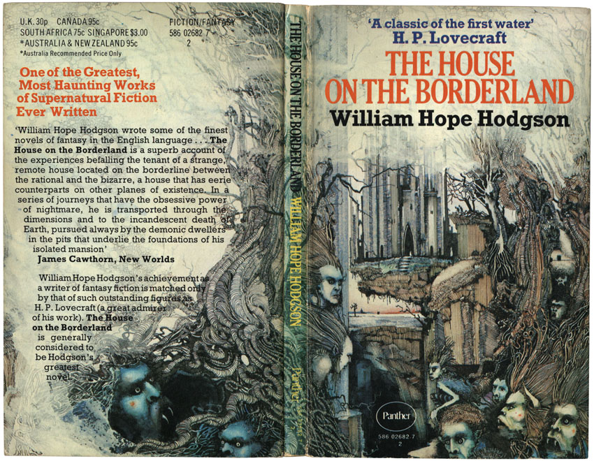
The House on the Borderland (1972).

Continue reading “The art of Ian Miller”

Dorothy Lathrop’s Three Mulla-mulgars

lathrop1.jpg

A Kipling-esque jungle tale by Walter de la Mare with Sidney Sime-esque illustrations by Dorothy Lathrop (1891–1980). The Three Mulla-mulgars was published in 1919 and is another book which can be downloaded at the Internet Archive. Inevitably (and conveniently), Golden Age Comic Book Stories has two pages of Ms Lathrop’s work including a number of colour plates from the book.

lathrop2.jpg

Bud Plant’s Dorothy Lathrop page

Elsewhere on { feuilleton }
The illustrators archive

Previously on { feuilleton }
Sidney Sime and Lord Dunsany
Harry Clarke’s The Year’s at the Spring

Recovering Bond

new_bonds.jpg

Penguin is really coming up with the goods these days, living up to their reputation as a house with high standards of cover design, unlike Picador and the shabby way they treated Cormac McCarthy recently.

Ian Fleming’s Bond novels are the latest to receive a makeover with some fabulous art from illustrator Michael Gillette. 2008 is Fleming’s centenary so the books have been republished as demi-format hardbacks with these new designs adorning the jackets. Each cover features a different girl matched to the theme of the book (yes, I know they’re women but in Bond’s world women are always girls unless they’re Miss Moneypenny); each cover also features groovy period type which alludes to the hand-drawn elaborations of the Sixties and Seventies. The effect is reminiscent of the poster art for the 1967 film of Casino Royale (below) which used a naked girl as the focal point; all Bond posters before and after this place oo7 himself centre stage. Penguin even dare to push the level of pastiche by making On Her Majesty’s Secret Service look rather like an old romance novel, not such a surprising decision since this is the book where Bond gets married.

casino.jpg

My favourite Bond covers remain the old Pan paperbacks from 1963 but that’s just me; these look great. There’s been a persistent moan recently from authors and publishers worrying about file sharing as they foresee the publishing world going the same way as the music business. The solution is obvious: you can’t stop texts being copied and distributed but you can make the books themselves desirable objects so make them worth buying and owning. Penguin has numbered the spines of the new Bond books as they did with their recent Sherlock Holmes reprints, a smart appeal to book collectors as well as a tip to read them in the order they were written. “Smart” is the key word here; Picador take note.

Update: The Pan covers mentioned above were designed by Raymond Hawkey. Bond site MI6.co.uk has some details about the designer.

Elsewhere on { feuilleton }
The book covers archive

Previously on { feuilleton }
Repackaging Cormac
The World’s Greatest Detective
James Bond postage stamps
Boys Own Books

Franklin Booth’s Flying Islands

booth.jpg

I was rather aggrieved a few weeks ago when I found a copy of James Whitcomb Riley’s The Flying Islands of the Night (1913) at the Internet Archive. Nice to find a free copy of a rare book but the grievance came as a result of an intention to write something about its illustrator, Franklin Booth (1874–1948), and post a picture or two. It turns out that the scanned copy available is complete but all the colour plates have been removed, probably stolen during its career as a library volume. Riley’s story is a piece of light fantasy which might well have been forgotten by now if it wasn’t for Booth’s incredible illustrations; as a result it’s the illustrations that make the book worth seeking out.

booth2.jpg

Booth’s penmanship from Franklin Booth: American Illustrator.

Happily, and by coincidence, Mr Door Tree at the essential Golden Age Comic Book Stories has uploaded scans of his own in the past few days. Beautiful stuff and easily the equal of Booth’s contemporaries in Britain such as Charles and William Heath Robinson, Edmund Dulac et al. Booth’s colour work resembles similar watercolour book illustration of the period but his black & white work was quite unique, being done in a pen style derived from his boyhood interest in engraved magazine illustrations. His careful use of hatched lines went on to influence later American illustrators including Roy Krenkel, Mike Kaluta, Berni Wrightson and others. Golden Age Comic Book Stories has an earlier posting featuring one of Booth’s pen drawings here and a page of Mucha-esque women here.

Bud Plant’s Franklin Booth page
Franklin Booth: American Illustrator

Elsewhere on { feuilleton }
The illustrators archive

The art of Boris Artzybasheff, 1899–1965

artzybasheff1.jpg

Myths of the World (1930).

Boris Artzybasheff’s humorous illustrations of anthropomorphic machines have received a lot of attention from Boing Boing recently. But Artzybasheff was a very versatile artist, not a one-trick pony, and his book and other magazine illustration is worth a look as well. These examples are from the indispensable VTS. Some of his early magazine covers brought to light here have a distinct Hannes Bok flavour.

artzybasheff2.jpg

Seven Simeons (1937).

See also:
Artzybasheff’s Neurotica
Artzybasheff’s Machinalia
Another page of illustrations

Elsewhere on { feuilleton }
The illustrators archive