Jugend Magazine

jugend.jpg

Two of several cover illustrations by Hans Christiansen (1866–1945) for 1898 issues of Jugend magazine. I waited a long time for someone to put together a site devoted to Jugend and good as this one is I can’t help but wish it was as thorough as the Simplicissimus site. Jugend is a regular fixture in histories of Art Nouveau since it was the magazine’s promotion of the new graphic style which gave the movement a name in Germany, Jugendstil. The covers look strikingly advanced today in the way they vary their style and the presentation of the magazine title from one week to the next. The monotonous branding of contemporary magazines seems staid in comparison. Christiansen’s swirling title design shows why these covers had such an influence on the psychedelic poster art of the 1960s. You can see a larger copy of that cover here and a further 299 drawings and paintings by the artist here.

Elsewhere on { feuilleton }
The illustrators archive

Previously on { feuilleton }
Meggendorfer’s Blatter
Simplicissimus

The art of Maxwell Armfield, 1881–1972

armfield1.jpg

De Profundis.

I’ve known Maxwell Armfield’s work in the past mainly for the appearance of his paintings in books of late Victorian or even Pre-Raphaelite art. His depiction of Faustine (1904), which illustrates a Swinburne poem, is probably the most popular of these, with a subject resembling Rossetti’s portraits of Jane Morris. So it’s a surprise to find his illustration work using a very different, more open style based on Ancient Greek art and (possibly) Classical enthusiasts such as John Flaxman. Among the online examples, the redoubtable Internet Archive has a few book downloads available including a volume of Armfield’s rather tepid poetry, The Hanging Garden, and other verse (1914), which nonetheless includes the fine illustrations shown here. In addition there’s a curious fable by Vernon Lee, The Ballet of the Nations; a Present-day Morality (1915) in which Death stages a ballet (aka another war) to decimate humanity, and a short book Rhythmic Shape; A Text-book of Design (1920), Armfield’s guide to art and design theory.

armfield2,jpg

“Out of the East he came.”

Elsewhere on { feuilleton }
The illustrators archive

Poe at 200

poe.jpg

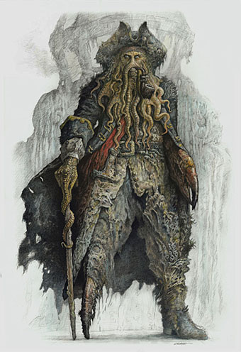
Poe by Harry Clarke.

Happy birthday Edgar Allan Poe, born two hundred years ago today. I nearly missed this anniversary after a busy weekend. Rather than add to the mountain of praise for the writer, I thought I’d list some favourites among the numerous Poe-derived works in different media.

Illustrated books
For me the Harry Clarke edition of 1919 (later reworked with colour plates) has always been definitive. Many first-class artists have tried their hand at depicting Poe’s stories and poems, among them Aubrey Beardsley, Gustave Doré, Arthur Rackham, W. Heath Robinson and Edmund Dulac; none complements the morbid atmosphere and florid prose as well as Clarke does. And if it’s horror you need, Clarke’s depiction of The Premature Burial could scarcely be improved upon.

Honourable mention should be made of two less well-known works, Wilfried Sätty’s The Illustrated Edgar Allan Poe (1976) and Visions of Poe (1988) by Simon Marsden. I wrote about Sätty’s collage engravings in Strange Attractor 2, and Sätty’s style was eminently suited to Poe’s work. Marsden’s photographs of old castles and decaying mansions are justly celebrated but in book form often seem in search of a subject beyond a general Gothic spookiness or a recounting of spectral anecdotes. His selection of Poe stories and poems is a great match for the photos, one of which, a view of Monument Valley for The Colloquy of Monos and Una, was also used on a Picador cover for Blood Meridian by Cormac McCarthy.

Recordings
These are legion but among the outstanding one-off tracks I’d note two poems set to music, Dream Within a Dream from Propaganda‘s 1985 album, A Secret Wish, and The Lake by Antony & The Johnsons. The latter appeared on the landmark Golden Apples of the Sun compilation and also on Antony’s own The Lake EP.

Among the full-length works, Hal Willner’s 1997 2-CD collection Closed on Account of Rabies features lengthy readings set to music from a typically eclectic Willner line-up: Marianne Faithfull, Christopher Walken, Iggy Pop, Diamanda Galás, Gavin Friday, Dr John, Deborah Harry, Jeff Buckley (one of the last recordings before his untimely death) and Gabriel Byrne. Byrne’s reading of The Masque of the Red Death is tremendous and the whole package is decked out in Ralph Steadman graphics.

Antony Hegarty appears again on another double-disc set, Lou Reed’s The Raven (2003), a very eccentric approach to Poe which I suspect I’m in the minority in enjoying as much as I do. An uneven mix of songs and reading/performances, Reed updates some Poe poems while others are presented straight and to often stunning effect by (among others) Willem Defoe, Steve Buscemi, Laurie Anderson, David Bowie, Amanda Plummer and Elizabeth Ashley.

Films
Once again, there’s too many films but The Masque of the Red Death (1964) has always been my favourite of the Roger Corman adaptations, not least for the presence of Jane Asher, Patrick Magee and (behind the camera) Nicolas Roeg. I wrote last May about the animated version of The Tell-Tale Heart from UPA. That adaptation, with narration by James Mason, is still on YouTube so if you haven’t seen it yet you can celebrate Poe’s anniversary by watching it right now.

Elsewhere on { feuilleton }
The illustrators archive

Previously on { feuilleton }
The Tell-Tale Heart from UPA
William Heath Robinson’s illustrated Poe
The art of Harry Clarke, 1889–1931

Groovy book covers

groovy.jpg

top left: Leo & Diane Dillon (1969); top right: Tom Huffman (1968).
bottom left: Gray Morrow & Henry Berkowitz (1967); bottom right: no credit.

Great examples of typically florid Sixties’ cover design at Font of all Wisdom – Unique lettering in design, a Flickr pool. The masterful Leo & Diane Dillon illustrated many of Harlan Ellison’s books, inside and out.

Elsewhere on { feuilleton }
The book covers archive

Previously on { feuilleton }
Harlan Ellison: Dreams with Sharp Teeth

Buccaneers #1

silver1.jpg

“For all the world I was led like a dancing bear” by NC Wyeth (1911).

This year’s reading began with a desire to explore some of the Robert Louis Stevenson volumes in my collection which I’ve so far neglected. At the moment I’m thinking of maybe reading everything I have by RLS, having begun with a return journey to Treasure Island, a book which seems to improve every time I revisit it. Setting out with Stevenson’s pirate tale was partly a result of having watched all three Pirates of the Caribbean films over Christmas, a series I’m probably in the minority in enjoying wholeheartedly, flaws, preposterousness and all. Much as I’d like to see a fourth film (there’s a hint of a sequel at the end), I’d prefer the makers to leave things be. The three films taken together can be watched as a single nine-hour ramble across the high seas and the tidy conclusion would be better left as it is.

My pocket-sized copy of Treasure Island from the Tusitala edition of Stevenson’s collected works is fine apart from the very small and poorly-printed map, something to which the reader is compelled to refer as we follow Jim Hawkins on his journey around the island. Happily the web provides many examples which can be printed out for viewing while reading. The web is also a resource for some of the numerous illustrated editions of the novel. The version by American illustrator NC Wyeth is one of the more well-known and more successful and his Long John Silver is a suitably powerful figure. Wyeth’s depiction of Billy Bones waiting on the cliff top was featured in a set of US stamps in 2001. The Internet Archive has scans of the Wyeth book (and a version with illustrations by Louis Rhead) although one of these, with better scans of Wyeth’s paintings, has some of the plates missing.

silver2.jpg

Long John Silver by Mervyn Peake (1949).

Far stranger—weirder, even—is Mervyn Peake’s Long John Silver, seen here on the cover of a more recent edition. Peake’s illustrations are probably my favourites but then I’m biased towards Peake as an author and illustrator so the preference is unavoidable. Even so, his depiction of Israel Hands brings to the fore the malevolent duplicity of that character in a way I’ve not seen any other illustrator attempt. It’s a shame the Peake site doesn’t have another of the artist’s renderings of Silver showing the sea cook posed on his single leg in an attitude more like a ballet dancer than a pirate. That drawing and his ogre-like Blind Pew show how original Peake could be as an illustrator. And lets not forget his own pirate creation, also his first book, Captain Slaughterboard.

silver3.jpg

It’s asking too much but it’s a shame that Walt Disney couldn’t have taken a look at Peake’s drawings instead of diluting Stevenson’s cunning buccaneer into the gurning caricature portrayed by Robert Newton in 1950. The less said about Byron Haskin’s film (and its sequels), the better. It has its moments visually but Newton’s portrayal has blighted all those that follow (Geoffrey Rush tips the hat in the Pirates films) and is single-handedly responsible for all subsequent pirate clichés.

davy_jones.jpg

Davy Jones from Pirates of the Caribbean, on the other hand, could almost have been designed specifically to please me alone, looking like the offspring of some unwholesome ménage between Long John Silver and the Great God Cthulhu. For the time being Davy Jones is probably my favourite screen villain, his tentacled face—and the fishy caste of his crew—is a wonder to behold. God knows what Stevenson would have made of this transfiguring of his creation but it suits me fine.

More buccaneers tomorrow.

Elsewhere on { feuilleton }
The illustrators archive

Previously on { feuilleton }
Mervyn Peake in Lilliput
Stevenson and the dynamiters
Howard Pyle’s pirates
Druillet meets Hodgson
Rogue’s Gallery: Pirate Ballads, Sea Songs, and Chanteys
Davy Jones