Sibylle Ruppert: Frenzy of the Visible

ruppert1.jpg

La Bible du Mal (1978).

I’m late to this but it’s worth passing on the news about an exhibition of paintings, drawings and collages by Sibylle Ruppert (1942–2011) which is currently running at Project Native Informant in London. Ruppert’s art has been mentioned here many times, she’s one of my favourite artists, so it’s great to see her receiving more recognition, and in London as well, not Paris as I would have expected. I ought to go and see this but finishing the Bumper Book of Magic book took longer than I expected so I’ve had scheduled work backed up which I’m dealing with at the moment. I also don’t fancy taking another chance with Britain’s failing rail network, not when the last experience a few weeks ago was a bad one. But if you’re closer to London I’d recommend this exhibition which Artforum says is Ruppert’s first solo show in the UK.

ruppert2.jpg

Ma Soeur Mon Epouse (1975).

It’s tempting to connect the exhibition to this year’s 100th anniversary of Surrealism but I’ve never seen Ruppert’s name mentioned in Surrealist circles. She isn’t referred to in Penelope Rosemont’s wide-ranging Surrealist Women, for example, but then neither is Leonor Fini, possibly because Fini tried to maintain some distance from groups and movements. Was Ruppert the same? Without further information it’s hard to say. She was friends with HR Giger, however, and pictures by both artists may be seen in Providence (1977), the Alain Resnais film, as I noted a couple of years ago.

Frenzy of the Visible will be running until 20th April.

ruppert3.jpg

Le Sacrifice (1980).

Elsewhere on { feuilleton }
The fantastic art archive

Previously on { feuilleton }
Art on film: Providence
Hans by Sibylle
Sibylle Ruppert revisited
Sibylle Ruppert, 1942–2011

Rare Opals

opal.jpg

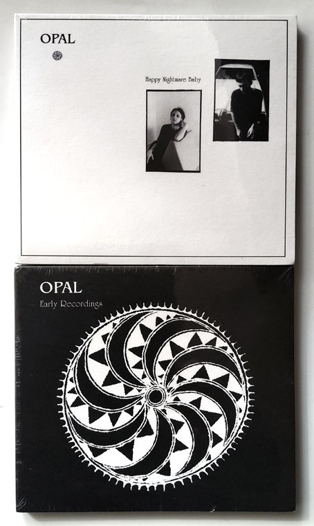
In the mail at the weekend, a pair of reissued Opal CDs that I didn’t expect to see any time soon, Happy Nightmare Baby (1987) and Early Recordings (1989). Opal were an American group who were active throughout the 1980s but they didn’t record very much, only releasing these two discs towards the end of their career. Both albums sank from sight in the early 1990s, and had been unavailable in any form when CD reissues were announced in late 2019 on guitarist David Roback’s own label, Salley Gardens. The reissues were withdrawn shortly before the release date, possibly as a result of Roback’s illness and subsequent death in February 2020. All of this is niche stuff but aficionados of the niche in question may like to know that I bought these new from an eBay (UK) seller for a fraction of the price you’ll pay at Discogs or elsewhere. (Here and here.) I’d seen reports that copies had been shipped before the cancellation was announced but hadn’t seen any on sale outside Discogs until last week. I’ve also seen suggestions that there might be bootlegs circulating but if these are boots then someone has managed to imitate the matrix numbers on the discs which I don’t think is an easy thing to do.

opal2.jpg

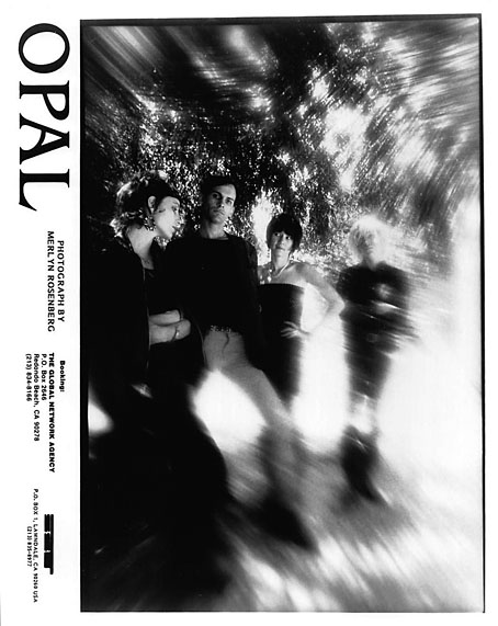
Opal is a group you seldom see mentioned today but plenty of people know the name of Mazzy Star, the group that Opal became after the departure of singer Kendra Smith in the late 1980s. David Roback was the key member, the link between Mazzy Star and the neo-psychedelia of the Los Angeles Paisley Underground which gave rise to both Opal and Roback’s other outlet, the Rain Parade. The Paisley Underground was never as psychedelic as I hoped it might be, only the Rain Parade could be classed as a bona fide psych band, but the groups associated with this loose scene—The Bangles, The Dream Syndicate, The Three O’Clock, et al—were all preoccupied with the music of the late 1960s, and of the early 70s via Neil Young and Alex Chilton. Opal followed the trend, being less oneiric than Mazzy Star would be, more concerned with reviving older musical styles than creating something new. Early Recordings, a collection of singles, EPs and other songs, owes less to psychedelia than it does to late-60s balladeering: guitar and vocals, lots of reverb and minimal percussion and keyboards. Kendra Smith, formerly of The Dream Syndicate, sings almost all the songs on both albums. The origin of the Opal sound may be found in the cover versions on Rainy Day (1984), a one-off album that David Roback recorded with Kendra Smith plus members of The Bangles, Rain Parade and The Three O’Clock. Lou Reed’s I’ll Be Your Mirror is the early Opal sound in miniature, especially in the version by Nico and The Velvet Underground which Roback emulates with Susanna Hoffs.

Happy Nightmare Baby has a rather prosaic monochrome cover but this is where the psychedelic rock comes to the fore, with Roback breaking out the fuzz box and wah-wah pedal to fashion a heavier sound that would later be heard on Mazzy Star songs like Ghost Highway. I said that only the Rain Parade warranted the psych label but Happy Nightmare Baby certainly gets there on songs like Magick Power and the slow explosion of Soul Giver, the latter being the closest that Opal get to the Rain Parade’s finest moment, No Easy Way Down. There’s also a touch of glam in the opening number, Rocket Machine, which harks back to the T. Rex of Electric Warrior. Happy Nightmare Baby is a fiery debut—and Opal could be even heavier live—but it’s one of those albums that you’d expect would be surpassed by later releases, instead of which all we have is Early Recordings*. The two albums are dissimilar enough to almost be the work of different groups; together they suggest that David Roback spent most of the 1980s trying to orient his music in a way that honoured his influences while also accommodating all his favoured modes of expression, from fuzz squall to languid blues to nocturnal drift. The first Mazzy Star album, She Hangs Brightly, is the place where the influences and intentions fused to create something new. And Roback found his ideal singer in Hope Sandoval, of course. Kendra Smith is okay but her voice can get monotonous over a whole album, she lacks Hope Sandoval’s mystique and emotional range. Opal were good but you can’t imagine many people wanting to cover their songs the way people have done with Mazzy Star. But then without Opal there might never have been a Mazzy Star. Niche stuff this may be but it doesn’t deserve to be buried for another thirty years.


* Or almost all. There is another album, Early Recordings Volume 2, a collection of unreleased songs and covers. But this has never been given an official release.

Previously on { feuilleton }
Balloon parade
The Dukes declare it’s 25 O’Clock!
Strange Things Are Happening, 1988–1990

Weekend links 719

rimmington.jpg

The Decoy (1948) by Edith Rimmington.

• “Among other things, [Dalí’s] storyboards involved [Ingrid] Bergman turning into a statue that would then break up into ants.” Tim Jonze talks to film scholar John Russell Taylor about the storyboards for Alfred Hitchcock’s films, including the ones for Spellbound which Taylor found in a bric-a-brac sale.

• “Of all the pop acts that proliferated in the early 80s, it was Soft Cell who retained punk’s sharp, provocative edges.” Matthew Lindsay on 40 years of Soft Cell’s This Last Night In Sodom.

• Coming soon from White Rabbit books: Futuromania: Electronic Dreams, Desiring Machines and Tomorrow’s Music Today by Simon Reynolds.

Anathema to many philosophical systems, or perhaps philosophy itself, Lovecraft’s philosophical project fundamentally holds that contemplations of higher reality or the nature of things can never be fully realised. Ultimately, the search for knowledge does not constitute some telos, some purpose, for humankind, but rather leads to the violent dissolution of the self. Higher reality is that which the limited human psyche can never fully comprehend.

Sam Woodward on the cosmic philosophy of HP Lovecraft

• At Public Domain Review: Grotesqueries at Gethsemane: Marcus Gheeraerts’ Passio Verbigenae (c.1580).

• “Here is a remarkable form of popular heraldry.” Mark Valentine on the mystique of old inn signs.

• At Bandcamp: Brad Sanders on where to begin with Lustmord’s cosmic ambient.

• New music: Eleven Fugues For Sodium Pentothal by Adam Wiltzie.

• At Aquarium Drunkard: Jason P. Woodbury talks to Roger Eno.

Gomorrha (1973) by Can | Sodom (1978) by Can | Spellbound (1981) by Siouxsie And The Banshees

Liber Artificiosus Alphabeti Maioris

merken01.jpg

The previous post reminded me of this, one of my favourite examples of ornamented alphabets from the 18th century. Liber Artificiosus Alphabeti Maioris (“Artistic Book of the Major Alphabet”, 1782) was written and designed by Johann Merken, with the book’s 56 plates being engraved on copper by Heinrich H. Coentgen. I first saw these in a post at the now-defunct (and much missed) BibliOdyssey where Mr Peacay had found copies of the alphabet plates at some library archive or other. Happily, the Getty Research Institute made a scan of their own copy of the book a few years ago which includes all of the plates plus the accompanying German text.

merken02.jpg

The first part of Merken’s volume is unique in its combination of abecedarium with a variety of objects, emblems, symbols and other designs: silhouette figures, plants and flowers, ornamental gardens, coats of arms, calligraphic doodles, trophies (those accumulations of military paraphernalia), birds and animals (eg: a pair of monkeys playing the drums), monograms, mathematical figures, etc, etc, all festooned with the familiar swags and foliage of baroque decoration. In the second part of the book there’s more emphasis on science and technology, with plates devoted to astronomy, alchemy/chemistry, the orders of Classical architecture, and so on. The later pages are interesting but it’s those in the first section that really stand out. Many of the alphabet designs push their elaboration and embellishments to such a degree that the letters appear to be mutating to resemble their own decorations. The book as a whole is a curious blend of the 18th-century enthusiasm for taxonomy and categorisation combined with the baroque love of the grotesque and the arabesque. I wish there was more like it.

merken03.jpg

merken04.jpg

merken05.jpg

Continue reading “Liber Artificiosus Alphabeti Maioris”

Michael Baurenfeind’s extravagant calligraphy

baurenfeind01.jpg

I like extravagant calligraphy, the more extravagant the better, as with these examples from Schreib-Kunst (1716) by Michael Baurenfeind (1680–1753). The book is a recent scan by the Getty Research Institute whose art and design collection includes many similar volumes, although finding the good ones usually means clicking hopefully on blank covers with promising titles. Baurenfeind’s book was published in the middle of the period that extends from the mid-1600s to the mid-1700s when this kind of maximal elaboration of lettering was at its height. Books published later in the 18th century are more devoted to the mastery of careful penmanship, although you still find depictions of calligraphic excess mixed with baroque decoration. These later studies can be very impressive but I prefer the books like Baurenfeind’s which is a demonstration of the calligraphic art pushed to extremes of elaboration and ornamentation. Some of the capitals in this volume are the most excessive examples I’ve seen outside Paul Franck’s Kunstrichtige Schreibart (1655), a book filled with elaborate letterforms which yet seems crude in comparison to many of Baurenfeind’s pages. Baurenfeind goes beyond Franck’s solid black curves to create shaded interlacings that are less examples of calligraphic formation than intricate knotworks that just happen to resemble capital letters.

baurenfeind02.jpg

There’s more of the same in a Baurenfeind book from 1736, also called Schreib-Kunst, which includes several plates that show the construction of the letterforms. Volumes like these are usually showcases rather than instruction guides so this is unusual; Baurenfeind even has a guide to cutting your goose quill before you begin. Having tried writing with a bird’s feather once or twice I wouldn’t recommend it unless you have no other choice. Metal nibs are always better.

baurenfeind03.jpg

baurenfeind04.jpg

baurenfeind05.jpg

Continue reading “Michael Baurenfeind’s extravagant calligraphy”