
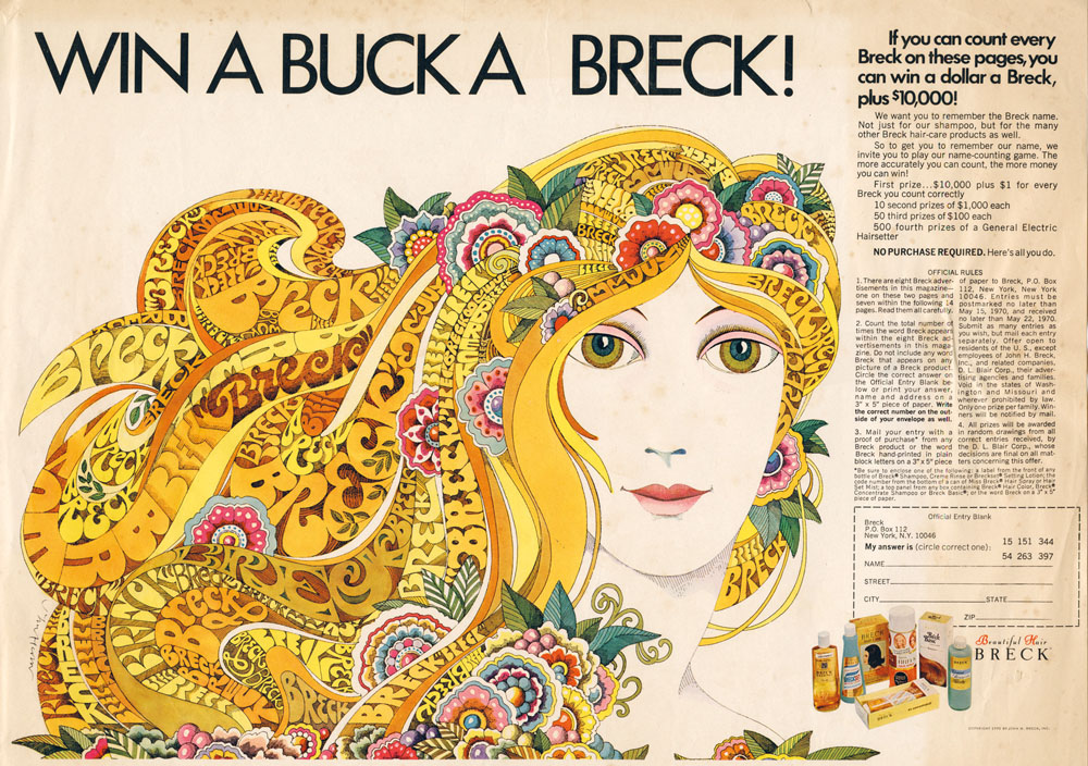
Ad art for Seventeen magazine, August 1970.
Another member of the Groovy Set, John Alcorn was a very prolific illustrator and designer whose career included a period at Milton Glaser and Seymour Chwast’s Push Pin Studios. Alcorn’s art predates the groovy look, and also extends beyond it, but since I have a taste for this quasi-psychedelic style all the examples here are from the late 1960s/early 1970s. An overview of Alcorn’s career may be found in John Alcorn: Evolution by Design, a book edited by Stephen Alcorn and Marta Sironi which was featured at 50 Watts. And since I keep referring back to it, I’ve added some updates to the original groovy post.
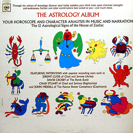
The Astrology Album, 1967.
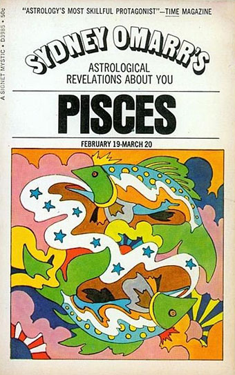
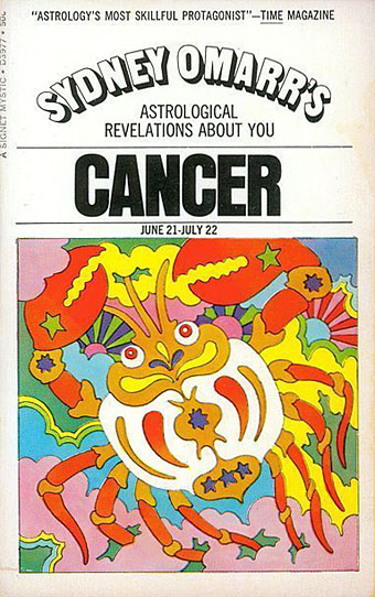
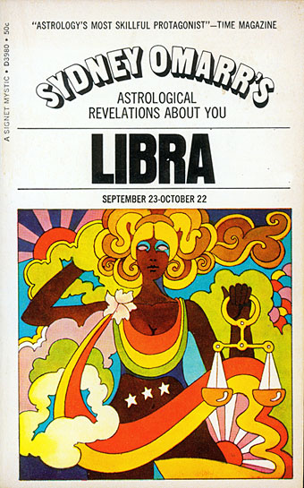
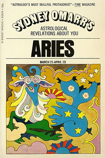
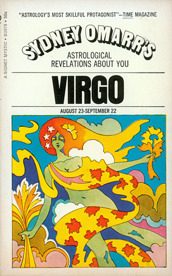
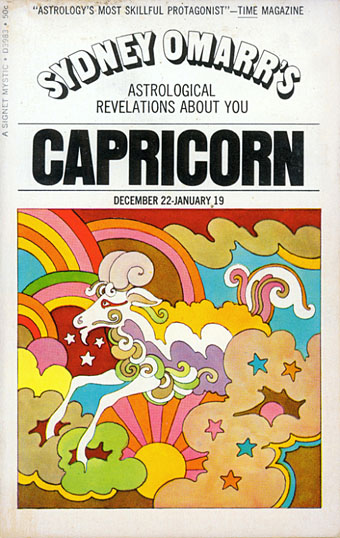
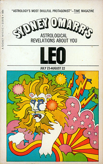
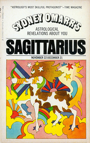
From an astrological album to astrological covers for Sydney Omarr’s books, 12 of which were published by Signet in 1969.
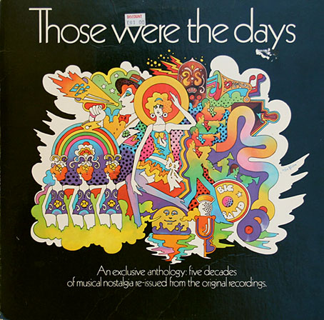
Those Were The Days: Fifty Years Of Achievement 1919-1969. A compilation album prepared by RCA for the Enjay Chemical Company.
John Lennon dismissed Paul McCartney’s old-time song pastiches as “granny music shit”. This compilation of granny music swipes the Yellow Submarine style so completely it even has the same Kabel typeface used in the film’s title sequence. What you might call the revenge of the pastiched.
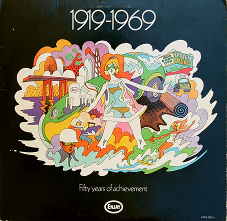
Those Were The Days: Fifty Years Of Achievement 1919-1969. Back cover.
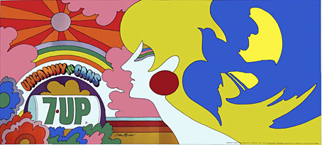
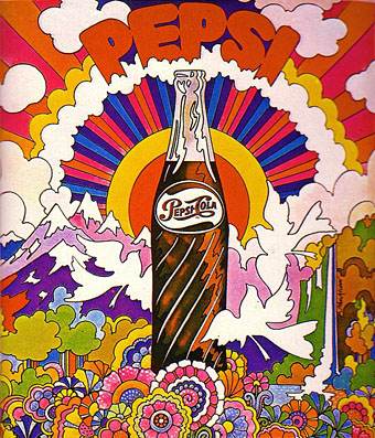
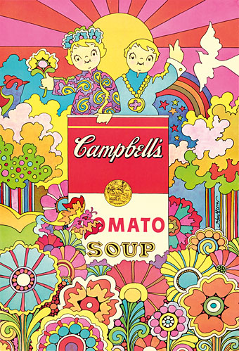
The speed with which the psychedelic art style was co-opted by corporations in order to sell more stuff must be one of the swiftest appropriations in cultural history. In 1966 the psychedelic poster style occupied a niche connected exclusively to sex, drugs and rock’n’roll. Two years later, thanks in large part to the popularity of The Beatles and Yellow Submarine, graphics derived from the pioneers at Push Pin studios and the San Francisco poster designers were being used to make old products seem fresh again. John Alcorn’s billboard for 7Up was part of a 1969 campaign that rescued the brand from bankruptcy with a series of trendy advertising designs, together with a slogan that positioned the drink in opposition to its rivals by declaring it to be the “Un-Cola”. Other corporations weren’t going to be left behind, as the designs below demonstrate. The Campbell’s ad suggests that psilocybin was now being used in the cream of mushroom soup.
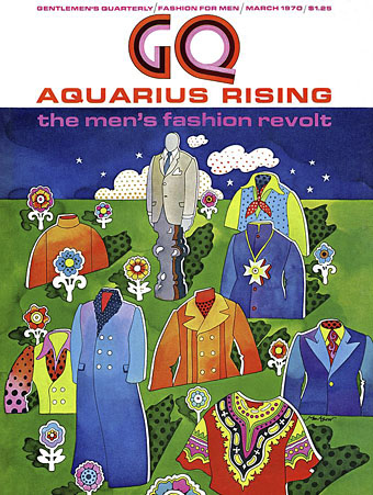
GQ magazine, March 1970.
Previously on { feuilleton }
• The art of Mike Hinge, 1931–2003
• The groovy look
• The psychedelic art of Nicole Claveloux
• Art that transcends
• Philippe Caza covers
• Saga de Xam by Nicolas Devil