BUTT covered

butt00.jpg

What I discovered is that BUTT actually matters, and I’ll tell you why. BUTT fills a hole, as tautologous as that may sound. I’m tempted to say that BUTT fills the vacuum left by the sad and lamented loss of such historically important magazines as the original Andy Warhol’s Interview, After Dark and the first five years of index (under the editorship of Bob Nickas), but since none of those magazines were explicitly and overtly, capital G gay, I guess it’s more accurate to say that BUTT has single-handedly pioneered the notion of a smart, literate and fashionable, conversational gay magazine that isn’t interested in propping up some ideologically proper or even terribly consistent image of what it means to be a homosexual, and that also manages to be dirty. —Bruce LaBruce

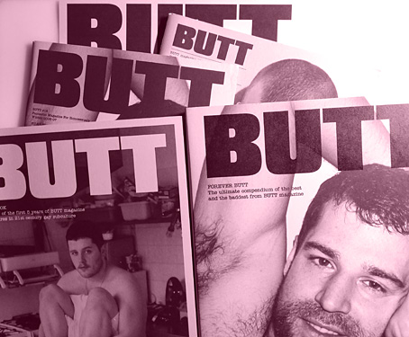
BUTT magazine—variously subtitled “Amazing (or Fantastic, or Hysterical) Magazine for Homosexuals”, “The Homosexualist Quarterly”, “International Fagazine”, etc, etc—ceased publication in 2012, but the best of its run is preserved in two book collections from Taschen: BUTT Book (2006), a paperback which seems now to be out of print, and Forever BUTT (2014), a hardback contained within leatherette boards. I was re-reading some of the interviews in the books recently, and feeling the loss of a gay magazine that was easily the best of its kind in the 2000s, a welcome alternative to contemporaries that were little more than glossy aspiration fodder, filled with fashion shoots and anodyne celebrity interviews.

butt01.jpg

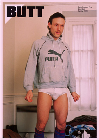
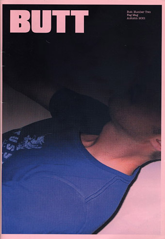
Issue 1: Bernhard Willhelm by Wolfgang Tillmans.

BUTT wasn’t as thoroughly sex-obsessed as Boyd McDonald’s Straight to Hell but publishers/editors Gert Jonkers and Jop van Bennekom shared McDonald’s determination to reflect the lives of gay men as they were lived, with an equivalence given to complete unknowns (often the magazine’s own readers) as well as to successful writers, musicians and film directors. Interviews with the latter predominately concerned the subjects’ sex lives and interests, they were never promo pieces for current work. BUTT was the only magazine in the world where you might find interviewees such as Gore Vidal and Edmund White rubbing shoulders with a man like Dirty Danny (“the filthiest homosexual on earth”) or a gay refuse collector. I also loved the design which from the first issue used pink paper stock and only two typefaces for the entire run: Compacta for headlines, and different weights of American Typewriter for everything else. The minimal look established a distinct identity that inspired imitation among later titles such as Kaiserin (“A magazine for boys with problems”).

butt02.jpg

Issue 2: Lernert in Stüssy by Jop van Bennekom.

BUTT ran for 29 issues in all, stopping short of the 30-issue barrier which smaller magazines often struggle to pass. I’m always torn in cases like this, wishing there might have been more while also being aware that magazines can outlive their initial promise if they run for too long. BUTT certainly maintained its integrity, and we have the books, of course, which is more than many other titles manage. Back issues may be found for sale online but they’re increasingly expensive, a disappointment for would-be collectors but also a sign of the magazine’s cult value. I just wish I’d bought more of them as they appeared.

butt03.jpg

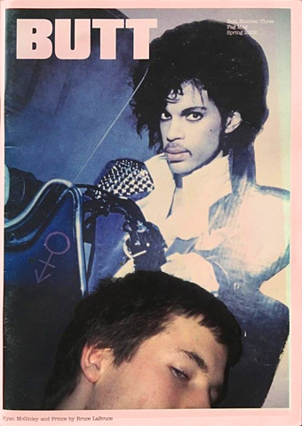
Issue 3: Ryan McGinley and Prince by Bruce LaBruce.

butt04.jpg

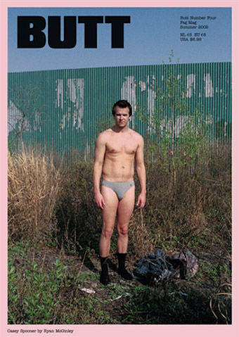
Issue 4: Casey Spooner by Ryan McGinley.

butt05.jpg

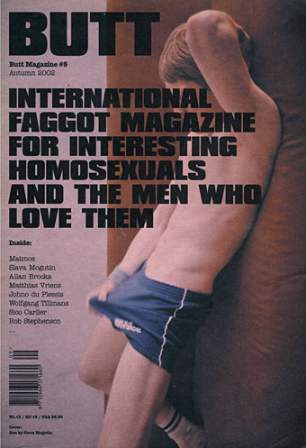
Issue 5: Ben by Slava Mogutin.

Continue reading “BUTT covered”

Weekend links 511

marber.jpg

Design by Romek Marber, 1963.

• The death of Polish composer Krzysztof Penderecki prompted so many “Shining composer” headlines you have to wonder what kind of notices he might have received if his early work hadn’t been purloined by Hollywood. György Ligeti always seemed ambivalent about having his music used as cinematic illustration (Kubrick annoyed him by altering some of it without permission) but Penderecki worked as a composer for Polish films in the 1960s, not only providing a score for The Saragossa Manuscript (1965) but also (surprisingly) writing music for a number of short animations. I’ve been listening to his music for almost 40 years, after a chance discovery of the stunning Threnody For The Victims Of Hiroshima led me to seek out more. I have to admit that the appeal of his recordings lay in their ability to thrill and terrify—qualities that musicologists seldom address—and I’ve never paid any attention to Penderecki’s later work which was less of an assault on the senses. At The Quietus James Martin argues for listening to the entire oeuvre, not just the early works. For more about the composer’s life and work, Culture.pl has a number of good articles, eg: Mazes, Notes & Dali: The Extraordinary Life of Krzysztof Penderecki, and Music Is Not for Everyone: An Interview with Krzysztof Penderecki.

• The late Romek Marber (1925–2020) was a designer/illustrator whose name is familiar to collectors of Penguin books via the Marber Grid, the template he created in the early 1960s for the Penguin Crime series, and which was later extended across the entire paperback range. Marber talked about this period of his work in Penguin by Illustrators in 2009. Elsewhere: Rick Poyner on Marber’s design, and a suggestion for how the Marber Grid was designed.

• “…you’ll see Lego and children’s toys, but also Rawlplugs, tile spacers, Monopoly houses, cigarillo tips, curtain hooks, biofilters, Smarties tube lids, fishing beads, broken security seals, razor parts, bits of toothbrushes, roofing screw caps, medical lancets, golf tees, false teeth, plastic soldiers, posties’ rubber bands, bungs and stoppers.” Beachcomber Tracey Williams talks to Andrew Male about the undying ubiquity of plastic waste.

• “Thanks to Bookshop, there is no reason to buy books on Amazon anymore,” says Alex Lauer. The caveat is that the service is limited to the USA. I order books direct from publishers or from eBay and Abe; the latter may be Amazon-owned but you’re still paying most of the money to the individual sellers.

• Mixes of the week: Radio Belbury 19: Family Fun Time, and Through A Landscape Of Mirrors Vol. VII – France IV by David Colohan.

• “[Amanda Sewell’s] Wendy Carlos: A Biography is a great work of scholarship,” says Geeta Dayal.

• “Part of me expects to go on forever.” David Barnett on Michael Moorcock at 80.

• “What is the point of a critic if not to tell the truth?” asks Rachel Cooke.

John Boardley on medieval road-trips and the invention of print.

Anna Bogutskaya on where to begin with the Weird West.

• Inside Tove Jansson’s private universe by Sheila Heti.

• Memory Of Hiroshima (1973) by Stomu Yamash’ta’s Red Buddha Theatre | Hiroshima Mon Amour (1977) by Ultravox! | Hiroshima (1982) by Borsig

Hazardous design

watts16.jpg

Cover design by Elizabeth Story.

Our present viral moment reminded me that I hadn’t written anything about Peter Watts is an Angry Sentient Tumor, a collection of essays by Canadian science-fiction writer Peter Watts whose interiors I designed for Tachyon last autumn. Watts has a special interest in biology, and several of the pieces in the collection are partly or wholly concerned with pandemics; needless to say, when I was adding a biohazard symbol to one of these pages six months ago I didn’t expect such a situation to be the event that defined the coming year, although for anyone who’s read enough SF (or horror, for that matter), potentialities like this tend to lurk in the back of your mind. Watts’ essays are mostly blog entries—much more substantial ones than the brief things I usually file here—together with a few articles from print sources. The contents range from polemics about police violence and the creeping surveillance state to personal entries covering his late brother, his father’s closeted sexuality, his beloved cats, and a near-fatal experience with a flesh-eating virus. There are also film reviews, scientific speculations and musings/warnings about global calamities, especially the climate variety. His writing is consistently witty, engaging and thought-provoking. The book was a pleasure to read as well as work on.

watts14.jpg

As with other interiors I’ve designed for Tachyon, I took the design cues from the cover, which in this case was the work of Elizabeth Story. The internal graphics are a combination of writhing tentacles and hazard/warning signs, the latter being taken unaltered from public information sets or adapted to suit the content of the piece. In a way they’re a sequel to the Tarot symbols I designed in 2006 based on graphics from the international symbols commonly used in public buildings. The bespoke designs were fun to create, and required some ingenuity in places: how do you show global warming in a simple, wordless symbol? My solution was to put a globe in a frying pan. There are 50 essays in all so the examples shown here represent a fifth of the book.

For an idea of Watts’ writing together with his thoughts about the pandemic, his most recent post is here. He’s not the only person who’s been saying we should expect more events like this one in the future.

watts02.jpg

watts04.jpg

watts05.jpg

Continue reading “Hazardous design”