
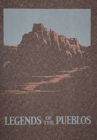
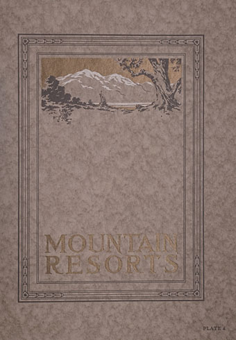
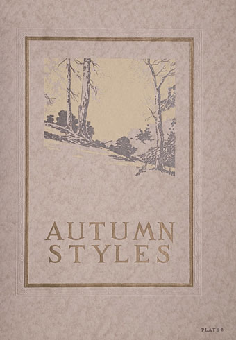
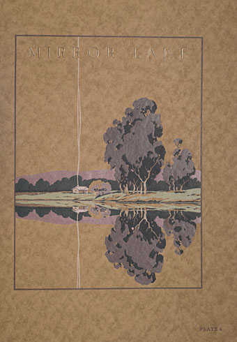
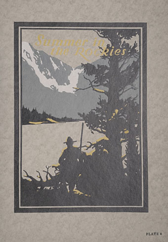
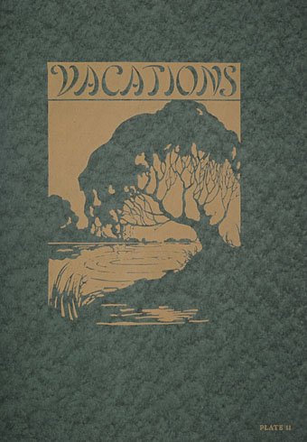
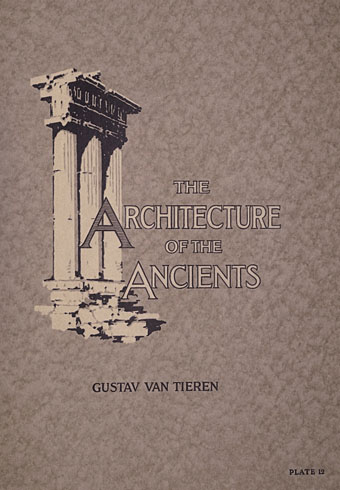
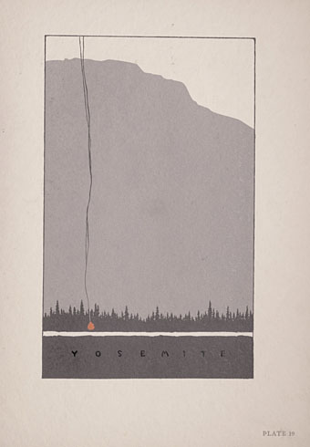
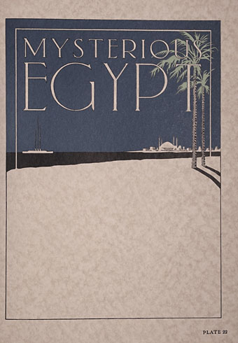
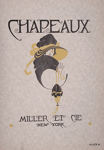
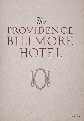
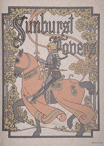
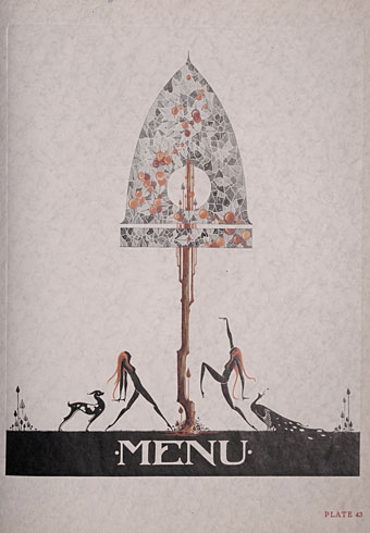
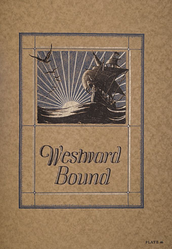
Not a guide from myself but a sample book from 1923 produced by the Hampden Glazed Paper and Card Co. of Holyoke, Massachusetts. Seventy-six designs by different artists are arranged by theme—landscape, architectural and so on—the common thread being the way they all give prominent space to the paper that provides the background of the design. The restrained colour palette and use of space reminds me of some of the posters produced by Noel Rook and others for the London Underground at this time. This isn’t an isolated style, in other words, and the prevalence of the look in the 1920s may have filtered into the cover designs Edward Gorey was creating for Doubleday in the 1950s. Mark Dery’s Gorey biography mentions Japanese prints being an influence on Gorey’s covers but he would have grown up around books and poster graphics that looked like this, designs which themselves (via Aubrey Beardsley, Will Bradley and others) possess a Japanese influence.

Previously on { feuilleton }
• Posters: A Critical Study, 1913