Weekend links 425

tsuruta.jpg

Art by Ichiro Tsuruta.

• “Writing is so much about subverting dogmatisms of all kinds, above all the ones that insist you cannot go there! You must not say that! Writers need to go anywhere, to take anything on. And the only rule is to do it well.” Rikki Ducornet in a feature at Dennis Cooper’s which has been linked here before but was previously on DC’s old (now deleted) blog.

• “This book-cover trend is turning bookstores into flower shops,” says Kenzie Bryant. “How publishing’s floral-print trend came to rule the world’s bookshelves.” (Where “the world” means the USA, as usual…)

• The third edition of Wyrd Daze—”The multimedia zine of speculative fiction + extra-ordinary music, art & writing”—is out now.

For this listener, Nardis has become a full-on musical obsession. I have more than ninety official and bootleg recordings of the tune stored in the cloud, ranked in a fluid and continually updated order of preference, so they follow me wherever I go. In my travels as a writer, I use Nardis as a litmus test of musical competence: if I see a jazz band in a bar or a busker taking requests, I inevitably suggest it. (If they’ve never heard of it, I understand that they must be new at this game.) By now I’ve heard so many different interpretations, in such a far-flung variety of settings, that a Platonic ideal of the melody resides in my mind untethered to any actual performance. It’s as if Nardis were always going on somewhere, with players dropping in and out of a musical conversation beyond space and time.

Steve Silberman on the obsession that he and pianist Bill Evans share with Nardis, a Miles Davis composition that Davis himself never recorded

• Mixes of the week: Secret Thirteen Mix 263 by Jung An Tagen, and XLR8R Podcast 554 by Tutu.

• “René Magritte still has the power to surprise,” says Sophie Haigney.

Ishmael Reed at the Brockport Writers Forum, 1st May, 1974.

• The On-U Sound label is now at Bandcamp.

Brian Eno talks music, global politics, etc.

Faded Flowers (1985) by Shriekback | Other Flowers (2003) by Harold Budd | White Flowers (2014) by Lutine


The Joe Phenix Detective Series

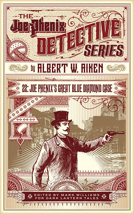
joephenix.jpg

After six months of black-and-white drawing it’s been good to return to colour book covers of which this is the first of a new crop of designs. Albert W. Aiken (c.1846–1894) was a prolific American author of pulp fiction, whether writing under his own name or pseudonymously (and sometimes as a woman) for Dime Library, Banner Weekly, Saturday Journal and many other publications. Joe Phenix (also named Phoenix in later stories) was one of his more popular creations, a late-Victorian detective whose investigations ran to over 20 adventures. These tales are in the process of being made available by Mark Williams in ebook form so my task was to provide a single cover design that could function for all the titles.

In keeping with the new format, the style deployed here is mostly a pastiche of the dime novel idiom with a few contemporary touches. Many of the dime publications favoured a large box in the top third of the cover which would contain a typically florid title arrangement. The accompanying illustrations were often comparatively crude but the titles followed the style of the period with engraved drop shadows, gradients and lots of fine decoration. It’s fun to imitate this style although it can also be more time-consuming than contemporary design since everything has to be worked out one piece at a time. Several of the decorative elements on this cover are what printers used to refer to as “combination ornaments”, very small details which can be pieced together in a number of ways to form banners, borders and other motifs. Combination ornaments were a solution to the problem of working elaborate decoration into spaces of variable size and shape; instead of a pre-shaped design you’d shape the decoration to fit the space. They were also lucrative since printers charged for the use of each small element. In a digital composition such as this the joins between the pieces are invisible but in a period design you can often spot the combination pieces (especially in border designs) when the individual elements fail to line up properly. The figure with the gun, incidentally, is Mr Phenix himself, taken from the cover of Beadle’s Dime Library.

The first few Joe Phenix titles are available now at Amazon and other ebook outlets with further titles to follow.

Previously on { feuilleton }
The man who wasn’t Tesla
The George Dower Trilogy by KW Jeter
Steampunk in the Tank
More vapour trails
Steampunk catalogued
Steampunk: The Art of Victorian Futurism
Steampunk Calendar
Words and pictures
Nathanial Krill at the Time Node
Fiendish Schemes
Ghosts in Gaslight, Monsters in Steam
Steampunk Revolution
The Bookman Histories
Aether Cola
Crafting steampunk illustrations
SteamPunk Magazine
Morlocks, airships and curious cabinets
The Steampunk Bible
Steampunk Reloaded
Steampunk overloaded!
More Steampunk and the Crawling Chaos
Steampunk Redux
Steampunk framed
Steampunk Horror Shortcuts

Weekend links 424

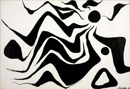
calder.jpg

Black Sun (1953) by Alexander Calder.

• “But Berlin Alexanderplatz transcends its genre elements, largely because of Döblin’s deep lack of hope about what can be expected of human beings.” Adam Kirsch on Alfred Döblin’s Berlin.

• “I occasionally dream of finding books that do not seem to exist (yet), and sometimes remember their titles,” says Mark Valentine.

• “I don’t read fiction.” He does, however, own 11,000 books. Alan Garner on writing a memoir of his wartime childhood.

What is it that I really like? I mean that’s the question that I think every musician and artists and everybody actually, is asking themselves; what they really like. And that means the emphasis is on REALLY like, meaning how do you push aside what you’ve been told, what you’ve been taught, what your friends like, and how much you like something because your friends like it or because it’s socially popular at the moment, or your girlfriend likes it or any of those ideas.

Jon Hassell (again) in an interview at Ableton

• How Alexander Calder sparked a modern fascination with mobiles (sculptures, that is, not telephones).

• Deep in Italy, one man’s Surrealist mini-city sleeps: Francky Knapp on Tomaso Buzzi’s La Scarzuola.

• “Even before electricity, robots freaked people out”: Lisa Hix on the history of clockwork automata.

Nicolas Winding Refn’s website devoted to neglected/abandoned films was launched this week.

• Mixes of the week: FACT Mix 664 by Lucy, and XLR8R Podcast 552 by Thomas Fehlmann.

Jean-Paul Goude‘s best photograph: an androgynous Grace Jones.

Marquis de Sade: 112 pages, 100 erotic illustrations.

The world’s most beautiful libraries

Sade Masoch (1968) by Bobby Callender | I’ve Seen That Face Before (Libertango) (1981) by Grace Jones | Black Sun (2011) by Demdike Stare

Illustrating Sherlock Holmes

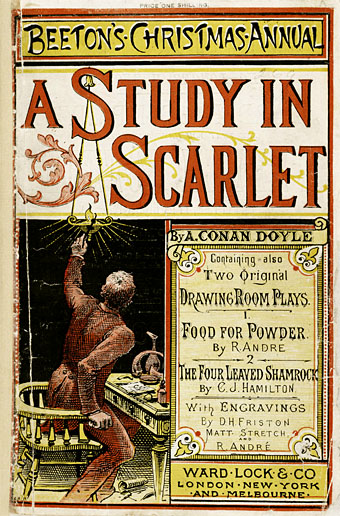
beeton.jpg

Beeton’s Christmas Annual, 1887.

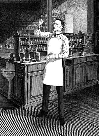
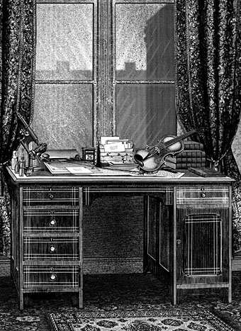
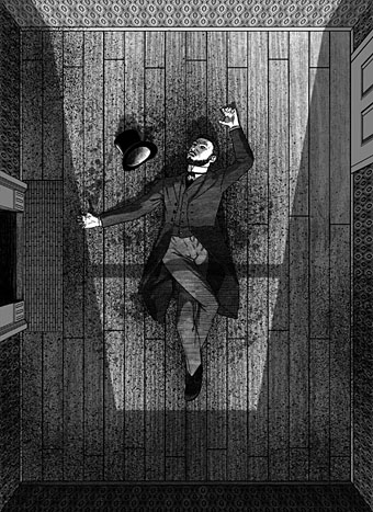
The latest in the series of illustrated editions I’ve been working on for Spanish publisher Editorial Alma is a single-volume collection of two short Sherlock Holmes novels, A Study in Scarlet and The Sign of Four. Work on this book began immediately after I’d finished Dracula so maintaining the Victorian theme was easy enough, although the commission as a whole was an awkward one. The main problem was having barely enough time to create 20 new illustrations while I was finishing work on the huge Jim Cawthorn book. But even with enough time this would have been a difficult brief. I regard Sidney Paget‘s original Holmes illustrations as the definitive ones so trying to offer people a fresh take on the world’s greatest detective is difficult. (And, as with Dracula, there’s further competition from the innumerable screen adaptations.) Then there are the stories themselves which are often more cerebral than visual, offering little for an illustrator beyond successive views of rooms, streets, houses and so on. Even Paget has trouble with this aspect of the stories, with many of his illustrations showing the various characters standing or sitting in rooms. If I’d had more time I might have tried a lateral take on the content—two of the illustrations in Dracula avoided the people-in-rooms problem by showing collections of objects on tables—but I didn’t have the time…

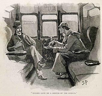
paget.jpg

Watson and Holmes by Sidney Paget. From The Adventure of Silver Blaze, The Strand Magazine, December 1892.

As things turned out, the least satisfying of the novels from a story perspective, A Study in Scarlet, was easier to illustrate because much of the second half takes place in the United States. This was the first Holmes novel, and it doesn’t work as well as the others for precisely this reason, the narrative attention is removed from Holmes, Watson and London, but the change of scene is a benefit for an artist. The second novel, The Sign of Four, is a better story but was compromised in this edition because the publisher only wanted every other chapter illustrated. For this reason Holmes and Watson are elusive presences in their own books although given the problems outlined above this may be for the best.

There’s still one more volume to emerge from my recent round of work for Alma, a collection of four Lovecraft stories, three of which I hadn’t illustrated before. More about this in a month or so. In the meantime, the full run of Holmes pictures follows below, while all may be seen at a larger size here.

A Study in Scarlet

holmes01.jpg

holmes02.jpg

holmes03.jpg

Continue reading “Illustrating Sherlock Holmes”