
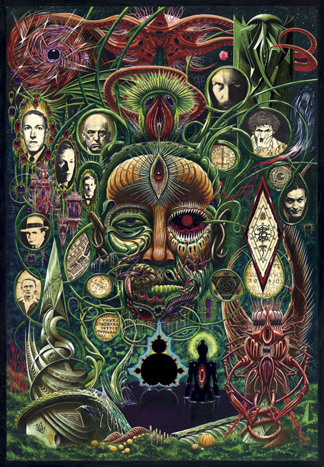
Yuggoth Cultures (1994) by John Coulthart.
Earlier this week I spent a day scanning this painting—which I’m now surprised to find is 21 years old—so I might at last have a good quality digital copy. There’s been a copy on the website for years but that was a print made at a high-street copy shop that did nothing for the detail and range of colour. It’s quite a large piece—49.54 x 71.39 cm (19.5 x 28.1 inches)—done with acrylics on board. Since 2003 the painting has been used (in another poor reproduction) on the cover of The Starry Wisdom, the controversial collection of Lovecraftian fiction from Creation Books. The painting wasn’t originally intended for that collection, however, and doesn’t quite fit since a number of the portraits don’t feature in the book at all.
Yuggoth Cultures would have been an earlier collection of Lovecraftian fiction and non-fiction that Alan Moore had begun writing for Creation in 1993. Alan’s idea was to take Lovecraft’s Fungi from Yuggoth sonnet sequence as the basis for a collection that would explore Lovecraft’s fictional world and also draw together a variety of figures from the same era: fellow writers, occultists like Aleister Crowley and Austin Spare, and Harry Houdini for whom Lovecraft ghost-wrote Imprisoned with the Pharaohs in 1924. Unfortunately the stars were not right on this occasion; Alan took the sole copy of the half-written manuscript to London in order to read selections at an event in Soho but left the papers in a cab. Some pieces survived, having been copied and stored elsewhere—The Courtyard in The Starry Wisdom is one of these—and there was talk for a while of the lost pieces being rewritten but enthusiasm for the project flagged.
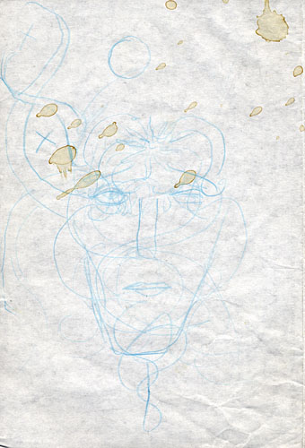
This is Alan’s sketch for the cover, the idea being to have a Lovecraft head made of fungal growths rather like an Arcimboldo painting. The head would be sprouting tendrils whose loops would contain pictures of some of the people featured in the book. Alan’s quick sketch is actually a better approximation of Lovecraft’s strange features than my painted version which isn’t narrow enough. For the record (and because people always ask), the other people on the cover are Alan himself, Austin Osman Spare, Aleister Crowley, Harry Houdini, Robert E Howard (not Al Capone as people often think) and Clark Ashton Smith.
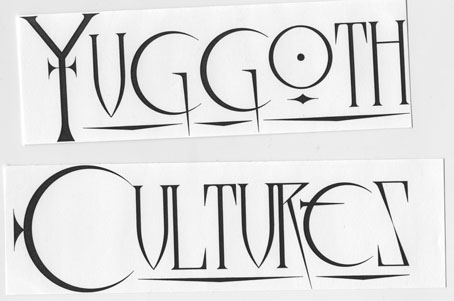
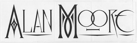
While searching through the archives I discovered these lettering designs although they’re probably not bold enough to read very well on such a busy painting. Before I started using a computer, designs like this had to be drawn at large size then scaled down using a photocopier.
I’d done a couple of acrylic paintings before this but nothing really ambitious which is one reason the picture contains such a variety of detail and pictorial technique. Prior to 1993 all my painted work had been in gouache which is fine for light watercolour effects or flat areas of colour but which can’t produce the depth and realism of oil or acrylic paints.
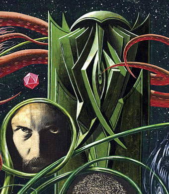
Mr Moore and an angled Cthulhoid statue that I wouldn’t mind seeing produced in three (or more) dimensions.
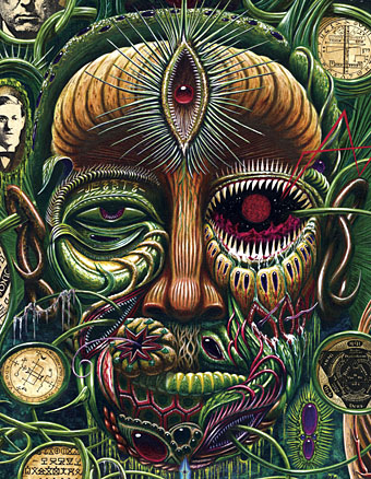
Tendril loops that don’t feature faces are filled with sigils and alphabets from the Key of Solomon.
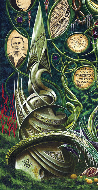
This monolith was my favourite part of the picture when I’d finished it mainly because that kind of solidity and realism had been impossible to achieve in the pre-acrylic days. Next to it on the right is the Miskatonic river from a copy of Lovecraft’s map of Arkham. The photo of Clark Ashton Smith is from the L. Sprague de Camp Lovecraft biography which I think now was a mistake. Smith wrote all his fiction in a short space of time when he was a much younger man so ideally a younger portrait ought to be used.
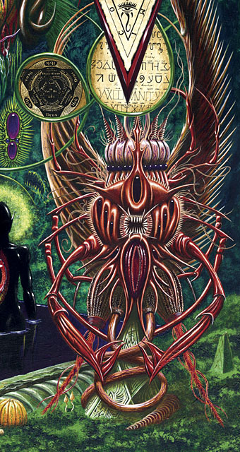
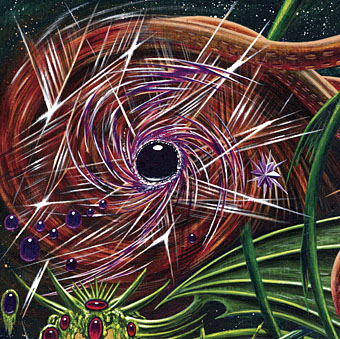
The only time I’ve attempted to depict one of the Mi-go, the aliens from The Whisperer in Darkness who are the very fungi from Yuggoth after which Lovecraft’s poem cycle is named. To the left of the creature can be seen a couple of psilocybin mushrooms. The dark figure in the pool was a reference to a similar figure in AA Attanasio’s The Star Pools, a great piece of Lovecraftian fiction that nobody ever seems interested in reprinting.
Elsewhere on { feuilleton }
• The Lovecraft archive
I could look at this piece of art for days.
The difference between the printed version on STARRY WISDOM’s 2nd edition and this is like night & days! The detail is just phenomenal. This–frankly- *historic* high watermark of Lovecraftian illustration has never really been seen until now. The lettering echoes your series of Futurist portraits (Joyce etc)–and begs the idea of doing one of HPL.
Coulthart, ye are a Wizard, a true Star.
Thanks. :) I don’t know what happened with the printing on the anthology cover but Creation’s quality control has often been haphazard.
For some time after painting this I felt the colours were overly bright but now they seem fine, especially with the psychedelic implication of all the fungi.
Forgot it on a cab. Gee!!!
Poster?
I’ve had things at CafePress for a while although they were using the old artwork. The page is here with some additional products such as a large-size poster:
http://www.cafepress.com/yuggothcult
For some reason that page is still showing the old artwork on the preview images even though I updated everything. Must be the way the previews are cached. I’ve also added a magnet to the Summerisle product list. And playing cards! Hadn’t noticed they were doing those now.
In general I’ve never been particularly fond of acrylics alone though this was always an exception. This enhanced view is off the charts though.
You must be a fast learner since this one of your earlier efforts in the medium. The version adorning Starry Wisdom was a relatively trippy affair compared to most book covers. This is vibrantly psychedelic though. Many portions, like aspects of the monolith and the lower face as well as the mandala-like figures next to the Mi-go, were not plainly apparent to me in the older resolution.
The success of something like this is as much in the drawing as in the painting—the aesthetics, shading, etc—and I’d done enough of that. I’d also done a lot of painting with either watercolours or gouache. The advantage acrylics (or oils) give you is that greater realism is possible at all levels without too much extra effort if you’re already familiar with painting in some form.