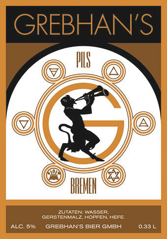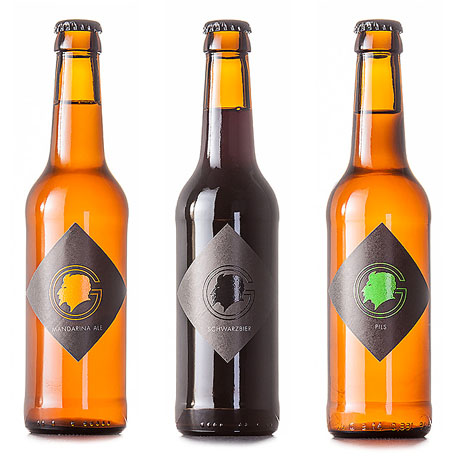
Bacchus has the wine so I suppose Pan can have the beer. Back in May the blog was stalled while I was contending with various computer problems but I did manage to do some work despite the turmoil. One job was a request from Grebhan’s, a small German brewery, who wanted help altering the design of their beer label. The results can be seen above. My contribution mostly involved making a neater arrangement of the Pan piper and symbols, and also changing the fonts. Once we had Futura selected as the main typeface I put a capital G behind the Pan figure. This was subsequently made into the minimal variant you see below, the head being the one from the Pan figure enlarged.

Earlier today Tobbi from Grebhan’s sent me a photo of the new labels. I’m very impressed with the way these have turned out, from the combination of matt and gloss to the diamond shape and the general minimal style. The black-on-black logo for the schwarzbier is a nice touch. I’m not a beer drinker (whisky, please) but if I was I’d want to try some of these.

Previously on { feuilleton }
• Green Pipes: Poems and Pictures
• The Piper at the Gates of Dawn
• The Great God Pan
• Peake’s Pan
