
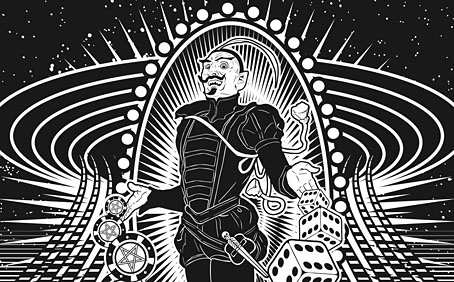
Back in February I bought a Wacom drawing tablet and said I’d show some proper results from its use later. For the past few months I’ve been working on this project using a combination of Wacom drawing and vector graphics. The initial brief from games designer James Wallis was for six Tarot-style card designs for his Alas Vegas role-playing game which has as its theme a fantasy extrapolation from Las Vegas and its gaudy mythology. The Kickstarter funding for the game turned out to be more successful than was anticipated so James asked me to expand the six cards idea into a full set of black-and-white Major Arcana designs.
This has been a fun series to work on although a number of the cards presented problems at first, the antique nature of the Tarot symbolism being a difficult thing to map across a very commercial American city. The symbolism from the Rider-Waite-Smith (RWS) deck was used as a rough guide although we deviated in a few places from the more traditional attributes. Las Vegas has changed over the years so rather than represent a single period of the city’s history there are references to different eras, from the huge casinos of today back to the buildings of the 50s and 60s with their distinctive “Googie” architecture. Notes for the cards follow below. The artwork can be seen at larger size here.
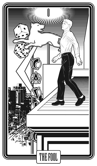
The Fool is usually a young man about to step off a cliff edge with a dog barking a warning at his heels, hence the dog on the sign.
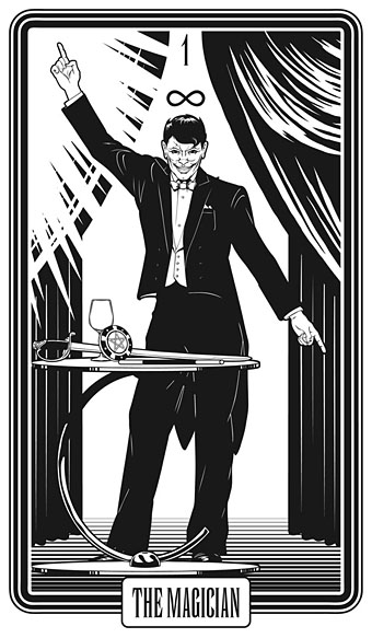
Several of the cards convert the Tarot characters into cabaret acts. This one was pretty inevitable, and I’m sure it’s not the first time a stage conjuror has appeared on this card.
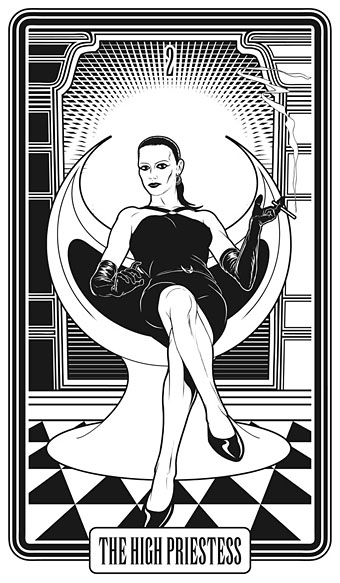
The chair is based on the 1965 “Ball Chair” design by Eero Aarnio (as seen in The Prisoner TV series), adapted here to resemble the Priestess’s crescent moon.
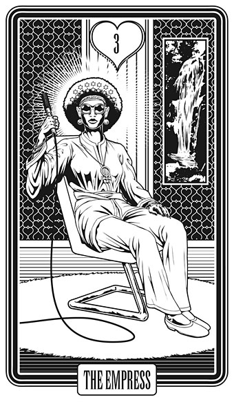
The style on this one is more 70s than 60s: patterned wallpaper (the hearts derive from the symbolism of The Empress, and from playing cards, of course), white rug, Kung Fu pyjamas.
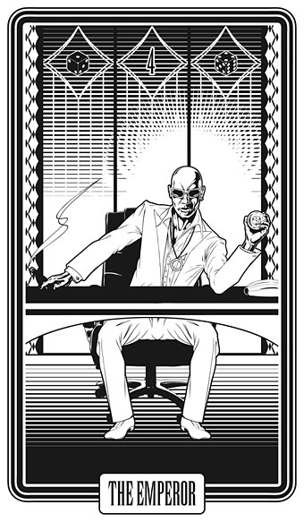
And the same with this one, the 70s-style medallions being a convenient way to incorporate the gender symbols.
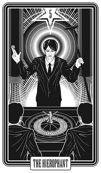
The first of the casino employees is a croupier in the guise of the Pope-like Hierophant.
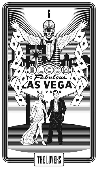
A wedding couple was an obvious choice for The Lovers. Searching for pictures of Vegas weddings it quickly became apparent that a great many married couples have their photos taken in front of the famous “Welcome to Las Vegas” sign.
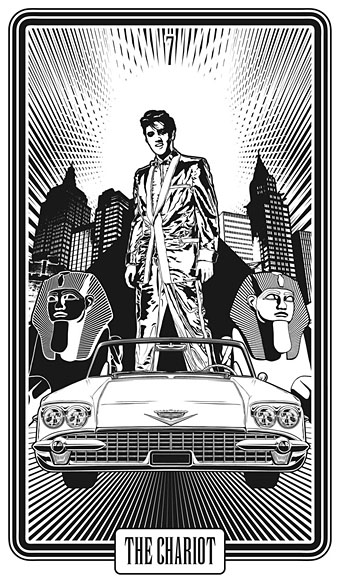
This one harks back to an old painting of mine which was would have been used on a Jeremy Reed novel about Elvis if the author (or publisher—I forget which) hadn’t abandoned the book. The background combines two hotel/casinos, the Luxor and the New York-New York.
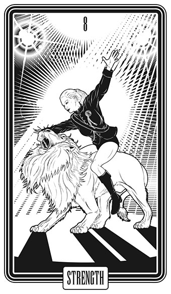
Another cabaret act although I doubt there are many performing animals left since Siegfried (or was it Roy?) got mauled.
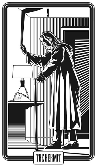
A suggestion from James, The Hermit James as a Howard Hughes-like character.
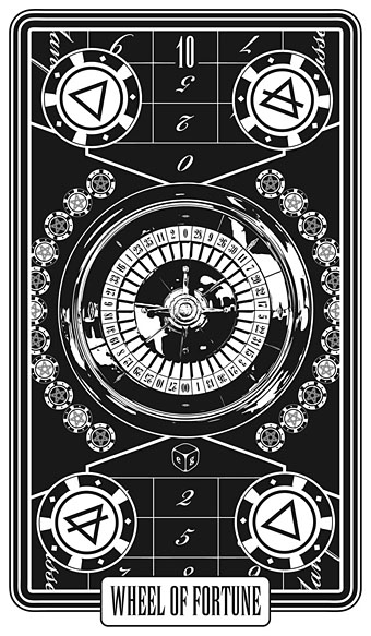
Another inevitable one given the combination of themes. The pentagram game chips appear on several of the other cards.
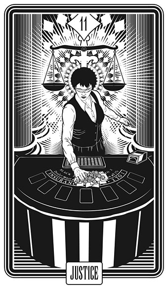
Justice in this scenario is a blind blackjack dealer who sweeps away all your winnings.
Another suggestion from James, and another cabaret act. In the Crowley/Harris Thoth Tarot deck this card represents a descent into the waters of the unconscious.
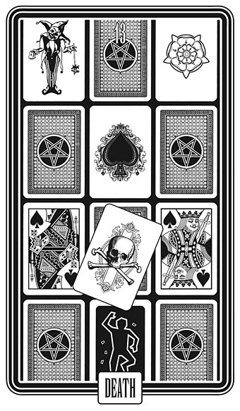
The RWS deck has an armoured skeleton on a white horse, something I felt wouldn’t work well in this context. In place of that there’s a variety of death cards, the white rose being a nod to the RWS rider’s flag, while the crime scene outline is a contemporary take on the prone corpse in that card.
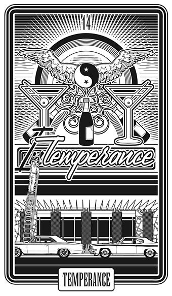
This was the most difficult one of the lot. In the Crowley/Harris deck Temperance is replaced with Art, Crowley shunning the Christian moralising. Temperance as a concept doesn’t really work in a city of excess, hence the joke with the sign. The RWS card shows a winged figure before a pool; in place of that we have a watering hole (geddit). The Yin Yang is a reference to the card’s theme of balance. The cars are late 60s/early 70s models.
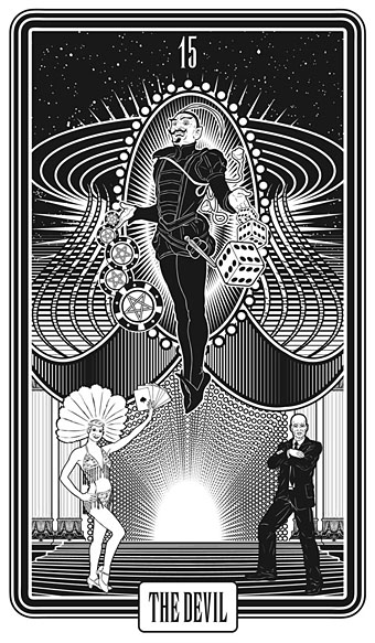
This is one of my favourites, a casino entrance with a Mephistopheles borrowed from this theatre poster. James mentioned that the composition looks vaguely phallic, something that wasn’t intentional, although with my subconscious you never can tell. It works for the card, however, as the Crowley/Harris Devil features some fairly overt phallic symbolism. The showgirl theme is continued on later cards.
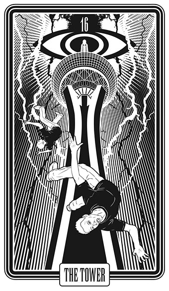
Las Vegas very conveniently has its own tower, The Stratosphere. I didn’t think we could justify having this collapsing as it usually is in card depictions but this design has everything else—lighting and falling figures—required to communicate a theme of disaster.
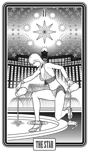
Another showgirl although she lost a headdress which was spoiling the composition. The background is the Bellagio hotel and its fountains.
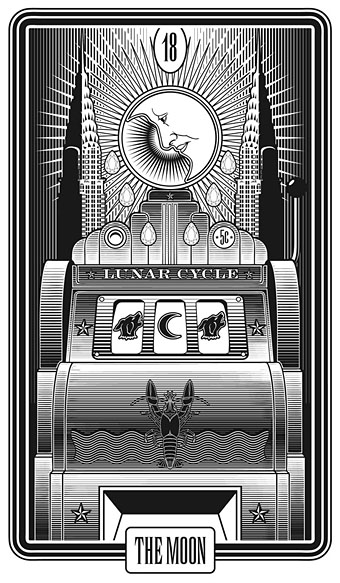
Another difficult one: how do you get the Moon, a pair of towers, two dogs/wolves and a crayfish to work with a Vegas theme? Reading a newspaper article about the current generation of slot machines led to this. Contemporary machines are all-electronic, this one is based on an antique Deco-styled model.
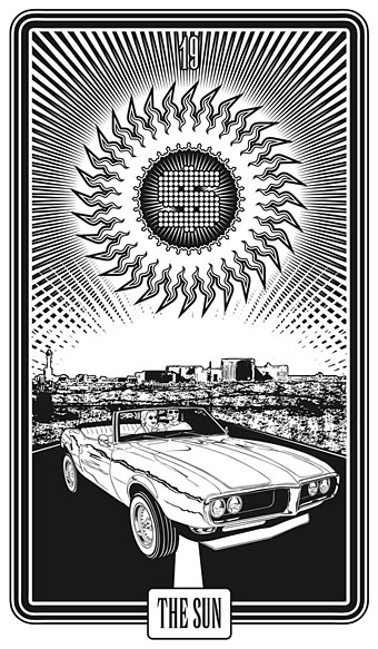
In place of the RWS children on horseback we have a couple in a Pontiac Firebird, circa 1969.
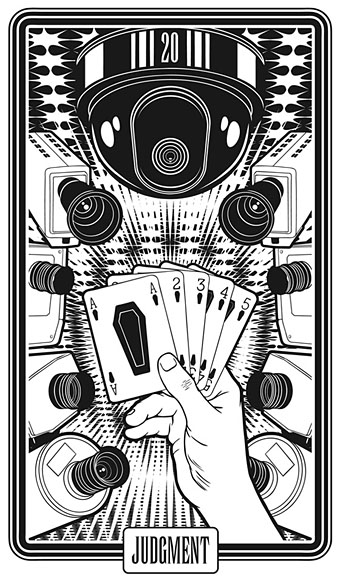
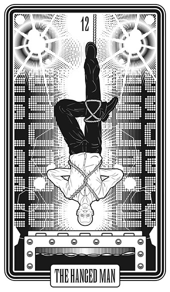
Crowley/Harris drops the RWS Last Judgement in favour of Crowley’s Aeon of Horus. Neither of these really work for this series so the judgemental angel is replaced by surveillance cameras while the cards themselves imply the resurrection theme. (The US spelling of “judgment” is used here.)
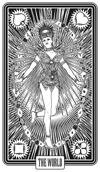
A final showgirl. The four playing card suits take the place of the figures representing the four elements.
Previously on { feuilleton }
• Palladini’s Aquarian Tarot
• Le Tarot de Philippe Lemaire
• Tarotism and Fergus Hall
• Giger’s Tarot
• The Major Arcana by Jak Flash
• The art of Pamela Colman Smith, 1878–1951
• The Major Arcana
Really clever handling of spookily ambivalent symbols! There’s something insidiously ominous in all these figures… if some day there’s a movie made using these as props, I want to watch it! XD
The black-and-white only treatment works very well too, most trumps are outstanding just as they are, however there’a a couple of them that scream for some additional color (or so it seems to me) … are you not tempted with adding a little coloring to some, just for art’s sake (or for fun’s sake)?
These are stunning.
Fabulous! Where can I get a pack?
I really loved Hughes as The Hermit, and The Moon and The Chariot were pretty brilliant as well.
I know that The Magus is represented by a cartoonish stage magician in the Trumps that Moore and Williams used in the “Metaphore” issue of Promethea.
Thanks, everyone.
Tororo: There’s been some discussion of doing coloured versions but no definite plans as yet. The Vegas theme in particular demands some colour.
Anne: They’ll only be printed as part of the game initially, and that won’t be available for a while yet.
G: I’d forgotten about that usage in Promethea. I’m sure there are more examples, there are so many Tarot designs today.
But you didn’t include Ann-Margaret anywhere.
Seriously there are great. Sorry I didn’t realize there was a KS campaign for this or I might have backed it too.
Normally I loathe modernizations of the Tarot Deck (in this if nothing else I’m a staunch traditionalist) but this set is absolutely brilliant!
Please give us the word when this pack is available for consumer gratification. I wanna!
Can I be a bore and ask what model of Wacom thingie you bought? I’m figuring I ought to get one and have no idea what to get. And how easy did you find the transition to drawing with it?
Gabe: I don’t think I’ve ever watched Viva Las Vegas although I do have the song on an Elvis compilation.
Stephen: Thanks, I’ll post news of any further developments.
B Smith: It’s an Intuos5 M. There’s a similar version with a built-in trackpad facility but I didn’t really feel I needed that.
My main concern before I bought it was with the sensitivity of the stylus as compared to pencil and pen. There’s no problems there, they really are very sensitive, with very finely-tuned touch-sensitivity.
I had some trouble at first finding the best brush selection in Photoshop since I didn’t want to have to keep switching brushes all the time. I settled on an angled brush which gives a tapered line that’s very similar to an inked brush line. If you narrow the setting of that you get something that looks exactly like a pencil line. I got used to using it very quickly, and now wish I’d bought one years ago.
What I tend to do is work roughly on a transparent layer then add more layers to firm up outlines and so on. Recent versions of Photoshop have a tablet pressure button which I keep enabled when drawing, and PS also let you use one of the tablet controls to rotate the artwork, a feature which quickly becomes essential. All the control settings on the tablet and stylus can be customised. They really are remarkable things but then Wacom makes little else, you’d expect them to be this good.
Venturing into Tim Powers territory here!
I love black and white tarot decks.
This is one of my favorites.
Probably the best personal work you’ve shown us yet. I don’t think it needs any colour. Only one or two would look better with colour but it would spoil most of the others and the line shading varies the weight of tone perfectly.
“I’d like you to check my motor. It whistles” …. http://www.youtube.com/watch?v=LtlGFKq_HVE
herr doktor bimler: That’s one I keep intending to read. I like Powers’ early books, haven’t got round to any of his more recent things.
Perfection
LOVE THESE! As you knew I would.