
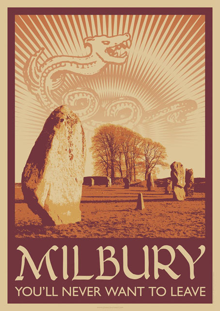
A little something I ran up this weekend inspired by a certain TV serial which has been the subject of discussion recently. This is now a new design at CafePress. The idea was to do a travel poster in the style of those produced by London Transport in the 1920s promoting their destinations outside the city. I’ve always liked the colours and bold design of those prints so this piece is based on posters by artist Noel Rooke (1881–1953).
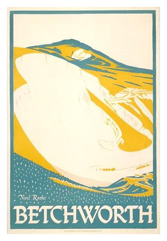
Betchworth by Noel Rooke.
The picture of the stones was adapted from a photo by Jim Champion which is made available under the Creative Commons licence. I took the liberty of enlarging the stone on the left to give it more presence. I couldn’t find a font that was a good match for Noel Rooke’s pen lettering so I scanned an alphabet from a lettering book my mother used to use when she was at art school (thanks, Mum!). The snake design is based on a postcard seen in the TV serial; nothing else looked as effective, and the combination of the snake with the slogan adds the requisite sinister touch.
Previously on { feuilleton }
• A Journey to Avebury by Derek Jarman
• Children of the Stones
• Avebury panoramas
In love with the Milbury poster! Just watched the whole series on youtube and will be getting it on DVD. So great to come across it again and finally see how it ends!
Thanks. I’ve been pondering the end of that story ever since I rewatched it. Must be the strangest ending there’s ever been to a children’s TV programme.
Incidentally, I was surprised this weekend looking up Avebury in a couple of books that all the snake symbolism is authentic. I thought they’d invented that for the series but it’s part of the history of the place, as is the story of the Barber’s Stone.
Splendid! Can’t wait to watch the series. I have a hunch that “Children of the Stones” will rest next to “Twin Peaks” on my DVD shelf.
I also was surprised to read the story of the Barber’s Stone being true. I was looking at your site earlier yesterday and clicked through a few links and found it. I admit I secretly enjoyed that someone was crushed to death while trying to destroy the stones.
Amazing! I watched CotS recently and was blown away. I like your use of colour. Keep up the great work!
I confess, I wouldn’t be able to tell if the sanserif part of the poster is Gill Sans or Johnston, but either way it adds to the authenticity.
herr doktor bimler: I did think about using Johnston but opted for Gill Sans for a more general period feel. You can usually tell them apart by minor details: Gill has a rounded apostrophe, for example, and the bar on the cap R is curved at the top where the Johnston one is straight. I went overboard on the Underground graphics a couple of years ago:
http://www.johncoulthart.com/bibliopoesy/itmw.html