
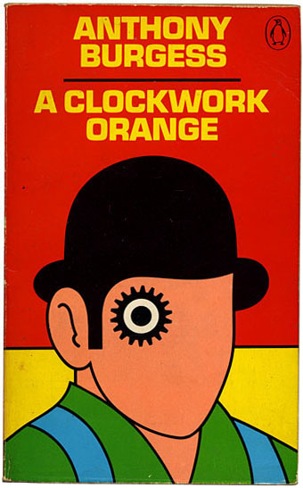
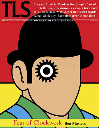
Design by David Pelham (1972).
Continuing an occasional series. Pity the poor designer who has to create a new cover for Anthony Burgess’s novel when David Pelham’s Penguin cover—created in haste forty years ago—is more visible than ever. Pelham’s design is a familiar sight on these pages but it’s also an increasingly familiar sight elsewhere, having become the primary visual signifier not only of the novel itself but also the novel’s entanglement with Stanley Kubrick’s film. Burgess came to resent the cult power of the film and the way it inflated the status of one of his early novels whilst overshadowing the rest of his work. The book still overshadows his other novels but what’s interesting now, fifty years after it was published, and forty years on from Pelham’s cover design, is seeing the novel clawing back some of the territory ceded to the film, in part because of that memorable cog-eyed face. What follows is a look at some of the subsequent reworkings of Pelham’s design.
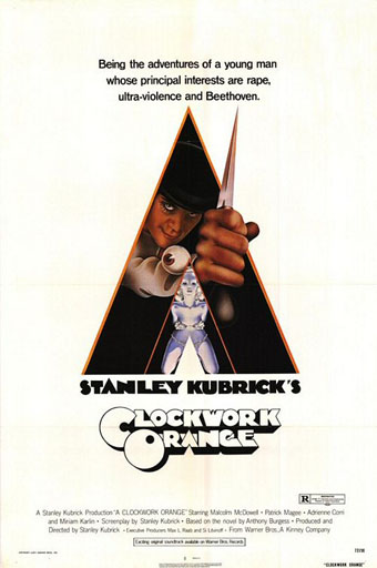
Artwork by Philip Castle, design by Bill Gold (1971).
It’s necessary to mention the original poster art first since the fat title typography gets reused more than any other part of the film’s publicity. The poster was also indirectly responsible for Pelham’s cover design when Kubrick denied Penguin any use of his promotional material:
Barry Trengove had designed a delightful cover for the Penguin edition of A Clockwork Orange and then the movie came along. While the Penguin marketing department was desperate to tie in with the film graphics, the director of the movie Stanley Kubrick wasn’t at all interested in tying in with the book. Consequently I was given the task of commissioning an illustration that gave the impression of being a movie poster. Sadly I was subsequently let down very badly by an accomplished airbrush artist and designer (whose name I will keep to myself), who kept calling for yet more time and who eventually turned in a very poor job very late. I had to reject it which was a hateful thing to have to do because we were now right out of time.
[…]
Well there I am, late in the day and having to create a cover for A Clockwork Orange under pressure. Already seriously out of time I worked up an idea on tracing paper overnight, ordering front cover repro from the typesetter around 4.00 am. I remember that my type mark-up was collected by a motorcycle messenger around about 5.00 am. Later that morning, in the office, I drew the black line work you see here on a matt plastic acetate sheet, specifying colours to the separator on an overlay while the back cover repro was being pasted up by my loyal assistants who had the scalpel skills of brain surgeons. I had wonderful assistants, absolutely wonderful.
Then more motorcycle messengers roaring around London in large crash helmets; and some days later I would see a proof. In those days, that was quick! Since those times I have often been amused to notice that my hurried nocturnal effort of so long ago appears to have achieved something of iconic status, for I’ve seen this cog-eyed image on fly-posters in Colombia, on t-shirts in Turkey, and put to a variety of uses in Canada, Los Angeles and New York. Because I did it, I spot it. Its like walking into a room where a party’s going on and, although the room is buzzing with conversation, if somebody simply mentions your name in conversation you immediately pick it up because it’s so familiar.
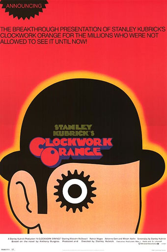
A scarce item, allegedly from 1972 (although it may be from a year later), which surprisingly uses the book design with the film poster titles. According to a film memorabilia site “This rare alternate style R-Rated poster was designed for wild posting exclusively in New York and Los Angeles”. In the US the film was given an X rating on its first release meaning that many theatres wouldn’t have shown it. Following a few edits it was reissued with an R rating. On the back of the 1972 Penguin paperback there’s notice of a copyright restriction against selling that edition in the US so Pelham’s design wouldn’t have been familiar there until much later.
Design by Town Group (1998).
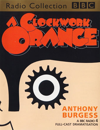
The BBC takes a similar approach for this cassette release.
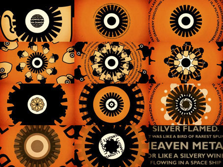
Video by Widelode (2006).
Frames from a video for an event described as “A tribute to Beethoven in music and film”. While its good to see Pelham’s design subjected to some kaleidoscopic transformation, the music seems somewhat light for the quotes spiralling around the cogs. The second movement of Beethoven’s Ninth Symphony makes a better soundtrack.
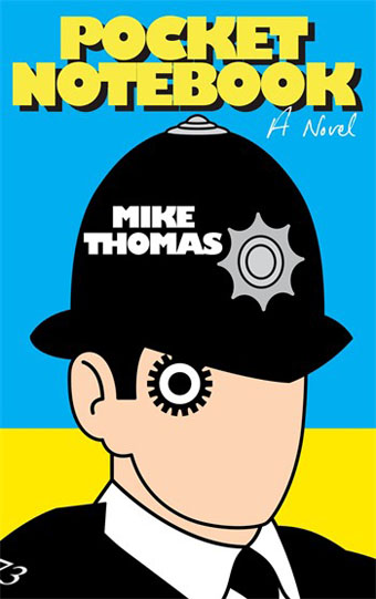
Illustration by Willie Ryan (2010).
David Owen/Ink Corporation (2010).
Here and below we can see the design slip its moorings and drift away from the book world into the Sargasso Sea of cultural mashups. Expect a lot more of this in the near future.
Headline Shirts (2011).
Ben Masters‘ appraisal of the novel on its fiftieth anniversary prompted the TLS to bring everything full circle. Despite the many cover designs Penguin have used since 1972 this is still the dominant one. Signed and numbered prints of Pelham’s design can be purchased here, together with prints of his paintings for Penguin’s Ballard editions.
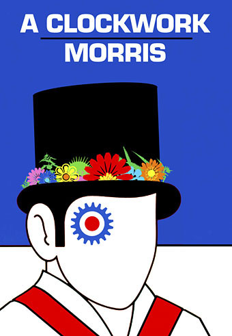
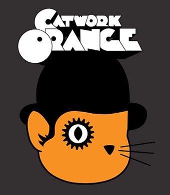
As usual if anyone’s seen other reworkings then please leave a comment. Note, however, that I’m not interested in straight reprints of the original design on T-shirts or whatever; those things are legion. It’s variations like the Clockwork Morris I’m after. (Thanks to Gabe for the Catwork tip!)
Elsewhere on { feuilleton }
• The book covers archive
Previously on { feuilleton }
• Design as virus 14: Curse of the Dead
• Design as virus 13: Tsunehisa Kimura
• Design as virus 12: Barney’s faces
• Design as virus 11: Burne Hogarth
• Design as virus 10: Victor Moscoso
• Design as virus 9: Mondrian fashions
• Design as virus 8: Keep Calm and Carry On
• Design as virus 7: eyes and triangles
• Design as virus 6: Cassandre
• Design as virus 5: Gideon Glaser
• A Clockwork Orange: The Complete Original Score
• Design as virus 4: Metamorphoses
• Design as virus 3: the sincerest form of flattery
• Design as virus 2: album covers
• Design as virus 1: Victorian borders
• Juice from A Clockwork Orange
• Alex in the Chelsea Drug Store
For some reason, that image has always reminded me of Liza Minnelli in the movie “Cabaret”. Then again, so many things do.
Great post!
I’m sure you’ve already seen this but here’s a bbc4 show broadcast last year, ‘the beauty of books’ which contains an interview with Pelham regarding ‘Clockwork Orange’…
http://vimeo.com/24117842
Thom: Odd that they both appeared in the same year. 1972 was about the last time the bowler was being worn in Britain with any kind of serious intent. After that businessmen gave them up and you’d only see them if people were referring to the Kubrick film.
Alfie: Thanks, I’d not seen that. I’ve been without a TV for almost ten years so don’t see much unless I download it or watch it online.
I can safely say you’re not missing much
You mean this isn’t serious ???
http://pinterest.com/pin/90986854942972450/
Oh wait there’s 2 pictures. Before and after
http://www.shortlist.com/entertainment/tv/noel-fielding#null
Er, yeah… Not sure what that has to do with David Pelham’s design.
Not much I was just riffing on derby hats. Think I already mentioned my favourite someone with a derby hat image to you before
http://en.wikipedia.org/wiki/File:Reed_Coney.jpg
and what did you think of
http://pinterest.com/pin/90986854942974844/
I prefer the new American edition from Norton who do an excellent range of modern classics with additional material. They’ve used the original cover design:
http://books.wwnorton.com/books/A-Clockwork-Orange/
The one you link to seems to nod a little to Pelham’s design. Also seems rather lazy: I’ve seen the cogs in the title done before and the orange in the title refers to the fruit as a symbol (“queer as a clockwork orange”) not the colour orange.
Making Beethoven into Alex is also a mistake; Burgess had a very specific point to make about how it was possible to be a murderous psychopath and still appreciate great art (see the Nazis, etc); Beethoven’s presence is incidental, and doesn’t cause Alex to behave the way he does.