
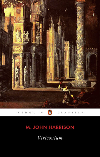
Detail from Assassination in the Night (c. 1600?) by Monsù Desiderio.
Yesterday’s post looked at some of the past cover designs for M. John Harrison’s Viriconium books. This post makes a few suggestions for how they might be presented in the future. Since these are mostly covers that I’d like to see they’re not necessarily ideal for the audience a publisher might be aiming at, cover design is usually a three-way process involving designer, author and publisher. In the end I’ve resisted the temptation to draft a range of original cover proposals—writing these posts has taken long enough—so almost everything here uses pre-existing art. If I was designing covers for all four Viriconium books, however, and the brief was to orient them towards a fantasy readership, the first thing I’d try would be a series of four imaginary Tarot designs. A peculiar pack of Tarot cards is a recurrent feature of the books so I’d create four emblematic cards that featured significant elements and characters from each. The characters wouldn’t be too well defined, they’d be stylised, maybe even silhouettes. Each card would feature a dominant presence: offhand these would be one of the geteit chemosit for The Pastel City, a locust for A Storm of Wings, the Barley Brothers for In Viriconium and a Mari Lwyd horse skull for Viriconium Nights. These presences together with the human characters would loom over a silhouette city at the foot of each card whose outlines would change appearance from book to book, evolving gradually from a fantastic outline of domes and towers to something that resembles a contemporary city. The colours and treatments would show a similar evolution from the bright and bold styles of the Pamela Colman Smith Tarot deck to something more photographic, collaged from elements closer to our world. Maybe.
That’s an idea for the four individual books. All the examples here use the convenience of the omnibus edition so a single image (or pair of images) has to somehow represent the entire series. To save time and effort I’ve taken the liberty of hijacking a couple of Penguin Books layouts. I hope Penguin doesn’t mind, and I should also apologise to Harrison’s UK publishers, Gollancz, for making one of their authors jump ship. The Viriconium omnibus is certainly good enough to be considered a modern classic. Penguin’s recent template for its Modern Classics series happens to be very easy to apply to a wide range of artwork.
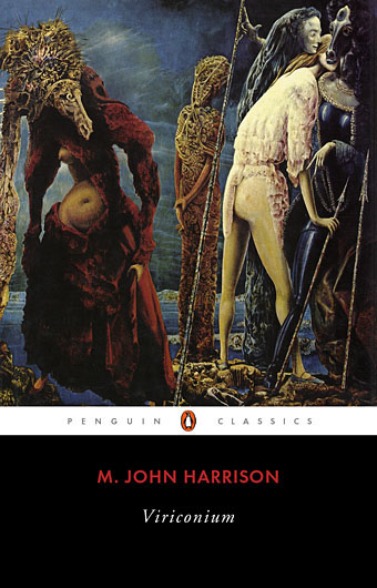
The Anti-Pope (1942) by Max Ernst.
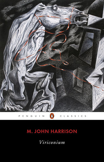
Penguin has a long tradition of using pre-existing art on its covers, especially on those in its Penguin Classics series. You can almost make this into a parlour game: match your favourite novel with the best choice of painting. The tradition was extended to its science fiction titles in the early 1960s when the art of Max Ernst was featured several times along with the work of other Surrealists. Max Ernst is a favourite artist of mine so this is one I can’t resist. Many of Ernst’s decalcomania paintings of the 1940s would suit Viriconium but The Anti-Pope with its horse heads seems especially suitable.
Also on the Penguin sf covers was a picture by the mysterious “Monsù Desiderio” one of whose works can be seen at the top of this post. Desiderio was a 17th-century painter with a vague enough presence—works have been attributed to both François de Nomé and Didier Barra—and a line in gloomy architectural fantasias to make him an ideal Viriconium artist.
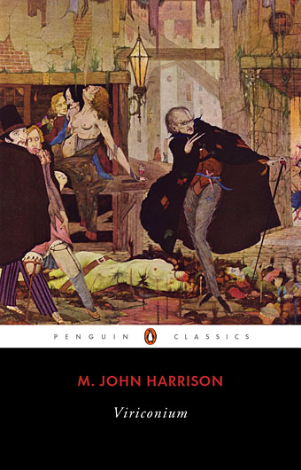
Illustration for Edgar Allan Poe’s The Man in the Crowd (1923) by Harry Clarke.
This is a cheat since it belongs with a Poe story but Harry Clarke is an artist far more suited to Viriconium than Aubrey Beardsley (see yesterday’s covers). Poe’s The Man in the Crowd concerns a pursuit through the worst areas of London, something that Clarke depicts with his customary skill.
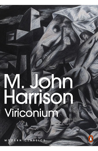
Detail from Hive Assault by Ian Miller.
For a more contemporary look there’s the estimable Ian Miller again, many of whose works would make fitting covers. This one is particularly good.
Detail from Red Flow (2002) by Clive Hicks-Jenkins.
As noted yesterday, the sheeted horse skull known in Welsh folklore as the Mari Lwyd is an increasingly sinister presence in Harrison’s later fiction so I had to try using one of Clive Hicks-Jenkins’ superb drawings from his Mari Lwyd series. As with Ian Miller, many of these drawings would work although I imagine a publisher might find them too dark and oppressive. My thanks to Clive for letting me borrow his art.
Detail from The Friends Gather (2001) by Clive Hicks-Jenkins.
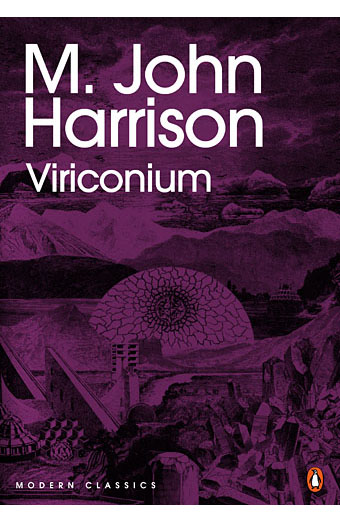
Metamorphosis (1973) by Wilfried Sätty.
Then there’s the collage approach. Viriconium is a collage city so it seems an obvious move to reflect this on the cover although to date only Ian Miller has taken the initiative with his pages for The Luck in the Head. Sätty is another personal favourite but there are plenty of other collage artists out there whose work might suit. The picture was a quick choice from the Time Zone book with a colour overlay applied. Ideally the collage would be an original piece more closely tied to the books.
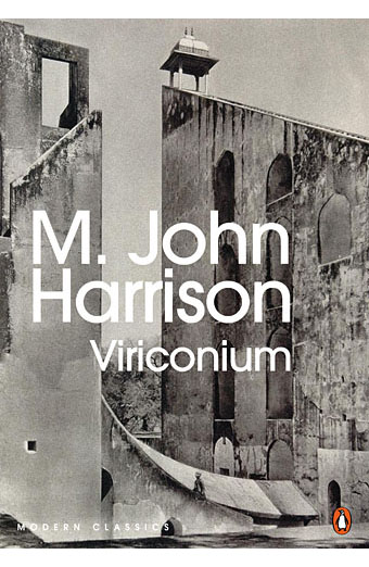
The Jantar Mantar, Jaipur (1928) photographed by Martin Hurlimann.
The architectural/photographic approach. Lots of choice here: Eugène Atget’s Paris, Karel Plicka’s Prague, Bill Brandt’s Halifax, etc. or combinations of the same either together or with others. The Jantar Mantar is an 18th-century garden of astronomical instruments in Jaipur, India. Alternatively there might be some collaged arrangement of street maps of real cities with a bold typographic treatment for the titles.
Beetle helm by Ian Miller.
With recent designs I’ve been using metallic inks more frequently (as with this CD and vinyl collection) to emphasise the tactile and material advantages that real books and CDs have over their virtual equivalents. This isn’t always an option since special inks add to the cost of production but when possible they make a significant difference. For these last two suggestions the idea would be to use metallic gold printed on black, or black ink printed on metallic gold. The background picture is another of Atget’s Paris photographs—many similar pictures might be used—with Ian Miller’s splendid beetle helm from his Green Dog Trumpet book. I like this combination of the fantastic and the prosaic. And that’s the challenge if you’re going to do something original for this single volume: how best to combine those two polarities.
This doesn’t exhaust the possibilities but I hope it shows you don’t always have to take the well-worn path. Some additional suggestions have been offered by commenters at the Ambiente Hotel. Meanwhile, there’s a new M. John Harrison novel, Empty Space, due from Gollancz next month. (Read an extract here.) I think we’re about due for a reprint of Viriconium as well. Over to you, publishers.
Update: Further discussion at the MJH blog. Fascinating seeing how people react to these suggestions.
Elsewhere on { feuilleton }
• The book covers archive
Previously on { feuilleton }
• Covering Viriconium
• The angels in their anguish
• Wilfried Sätty: Artist of the occult
• The art of Ian Miller
• Giant mantis invades Prague
• Nova Swing
Why does he use a pseudonym combining my first name with the surname of some obscure horror author when he co-writes books about cats?
http://www.randomhouse.com/features/wildroad/bio.html
I think you’d have to ask one or other of them that question.
Sorry just thought you might know.
Damn Virconium isn’t available as an iBook at least in OZ. Just Centauri Device and his new one. Will have to pay the full price for a 3Dimentsional version now. I’ve never read any of his stuff :-(
http://itunes.apple.com/au/artist/m.-john-harrison/id416532864?mt=11
Really enjoyable to do a ridealong on a designer’s thoughts. Thanks for these two posts.
I orginally read MJH in French with these covers (the ones on the left):
http://www.noosfere.com/babel/litt/oeuvre_editions.asp?numitem=3179&l=eo
http://www.noosfere.com/babel/litt/oeuvre_editions.asp?numitem=6253&l=eo
http://www.noosfere.com/babel/litt/oeuvre_editions.asp?numitem=5603&l=eo
The Red Flow (2002) by Clive Hicks-Jenkins and the other by the same artist do it for me! I also like the Anti-Pope cover, but the rest don’t do anything for me, in fact visually I find them really uninteresting.
GB Steve: Thanks for the links, interesting seeing more Continental editions. I’d seen the Gallimard ones before but not the others.
Justina: First idea was to try something by Ian Miller, second idea was to try something of Clive’s. I really like Red Flow as well, especially the way that red thread ties with the red type.
I liked the Jantar Mantar, part of its charm being that it is rather hard to work out what is happening in three-dimensional terms.
On another author, might I link to this: http://www.ballardian.com/landscapes-from-a-dream? I love Tanguy but cannot think of an image that would really suit a Viriconium book.
Hello,
As usual I am left with how thorough and informative your articles so often are. I confess I am unaware of the Harrison novels, although I do have the vague memory of seeing the 2005(?) “steampunk” cover. I wasn’t at all inspired to pick it up, if you had crafted the covers I might very well have.
The history of the cover art for this series was of great interest. As the author pointed out in his own post, the publishers did seem to go out of their way too not understand his work. All that said I did enjoy the Wendell minor cover. Kudos to you for not disparaging the artist or the work, just the mis-application, sensitivity only an artist could fully understand.
Being a great fan of Clive’s work I too will cast my lot with Red Line, though the Ernst bedazzles as Ernst always bedazzles.
Thank you for this information, enthusiasm and your industry. It is so refreshing to read articles inspired by the author’s deep love for the subject.
Take care,
Leonard
I meant to say the “assassination” cover is also quite inspired.
LG
I try to avoid criticising artists or designers (unless the work is actually bad) since I know too well the demands that can bear on the work from art directors, marketing people and the rest. When you’re doing work for hire you seldom have the final say.
philiph35: I know what you mean but I associate Tanguy far more with Ballard. Same with Dalí for that matter. As for the Jantar Mantar, there’s probably better photos to be found. It’s a fascinating place, entirely purposeful whilst (to our eyes) appearing very strange.
These are awesome. I’d much rather any of these covers than that on the current US omnibus. I recently gave away my copy of that omnibus edition, if any of these go into production in the near future …
Thanks, Nathan. I was surprised by the Bantam omnibus, the covers they did for Light and Nova Swing were very good with their complementary cats. I preferred them to the UK editions.
Would any of Caravaggio’s paintings make a suitable cover for Virconium or any other MJH books? I haven’t read any so don’t really know the contents all that well but I always think some of C’s painting would make good book covers but for which authors or books?
These have been a fascinating couple of posts, and MJH has shot up to the top of my To Read list. Surely this kind of approach to covering these books could potentially draw in a decent number of readers who are scared off by clichéd genre imagery. Red Flow gets my vote.
Gabriel: I wouldn’t have thought so although that’s one way you could extend the parlour game idea: take an unlikely painting and find a way to make it match a given text. Tarkovsky put Bruegel’s Hunters in the Snow into Solaris which isn’t a connection you’d expect.
James: I’m glad to hear these posts have stirred some interest in the books, that was part of the intention.
RE: Solaris & Brueghel
Apparently it’s got something to do with “Hari’s evolving capacity to make associations between perceptual data and mnemonic information” .
http://sanfordsanchez.blogspot.com.au/2012/01/hunters-in-snow.html
Much more detial here
http://www.ualberta.ca/~dmiall/MiallPub/Miall_Tarkovsky_Resisting.pdf
Now I’m going to have to watch the movie again.
Frustratingly, “Previously on { feuilleton }
• Giant mantis invades Prague”
is a borked link. SO I found it through the Gazoogle instead.
Escher came to mind.
The tradition was extended to its science fiction titles in the early 1960s when the art of Max Ernst was featured several times along with the work of other Surrealists.
Aldiss’ rhapsodic descriptions of those Penguin covers in “Million Year Spree” led me to a lot of artists that at the time were completely outside my ken.
Sorry about that, I’ve fixed the link, and also updated the original post since the page linked to in 2006 had vanished.
This post makes me very happy.
Hi John,
I remember buying the Church of Hawkwind album in the early ’80s and admiring the cover artwork then so it’s a great pleasure to find your journal all these years later – thanks to Clive Hicks-Jenkins for the link that brought me here.
A wonderful post about a fascinating subject. I love all the cover designs, any would make the book into a beautiful object I’d like to own which is what a cover design should do. My personal favourite is the one with the detail from Clive’s The Friends Gather followed by the gold on black beetle helm one, but all scrumptious.
Thanks, Phil, those Hawkwind albums follow me around like old ghosts. At least the ones I’m less happy with don’t seem to get reissued. Some ghosts are more welcome than others.
Monsu Desiderio is one of my favourites, I have the book “Francois de Nome e Dider Barra: L’enigma Monsu Desiderio” by Maria Rosario Nappi, 1991, it has about 350 pages nearly all with illustrations.
A couple of days ago I stumbled on an artist I had not heard of before, his work reminded me of Monsu Desiderio, Rombout Van Troyen, a lot of his pictures are of vast grottoes and caverns, with tiny figures and huge statues, I think you would like… – have you seen his work before?
I’d not thought of looking for a book of Desiderio’s work before so thanks for the tip, there’s more online than there used to be but still not enough. And thanks too for Rombout Van Troyen, I’d not come across him before. Worthy of further research, I reckon.
It has 173 colour and 143 b&w illustrations. I see that there is a copy on Abebooks for just over £70 inc pp, which is about what I paid for it some years ago. It’s good that artists can put books as tax expenses!
I’d just like to simply state that M. John Harrison is one of modern fiction’s greatest writers in any/all genres… from his compelling, mechanical quantum space opera Truck adventures through the fantastical Viriconium realms of his Pastel City stories; the incredibly detailed, raw & painstaking travels of the non-fiction “Climbers” (first novel to receive the Boardman Tasker Prize for Mountain Literature!); his Tag works of feline wonder & misadventure written as Gabriel King (co-writ w/ the great Jane Johnson): “Love the world and follow your nose”. There are Mike’s incredibly inventive & weird travel arrangement tales w/ abstraction, anarchy & architecture spelled within his myriad of wonderful short stories; those things that never happen (highly praised by the likes of China Miéville, Iain M. Banks & Richard K. Morgan)… and once again his revisit to SciFi w/ “The Kefahuchi Tract Trilogy” where he’s finally become an Arthur C. Clarke Award winner! Recognition to this great novelist far overdue. In Harrison’s worlds, his abstract & often eldritch if not just strangely natural roadways are deserted enough for everyday men to race cars down narrow alleyways or fast interstate highways from the I-90 out of a Lovecraftian Boston to the M4 in a bone-chilling London. The world of literature would be a far colder place if not for the works of M. John Harrison. He is… simply brilliant.