
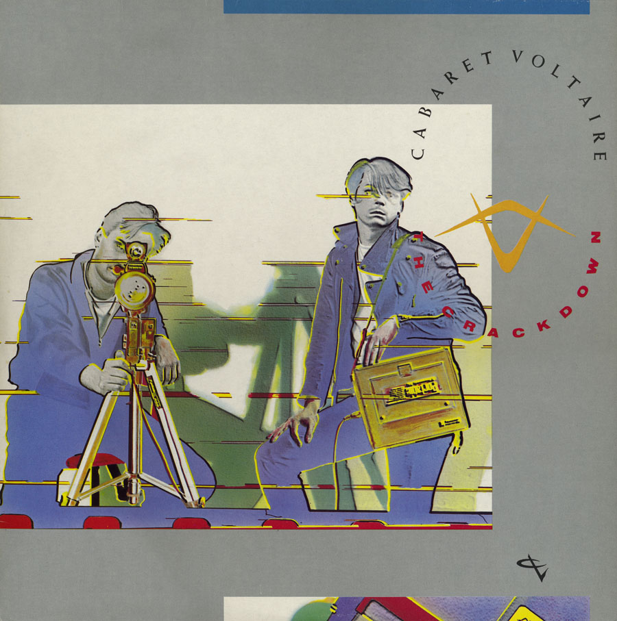
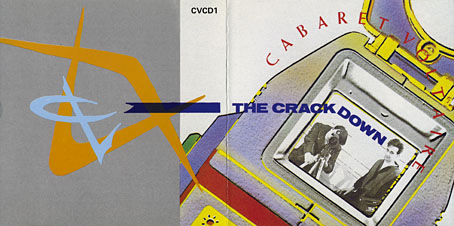
I mentioned yesterday Richard H. Kirk’s announcement that Cabaret Voltaire’s albums on the Virgin label are to be reissued next year by Mute Records. The news gives me a topical excuse to write something about the first album in that series, The Crackdown, which happens to be my favourite of all their releases. Cabaret Voltaire, like 23 Skidoo, benefited a great deal from their association with designer Neville Brody in the early 1980s, and this post mostly concerns Brody’s design for The Crackdown and its accompanying singles. The Crackdown was released in 1983 with the advance from Virgin having allowed them to buy new equipment and add a degree of polish to their recordings which earlier albums had lacked. Brody had been designing their covers for the past two years, and continued to do so for the next few releases before leaving the music business to concentrate on magazine and other design work.
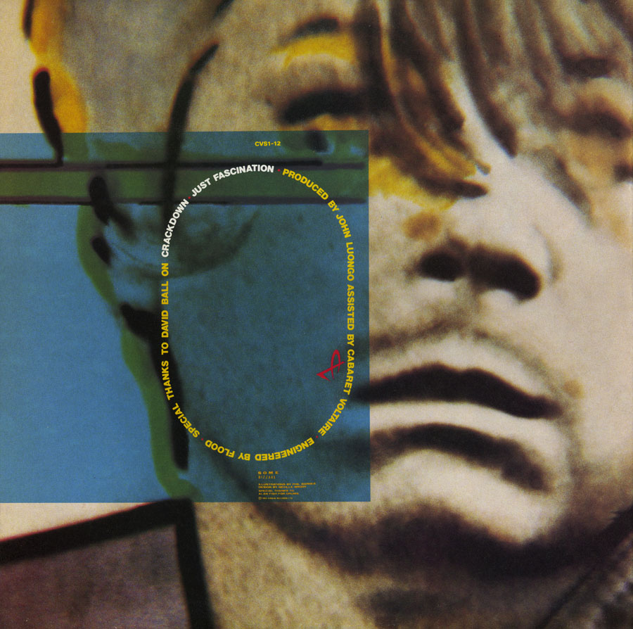
What I liked about this sleeve was the way it gets the most out of the careful arrangement of a few simple elements. The front photo showing Stephen Mallinder and Richard Kirk posing with video equipment (monitoring the viewer) is enlarged and cropped to provide backgrounds elsewhere. The sleeve photos wrap around front and back while the shape made by the titles determines the layout of track titles and credits. (The various CV graphics are credited to Phil Barnes.) The type wasn’t set digitally but was applied by hand using Letraset rub-down lettering which makes me wonder how much planning was required to get the track titles to perfectly fit their intended shape.
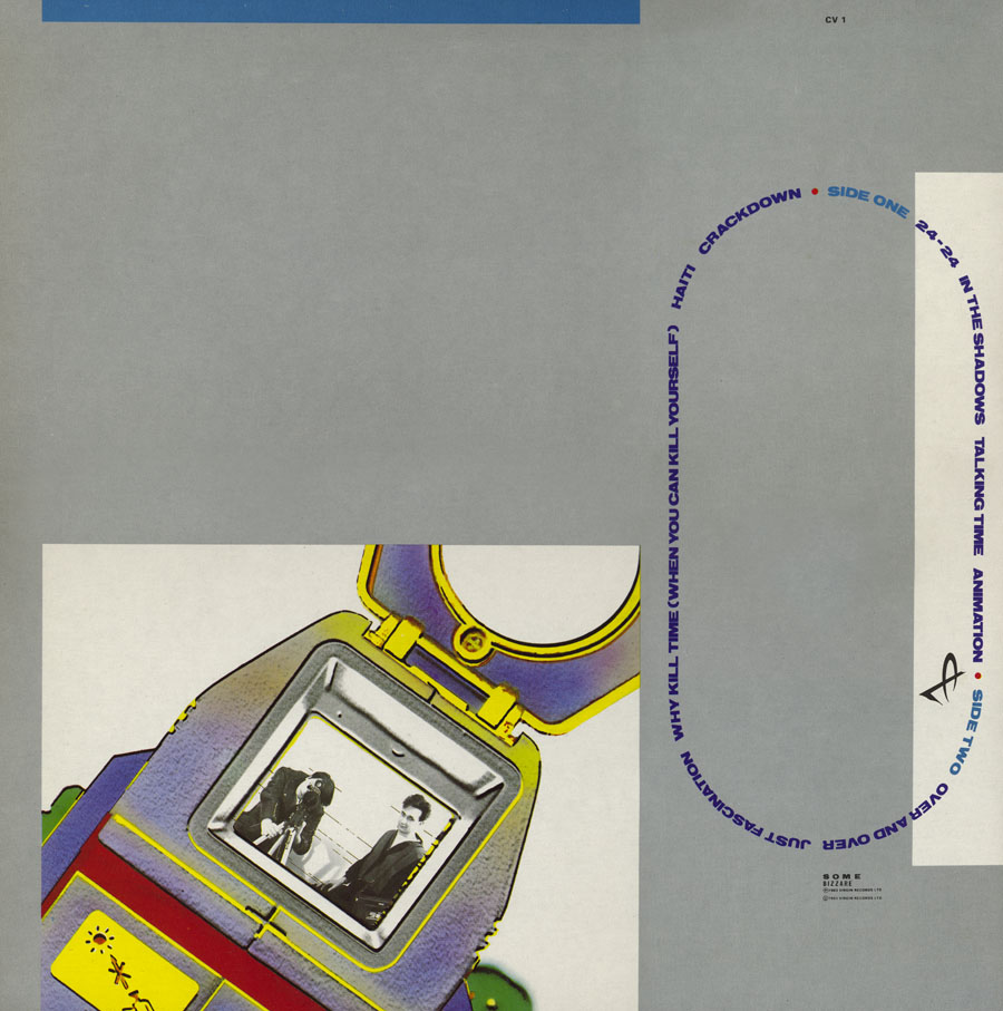
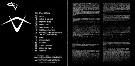
Being their first album on a label with bigger budgets, this release has an inner sleeve which can perhaps be read as a hot interior for a cool exterior. There’s more meticulous Letraset type (and saxophone mis-spelled…oops). The early numbers of this album also included a free four-track 12″ of music from the Cabs’ video label, Doublevision.
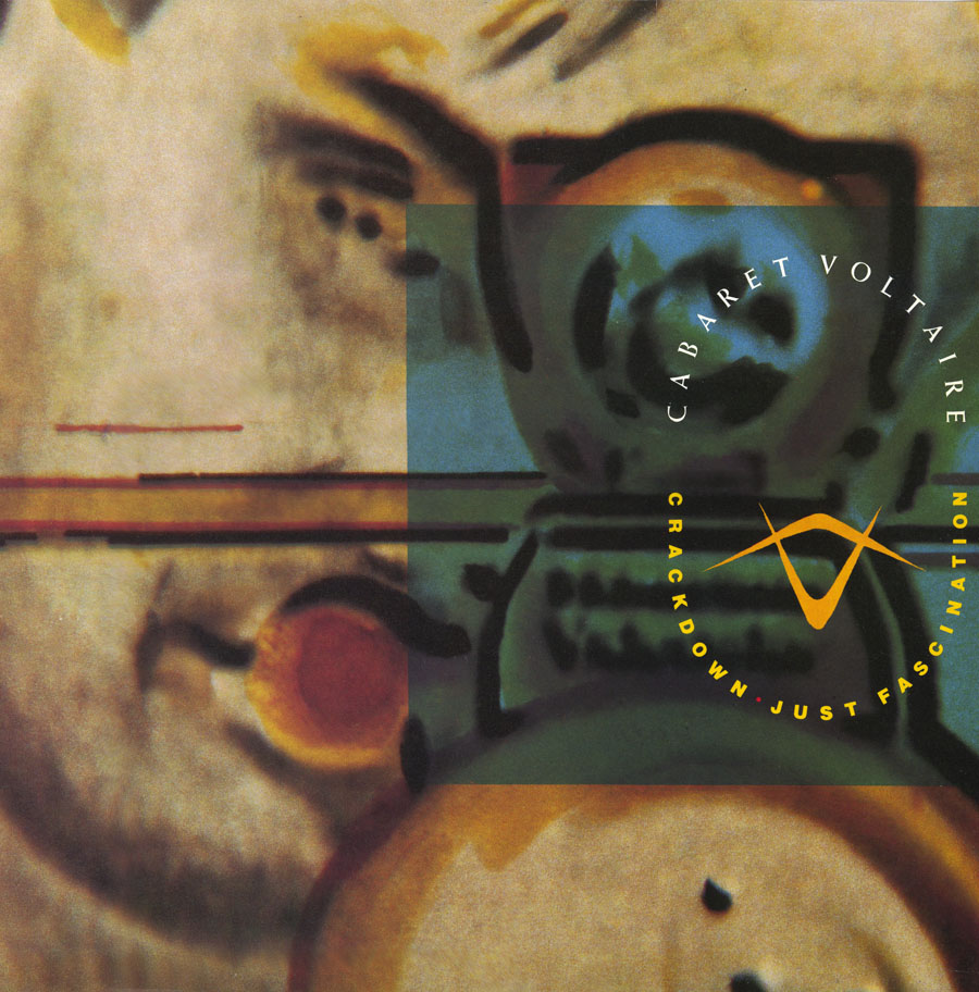
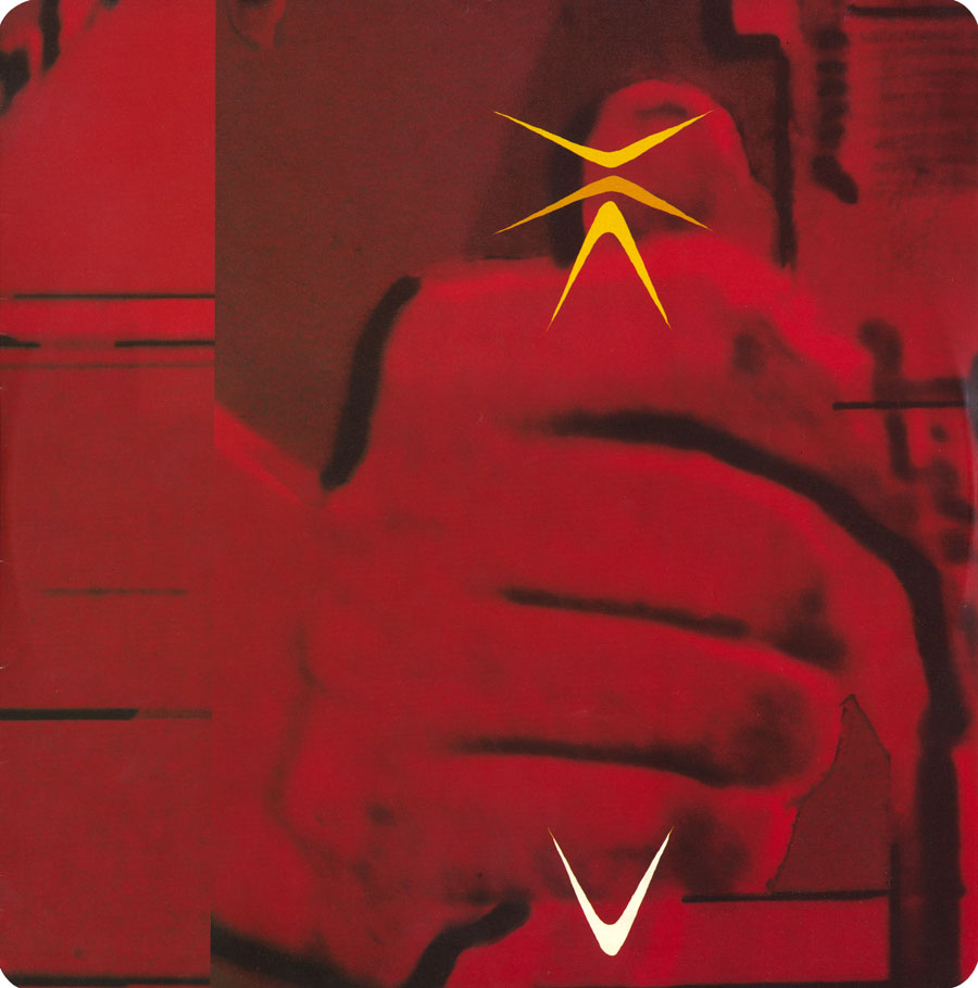
The Crackdown track was released as a 12″ single with both tracks given additional power by dance producer John Luongo. This slab of vinyl remains for me the group’s finest moment, The Crackdown in this version being a relentless monster that should always be played as loud as possible. Kirk and Mallinder’s faces are here enlarged almost to the point of abstraction, a typical Brodyism.
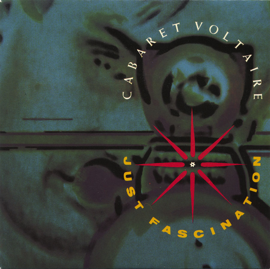
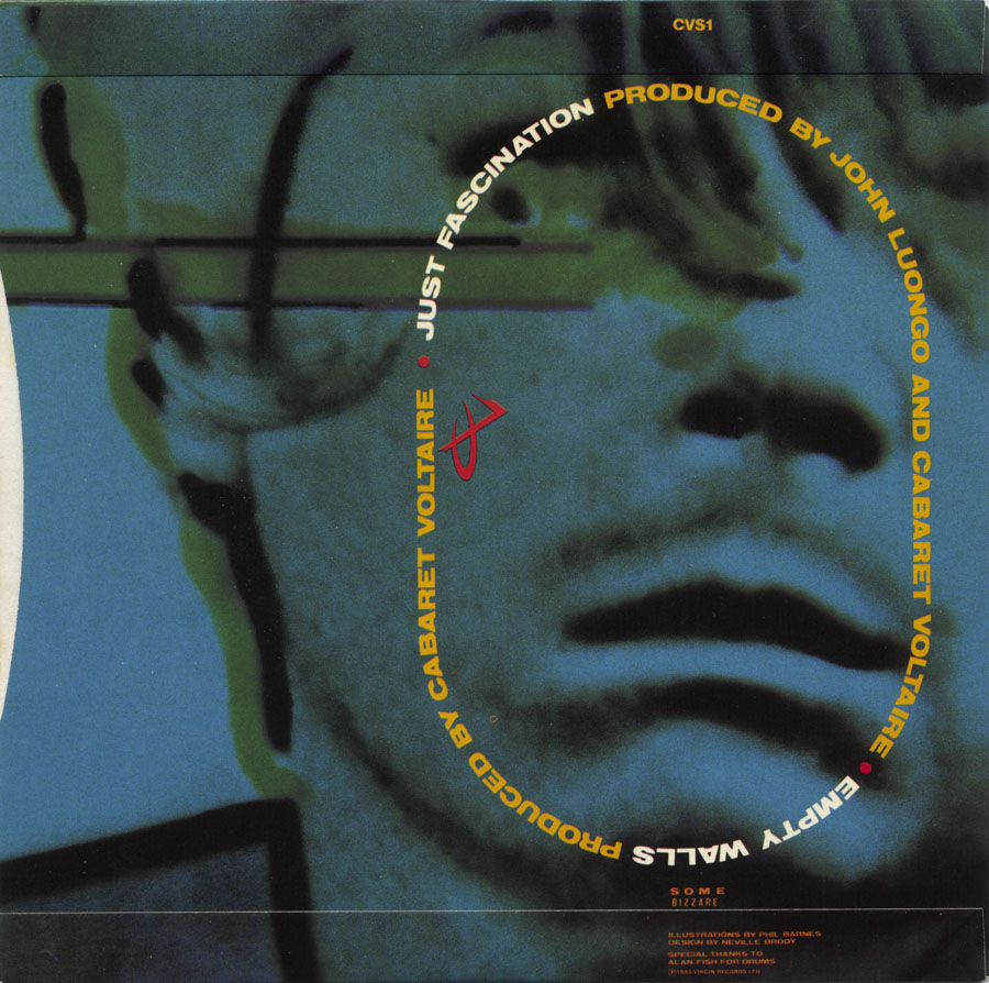
Just Fascination was selected for the 7″ release with the design almost copying the 12″ but for Phil Barnes’ graphic which I always read as representing concentrated attention or (yes) fascination. What’s less obvious is that the green square on the 12″ sleeve is exactly the same size as the single sleeve, the only example I’ve seen of two related releases being connected in this way.
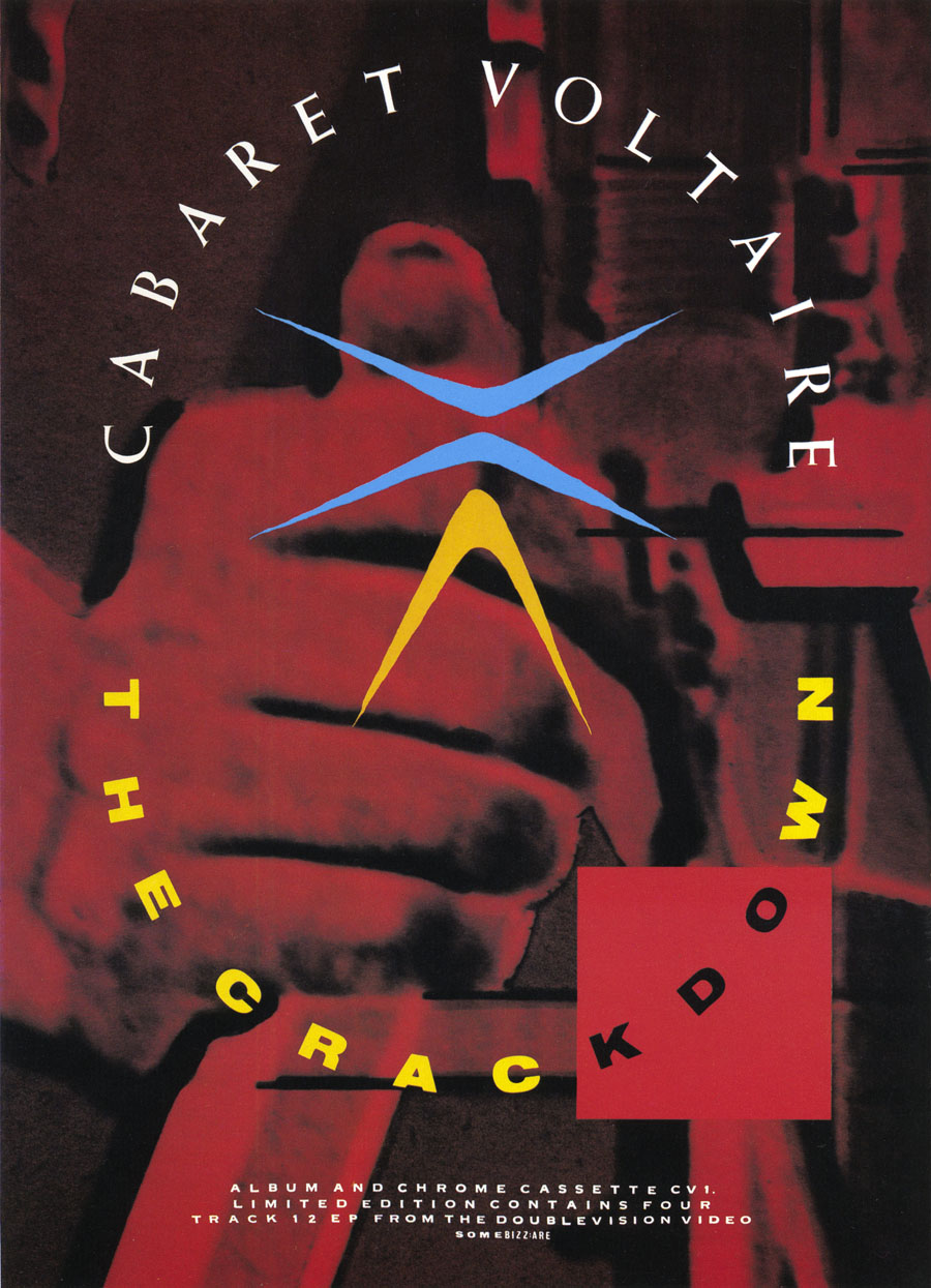
Neville Brody also designed magazine ads and posters for Cabaret Voltaire. The one for The Crackdown is below.
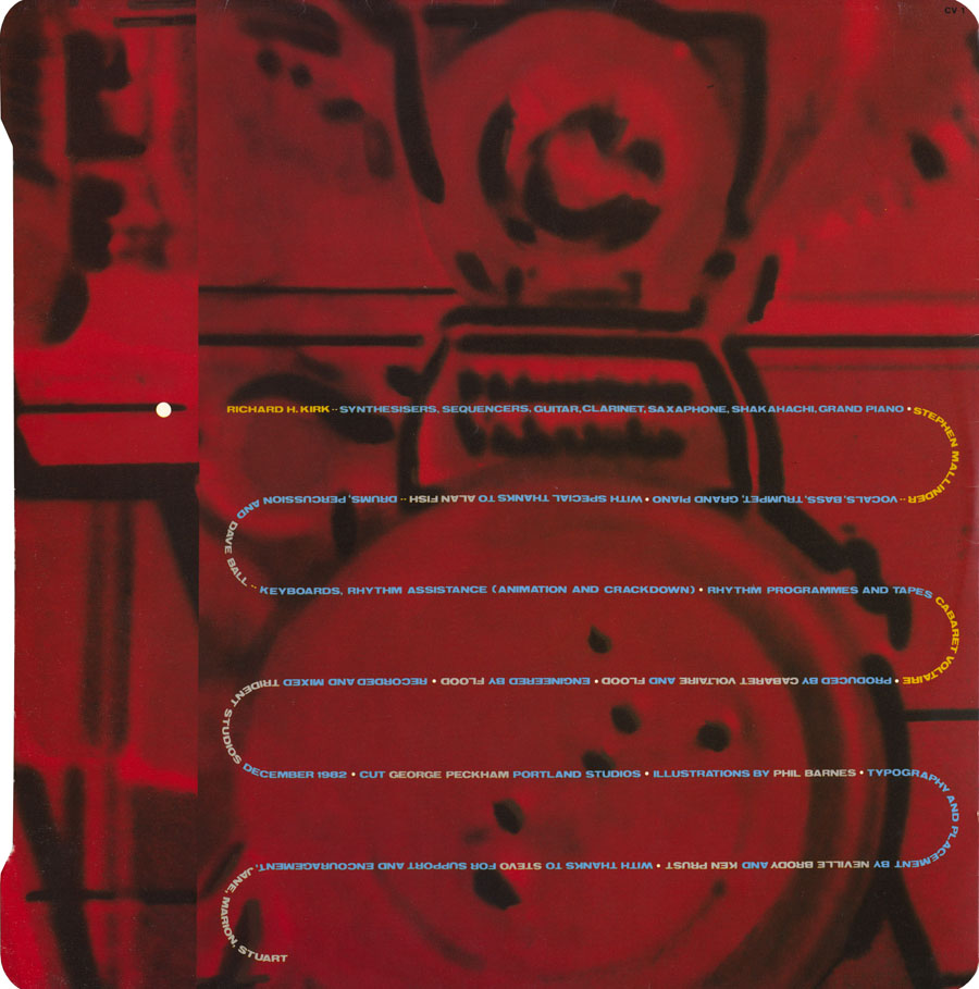
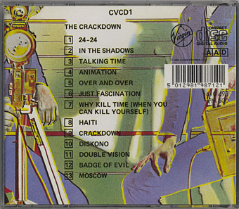
So after all of this care and attention to detail, how did Virgin repackage the album for CD in 1985? Terribly is the answer. Granted all Virgin’s first wave of CD reissues were perfunctory but this one treats Brody’s design with such a lack of respect it’s insulting. The credits are reduced to the barest minimum with no mention of the other musicians (including Dave Ball from Soft Cell) who appeared on the album. But they do manage to waste an entire page of the insert with some pointless boilerplate about “The Compact Disc Digital Audio System”. The only positive point is that the extra tracks from the Doublevision single were included as a bonus.
This, then, is why I’m looking forward to Mute reissuing these albums, whatever they do it will be better than this. The 12″ versions of The Crackdown and Just Fascination (and Empty Walls from the 7″ single) appeared on compilations in 2001 but they could easily be tacked onto the end of the reissue. There might even be room for The Dream Ticket 12″. How about it, Mute?
• See also: Micro-Phonies at Hard Format
Elsewhere on { feuilleton }
• The album covers archive
Previously on { feuilleton }
• Graphic design in Heat
Thanks for another fascinating post. I’ve just been going through a Cabs period myself, but my focus has been on their late work, particularly The Conversation, International Language and Plasticity. There’s something about the long-form House paranoia that continues to fascinate. Design-wise, I love the dark abstraction of The Designers Republic’s treatments for The Conversation and Kirk’s Virtual State (my desert island pick of his work). I must confess I struggle with the outer sleeve of The Crackdown, it seems too skeletal and lacks the impact of the inner sleeve or the single designs to these eyes. Hence my preference for Micro-Phonies and Covenant, The Sword I guess.
Hi Colin. I liked the way everything was off-centre on these designs. Being such an obsessive for symmetry I would have found that a challenge. Brody says in his first book that the red square on the poster was intended to disrupt the symmetrical layout. And the type layout on the album was like nothing else anyone was doing at the time.
I agree that The Designers Republic were the perfect match for the later releases. The Phil Barnes association continued as well with Barnes providing artwork for Kirk’s solo releases (there’s a nice skeletal bird on the first Sandoz album). I was less keen on the sound of the later albums which didn’t deviate very much from Kirk solo. That’s not bad in itself but I felt that Mallinder’s influence was lacking. But at least they finished well. The Groovy, Laidback and Nasty period seemed like a big mistake to me; judging by the amount of times I saw that album secondhand other people must have felt the same.
You know I love it, too, and was very happy to see this post!
Reissues of CV? Wonderful new, I’m seeking some albuns of the 760’s and early 80’s. I have ‘The Crackdown’, but I am lacking some of the most importantt CDs by this group, truly one of my favourites. Good to know they’re coming back.
I’ve always loved these covers, but ignorantly I always assumed they were by Steven R Gilmore. Thanks for putting me straight. Fascinating post.
Excellent post, I’m glad I stumbled upon it. The Crackdown remains the definitive C/V album to me, one of my favorites – it’s probably a tie with The Conversation.
I haven’t seen this cover art in years since I last owned the vinyl some 20+ years ago. Great to see again.
I don’t believe ‘Empty Walls’ has ever been reissued on anything. If it’s added as a bonus I’ll finally be able to toss my worn out 7″ single.
Hi Greg. You’re right, I was thinking that Empty Walls was on the Conform To Deform compilation but it’s not. If it doesn’t turn up on the Mute reissues there’s a decent vinyl rip here.
My absolute favourite album cover of all time would have to be the Cab’s Red Mecca cover. There’s nothing quite like that extremely distorted, abstract image; it matches the swirling minimalism of that album so perfectly and manages to stand alone as a work of art.
Hi Ethan. I like that cover too, in fact I usually like the cover better than the music which I never thought was as good as on their albums before and after. Red Mecca was another Neville Brody design with the cover photos supplied by the group.