Weekend links 77

farmer.jpg

Art by Tessa Farmer.

• An exhibition of Tessa Farmer’s art is running at Viktor Wynd Fine Art, London, until October 30th. On Saturday, October 1st, Strange Attractor hosts Good Neighbours: Faeries, Folklore and the Art of Tessa Farmer also at Viktor Wynd.

Unearthing The Psychedelic Harp: “David Moats talks to harpist and songwriter Serafina Steer about her work with John Foxx and Patrick Wolf, being classically trained, the difficulties of doing live soundtracks and psychedelia.”

• And speaking of psychedelia, Arkhonia is still blogging up a storm here, here and here about the lost Beach Boys album, Smile, the farthest Brian and co. ventured into the tripped-out weirdness of 1967. The complete original recordings will finally be released in November.

• “‘We’ve arrived at a level of commodification that may have negated the concept of counterculture,’ Gibson says in the Paris Review.” William Gibson profiled by Thomas Jones.

One of the qualities I always stress when talking about this design work influenced by Surrealism is its enormous boldness and creative freedom, which is something of a paradox in many cases, since the Czech and Polish designs were created under communist regimes. So, while Uncanny documents a significant current in the history of 20th-century visual culture, the show also has a polemical intention aimed, quite deliberately, at our circumstances now. Students who encounter these images in lectures sometimes feel constrained by their conception of what they — or their teachers — regard as acceptable in today’s marketplace. At times, this has struck me as being a form of insidious self-censorship. (more)

Rick Poynor: Jan Svankmajer and the Graphic Uncanny.

• The exhibition curated by Mr Poynor last year, Uncanny: Surrealism and Graphic Design, is now showing at the Kunsthal in Rotterdam until early December. Related: MizEnScen’s somber, surrealist collages.

Howard Pyle’s Book of Pirates (1921) at Golden Age Comic Book Stories, the Urtext of buccaneer imagery.

bonnat.jpg

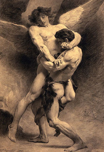
Another of those homoerotic religious pictures: Jacob Wrestling with the Angel (1876) by Léon Bonnat. Via Babylon Baroque.

• Celebrating the 250th anniversary of Laurence Sterne’s marbled page: Emblem of My Work.

John Martin’s Pompeii painting finally restored after 1928 Tate flood damage.

The Spectral Dimension: “where the paranormal and popular culture collide”.

The Writing of Stones (1970) by Roger Caillois at 50 Watts.

Mercury Arc Rectifiers.

• When silliness was an avant garde strategy: video from 1974 of Brian Eno performing China My China and (in better quality) The Seven Deadly Finns. (Go here for lyrics of the latter.)

Soft machines

smseven.jpg

Seven (1973) by Soft Machine. Design by Roslav Szaybo.

You’re the great, grey man whose daughter licks policemen’s buttons clean,
You’re the man who squats behind the man who works the soft machine.

Mick Jagger, Memo From Turner (1968)

By coincidence this month I’d been re-reading some William Burroughs when I picked up a nice box set of five Soft Machine albums, part of a series of reissues that Sony have been doing recently. They’re very cheap and sound excellent, and also have the additional benefit of being a card slipcase holding the discs in card sleeves so there’s no nasty plastic packaging. The set comprises the Third (1970), Fourth (1971), Fifth (1972), Six (1973), and Seven (1973) albums. I have the band’s first two studio albums already so this has been an opportunity to get fully acquainted with the rest of their output up to the point where the machine started to run out of steam.

smone.jpg

The Soft Machine (1968) with die-cut sleeve. Design by Byron Goto, Eli Allman, Henry Epstein.

Third and Fourth are freaked-out jazz fusion recorded when Robert Wyatt was still on drums; Fifth, which I had for years on vinyl, is post-Wyatt fusion of a more polite variety, great compositions but it sounds lightweight compared to Miles Davis’s On The Corner which was released the same year. Six, which I’d hardly heard at all, is a set of live recordings and four superb studio tracks. Seven is the weakest of the lot but it prompts this post on account of the cover which I always liked the look of when flicking past it in record shops. Seen today it still looks surprisingly advanced for 1973, and the intention behind the design is still mysterious. I used to regard it as vaguely “futuristic” despite knowing that the music was nothing of the sort. The accumulation of abstract symbols contained by a human head implies either a score for some aleatory composition (which again is belied by the short jazzy pieces within), or can perhaps be read as a “soft machine”, especially if one considers that the popular idea of electronics at this time involved patch-boards and banks of flashing lights. Ten years later with synthesizers in common use this kind of semi-cybernetic imagery was a lot more topical.

smtwo.jpg

The Soft Machine Volume Two (1969). Design by Byron Goto, Henry Epstein.

The first two Soft Machine albums both showed literal renderings of Burroughs’ “soft machine” idea albeit couched in the naked-woman-as-decoration style of the late 60s. Six has a horrible cover with an airbrushed attempt at a soft machine, one of those pictures common to the 1970s that you’re amazed was approved by band and record company.

v2.jpg

V2 by The Vibrators (1978). Design by Roslav Szaybo.

The design for Seven is credited to Roslav Szaybo, an in-house designer at CBS. Looking through Mr Szaybo’s other credits there’s little that resembles his Soft Machine cover until you arrive at the sleeve for V2, the second album by British punk band The Vibrators. This was another cover I always liked for similar graphical reasons to the Soft Machine sleeve; they also share a similar stencil typeface. Musically they’re worlds apart, of course, although William Burroughs’ influence on music carried on into the punk era (another Brit punk band named themselves Dead Fingers Talk) and beyond. It’s an influence reaching from the mid-60s with Soft Machine and his appearance on the cover of Sgt Pepper, into the 1990s with the many recordings he collaborated on or inspired from Bill Laswell, Hal Willner and others. His influence generally may have fallen off since his death in 1997 but it’s still a remarkable achievement for someone who never seemed to care much for music beyond the popular tunes he heard as a boy.

Elsewhere on { feuilleton }
The album covers archive
The William Burroughs archive

Labyrinths

labyrinth.jpg

The Breamore Miz-Maze, Hampshire. Photo by Jim Champion.

As part of the work-related research this week I was looking for designs of old turf labyrinths. It turns out I have two pages of the things in a book I’d earlier considered dropping into Oxfam so that particular volume may have gained a reprieve. Before I went to the bookshelves I’d been browsing the rather wonderful Labyrinthos site which is just the kind of detailed resource you hope to find in these circumstances. There we find an explanation for the difference between a maze and a labyrinth (the general rule being that a maze has more than one choice of route), and a wealth of examples from ancient history to the present day. I’ve long been fascinated by the labyrinths found in churches and cathedrals, of which the most famous example is the one in Chartres Cathedral. They’re a rare incidence of a symbolic device in Christian architecture which is near-universal, and which has clear antecedents in the labyrinths and mazes found in ancient temples. Labyrinthos has a guide to some of the surviving examples to be found in England. As to England’s turf labyrinths, there’s a page devoted to those here with a number of photos.

Previously on { feuilleton }
Jeppe Hein’s mirror labyrinth

Maxfield Parrish’s Arabian Nights

parrish01.jpg

Despite spending years tracking down the work of various illustrators I’ve never been as familiar with the major works of Maxfield Parrish as I might. I’ve seen a couple of the plates from this 1909 edition before but the majority are new discoveries. They’re as lucious as you’d expect from Parrish, and for once the paper and inks haven’t been spoiled by age. See all the pages or download the entire book here.

parrish02.jpg

parrish03.jpg

Continue reading “Maxfield Parrish’s Arabian Nights”

Index, fist or manicule?

index5.jpg

Third revised specimen book and price list of printing material (1887), Palmer & Rey, San Francisco.

Browsing through old type foundry catalogues recently reminded me of a question posed by Callum James a few years ago over at Front Free Endpaper, namely: what is the official description of those pointing hands favoured by pre-20th century typesetters? Writer Mark Valentine in a follow-up post mentions a term invented by William H Sherman—”manicules”—since Sherman also believed that the pointing hands were nameless. That’s not quite the case, however, as these pages show, with two descriptors being used: “indexes” and “fists”. Just to confuse matters both terms are used on different pages of the same catalogue which implies that the names may have been a convenience term to avoid having to repeatedly discuss “those pointing hand things” with customers. “Manicule” seems a better choice since “index” already has a standard meaning in printing, while “fist” doesn’t suit at all.

These catalogues contain many pages of similar type decorations and embellishments. All can be downloaded at the Internet Archive, just follow the links.

index2.jpg

Third revised specimen book and price list of printing material (1887), Palmer & Rey, San Francisco.

index4.jpg

Catalogue and book of specimens of type faces and printing material and machinery (1895), Cleveland Type Foundry.

index1.jpg

Copper alloy type book (1901), Pettingill & Co., Boston.

index3.jpg

Copper alloy type book (1901), Pettingill & Co., Boston.

Update: Thanks to Alan in the comments for pointing the way (so to speak) to William Sherman’s Toward a History of the Manicule.

Update 2: See this manicule Flickr group for many contemporary examples.

Previously on { feuilleton }
Victorian typography