Equus and the Executionist

equus.jpg

I wrote about Peter Shaffer’s fascinating play, Equus, in September last year, and in passing touched on the horse and Mari Lwyd-inspired paintings of Clive Hicks-Jenkins which seemed to complement the play’s themes of sexuality and passionate obsession. Callum James had been having similar thoughts about Clive’s art and urged his friends at The Old Stile Press to bring play and artist together. Clive was in touch last week to let me know that his illustrated edition of the play is now in print. The Old Stile Press produce limited collectors’ editions of books to the highest standard. Consequently these are expensive works but then they’re as much art pieces as books, as you can see from the care which has been lavished on this particular volume. Nice to see one of my favourite typefaces, Bodoni, used for the text.

scott.jpg

Also in touch last week was photographer Gray Scott with news of this striking picture entitled Executionist which also happens to be a limited edition print. This is another expensive piece—as limited prints tend to be—but there’s no law that says the best things have to be cheap, is there?

Elsewhere on { feuilleton }
The illustrators archive

Previously on { feuilleton }
Dark horses
Gray Scott

The Dark Monarch: Magic and Modernity in British Art

ayrton.jpg

Skull Vision by Michael Ayrton (1943).

The Dark Monarch: Magic and Modernity in British Art: great title for an exhibition, a shame that it’s all the way down in Cornwall at Tate St Ives.

This group exhibition takes its title from the infamous 1962 book by St Ives artist Sven Berlin. It will explore the influence of folklore, mysticism, mythology and the occult on the development of art in Britain. Focusing on works from the beginning of the twentieth century to the present day it will consider, in particular, the relationship they have to the landscape and legends of the British Isles. (More.)

Artists featured include Graham Sutherland, Paul Nash, Barbara Hepworth, Henry Moore, Ithell Colquhoun, Cecil Collins, John Piper, Leslie Hurry and John Craxton. Among the contemporary artists there are Cerith Wyn Evans, Mark Titchner, Eva Rothschild, Simon Periton, Clare Woods, Steven Claydon, John Stezeker and Derek Jarman. Austin Osman Spare is notable by his absence but then that’s no surprise, the major occult artist of the 20th century never rates more that a passing mention from the art establishment. One nice surprise is seeing Ithell Colquhoun (1906–1988) featured in her second major British exhibition this year. (Her work is also present in the Angels of Anarchy exhibition running at the Manchester Art Gallery.) Colquhoun was a contemporary of Spare’s whose work turns up in occult encyclopaedias or overviews of the minor current of British Surrealism but she’s still largely unheard of outside those circles.

The Tate exhibition may be awkward to visit but there’s an illustrated catalogue available featuring contributions from quality writers including Brian Dillon, Philip Hoare, Jon Savage, Jennifer Higgie, Marina Warner, Michael Bracewell, Alun Rowlands and Martin Clark. Michael Bracewell has a piece about the exhibition at Tate Etc while Brian Dillon has an excellent essay in the Guardian connecting John Dee’s mysterious obsidian scrying mirror with some of the works on display.

noonan.jpg

Untitled by David Noonan (2009).

Artist of the week: David Noonan
Ithell Colquhoun at A Journey Round My Skull

Previously on { feuilleton }
Angels of Anarchy: Women Artists and Surrealism
A=P=P=A=R=I=T=I=O=N
In the Shadow of the Sun by Derek Jarman

Through the Wonderwall

wonderwall1.jpg

It’s taken me years but the recent obsession with UK psychedelia led me to finally watch Joe Massot’s piece of cinematic fluff from 1968, Wonderwall, a film distinguished primarily for its score by George Harrison (with Ringo Starr and Eric Clapton playing pseudonymously), and its title which was swiped years later by a bunch of Rutles-imitators from Manchester. The story is so slight it would have barely sustained an hour-long TV film: absent-minded scientist (Jack MacGowran) becomes intrigued by his glamorous neighbour (Jane Birkin playing “Penny Lane”; yeah, right…) and knocks holes in the walls of his flat in order to scrutinise her modelling, partying and frequent undressing. Unlike Blow Up (1966, and also featuring Jane Birkin) and the later Performance (1970), both of which attempted to accurately pin down some of the modish aspects of the period, this is a very kitsch piece. That wouldn’t be so bad if it was entertaining kitsch like, say, Smashing Time (1967), but Massott has to resort to scenes of limp comedy and some rather dull dream sequences in order to pad the thing out. Between the handful of actual dialogue scenes there’s a lot of gloating over Ms Birkin’s flesh which no doubt satisfied one half of the audience but by today’s standards is hardly thrilling. Iain Quarrier plays Penny’s duplicitous boyfriend (with a fake Liverpool accent) in his last screen role before he quit acting. Quarrier and MacGowran had appeared together in two of Roman Polanski’s British films, Cul-de-sac (1966) and Dance of the Vampires (1967). In the latter, MacGowran again plays an absent-minded scientist while Quarrier is cinema’s first (?) gay vampire.

wonderwall2.jpg

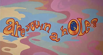
An interjection from The Fool.

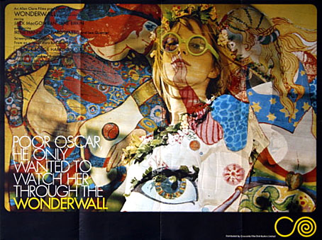
Of chief interest for me in Wonderwall was the decor and title card decorations by Dutch psychedelic collective, The Fool (who also appear in the party scene), famous for their earlier Beatles associations including the inner sleeve for Sgt Pepper and designs for the short-lived Apple Boutique in London’s Baker Street. I was also curious about the distinctive decor of MacGowran’s flat which contrasts with the psychedelia next door, all dark green walls embellished with Victorian murals and a Tennyson poem—very fittingly a piece called The Daydream—which circles the room.

wonderwall4.jpg

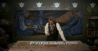
The professor prepares to attack the wall.

This was particularly interesting in that it made another connection between the psychedelic era and Victorian arts movements, especially from the Aesthetic/Arts & Crafts end of things, but it wasn’t at all obvious whether the connection was an intentional part of the film’s production design or an accident of location and budgetary convenience. Aside from the old-fashioned appearance of MacGowran’s rooms there seemed no reason why his otherwise cultureless character would have any interest in decorating his living space in this way.

wonderwall3.jpg

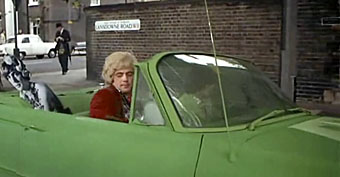
The street corner then…
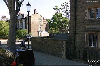
google1.jpg

…and now.

google2.jpg

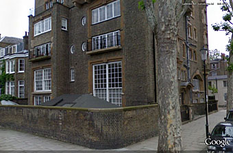
The building itself is equally distinctive and an exterior shot conveniently shows a street sign placing the location in Lansdowne House, a Victorian apartment block on the corner of Lansdowne Road and Ladbroke Road in the Notting Hill/Holland Park area of London.

google3.jpg

Lansdowne House.

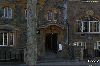
What did the building look like today, I wondered? Google Earth proves indispensable at times like this and it was easy to find, in a street which looks more cramped than it does in the film. The presence of a blue plaque on the wall proved intriguing, a sign that the place once had famous residents. Googling for that revealed this photo which was a real surprise: Lansdowne House at one time contained studios for artists who included Charles Ricketts and Charles Shannon, a gay couple and leading lights of London’s fin de siècle art scene (also friends of Oscar Wilde), and another artist, James Pryde, who with William Nicholson worked as The Beggarstaffs. So my suspicion about the Arts & Crafts decor was correct, which means that MacGowran’s flat may have been decorated that way originally and remained untouched since the 1890s. I haven’t seen Rhino’s special edition of Wonderwall which contained additional information about the making of the film, so have no idea whether the history of the building is mentioned there. If anyone does know, please leave a comment. For now I’m quite happy to have stumbled upon another minor link between two of my favourite art decades.

For more visuals, this page has a host of screen grabs from the film as well as some gif animations, all of which manage to make Wonderwall seem more interesting than it is when you’re watching it.

Previously on { feuilleton }
Charles Ricketts’ Hero and Leander
Images by Robert Altman

Booklife by Jeff VanderMeer

booklife.jpg

Yet another of the titles I’ve been working on this year—yes, it’s been a very busy time—Booklife took several months of back and forth on the part of author, editor and designer before we had something that everyone was happy with.

Offering timely advice in an era when the burden of production and publicity frequently falls on authors, this essential reference reflects on methods for being focused, productive, and savvy in the craft of writing. Discussing a wide range of essential topics for self-promoting authors, this important guide explores questions such as How can authors use social media and the internet? How does the new online paradigm affect authors, readers, and the book industry? How can authors find the time to both create and promote their work? and What should never be done? Through good-humored encouragement, practical tips of the trade culled from 25 years of experience as a writer, reviewer, editor, publisher, agent, and blogger are shared. Including topics such as personal space versus public space, deadlines, and networking, the benefits of interacting with readers through new technologies is revealed.

After all the work it’s been good to see the book receiving such a positive reception this week, with a feature spot on Boing Boing and a high placing in Amazon’s book listing. Back in February I wrote a lengthy post about the evolution of the cover design, and that post has been reproduced at the Booklifenow site which serves as an online extension of the book itself. Web designer Luís Rodrigues did a great job of matching the site design to the cover.

Update: The cover at unaccountably large size on Wired.com

Previously on { feuilleton }
Designing Booklife