
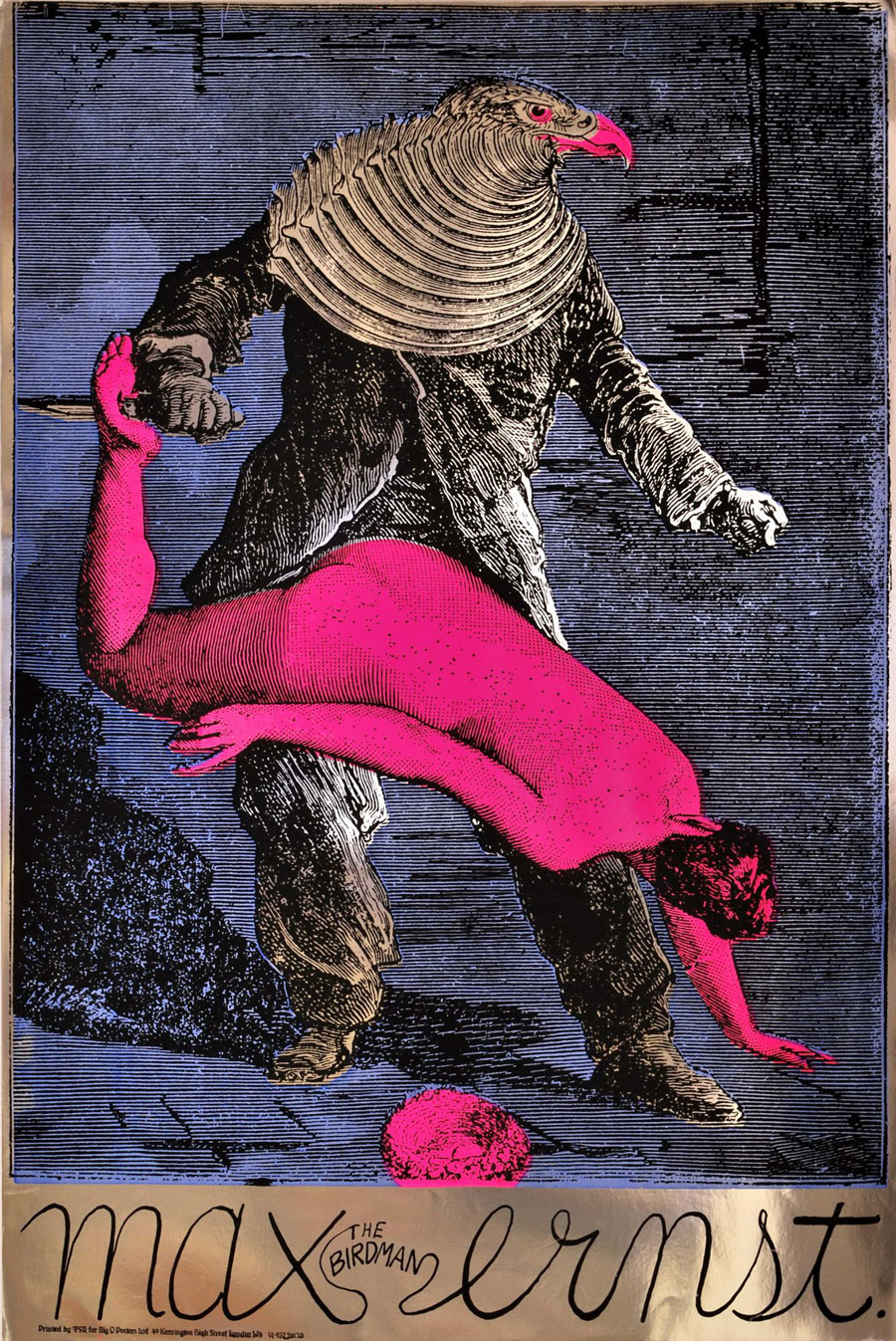
Max (The Birdman) Ernst (1967).
Psychedelia is never far away here at { feuilleton }. Yesterday’s film poster reminded me of this work from the psychedelic era by Martin Sharp, an Australian artist who moved to London and became closely-associated with Oz magazine and London’s other leading psych poster designers, Michael English and Nigel Waymouth, aka Hapshash & the Coloured Coat. Sharp’s homage to the great Max was one of a number of his designs produced on metallic foil sheets, the reflective nature of which often presents difficulties for reproduction in other media.

Performance (1970).
I wonder how many people who admired Sharp’s poster puzzled over the meaning of the image, one of twenty-eight similar collages from the fourth chapter of Ernst’s 1934 “collage novel” Une Semaine de Bonté. Chapter four—Wednesday; Blood—concerns the criminal travails of a series of bird-headed individuals (or possibly the same individual in different guises) which end in abduction, possible rape/murder, and suicide. This picture of Ernst’s has always struck me as a very obvious rape metaphor with the woman stretched over the birdman’s lap and the knife piercing her foot. Ernst’s dark imagination—informed by Freudian concerns, as were most of his fellow Surrealists—separates the picture from the more lightweight Art Nouveau/Beardsleyesque stylings of the other London artists. Martin Sharp was producing collages of his own during this period so it’s easy to see why he was attracted to Ernst. And the popularity of his poster may explain why the birdman turns up in a painted version in Donald Cammell & Nicolas Roeg’s Performance, seen when Pherber (Anita Pallenberg) goes to pick mushrooms in the greenhouse. Ernst’s sinister birdman suits Performance very well, a token of the film’s atmosphere of weirdness and violence. (“A heavy evil film, don’t see it on acid” warned underground newspaper International Times.)

Bob Dylan: Blowing in the Mind (1967).
And to compound the connections a little more, Sharp’s famous Bob Dylan collage portrait (another foil sheet production) also turns up in Performance as part of the collage-covered screen in one of Turner’s rooms. Unlike his fellow Hapshash artists, Sharp’s work is under-documented on the web beyond pages such as this one. The same goes for Ernst’s collage novel but then the best way to experience that is to buy the Dover book edition.
Previously on { feuilleton }
• The Robing of The Birds
• Gandharva by Beaver & Krause
• The Look presents Nigel Waymouth
• The New Love Poetry
• Judex, from Feuillade to Franju
• Further back and faster
• Quite a performance
• Borges in Performance
The birdman reminds me of Judex.
I used to have a metallic poster of this, when I was in college. Which was about a hundred years ago.
(I’m referring to The Birdman.)
Now you’ve got me wondering where my Max Ernst “Birdman” brooch has gone to …. mmm ….
See, now you’re making me jealous…. Thom had a poster–not an original, surely?–and Mr Kenneth has a brooch!
Nathalie: I’m sure that Franju was inspired by Ernst’s bird-people in Judex and I used the picture above in my earlier posting on the subject.
Sharp was also responsible for arguably the greatest of psychedelic album covers – Creams Disreali Gears – and for helping popularise the great Tiny Tim.He deserves a book.
I always wondered who painted that image in performance – the house was a real house, was it painted for the film or did the original owners do it? And why did they use the greenhouse as a canvas? Did it help the mushrooms grow? You can glimpse a larger mural in the garden, on a wall, if my memory serves me well.
“Sharp ….. and for helping popularise the great Tiny Tim.He deserves a book.”
I thoroughly agree Lord C. Sharp does need a book and a full on retrospective here in Oz. Australian curators? Stand up! The Queensland Art Gallery had a marvellous exhibition of prints here last year I think with half a dozen Sharp’s … wonderful to see … but something more comprehensive around this artist’s work is something I look forward to.
And yes … Tiny Tim IS great!
John … I’m searching, searching … and fingers crossed I’ll find the brooch! Its coming on winter down here and I need something wonderful to pin the scarf!
Lord Cornelius Plum: The sleeve of Disraeli Gears was an inspiration for the Dukes’ 25 O’Clock cover so it has that going for it as well. Always liked the Cream sleeve art more than the music, never been much of a Cream fan. Martin Sharp also co-wrote Tales of Brave Ulysses on that album.
Sharp and the Hapshash guys are featured in Ted Owen’s High Art: A History of the Psychedelic Poster, still the best book I’ve seen on the art of that period. There’s also Mick Farren’s poster book, Get On Down (long out of print) and the Michael English book, 3D Eye, also OOP. But I agree there should be a proper study of the Brit artists of the period to match the one Thames & Hudson did about the San Francisco artists.
Re: the Performance painting, the Donald Cammell biography (whose cover I designed) says that the garden and kitchen shots were filmed in an empty house near Hyde Park Gate. So the painting may well have been a deliberate addition to make that scene more interesting. There’s the Magritte painting which turns up earlier and which Turner refuses to buy, Surrealism is in the air.
Mr Kenneth: I’d love to see your brooch although I fear I may covet it.
This has got me thinking – its time i got in my garden and did some weeding ect, and theres a lovely blank whitewashed wall at the back just waiting to be psychedelisied……………
Theres a great book by Paul Grushkin (The Art of Rock), which is perhaps the most comprehensive book on psych posters, but mostly American.The Michael English book is great too (what a car boot sale find that was!), and theres an early 70s book called Underground Graphics which is excellent because it has things that i havnt seen elsewhere.Id imagine its next to impossible to find nowadays.
R.e Cream: Im afraid when it comes to Brit psych all my critical faculties fly out of the window on a tangerine coloured flower – i love ALL OF IT, from the most cringe inducing toytown pop to the creepiest acid folk.And those guitars they had painted by the Fool…….
The Art of Rock looks like one I’ll get eventually, even if only for the sake of completeness.
I have a blind spot where Cream is concerned, not sure why that is. I like some of their songs but find too many others turgid and dull. I much prefer the Stones where British blues is concerned, they seemed to have a more natural flair for it. But nice album covers! I still find it odd that I met Ginger Baker backstage in 1980 when he was playing briefly with Hawkwind.
I read this post with interest, just before going to see the Kuniyoshi exhibition at the Royal Academy… and was surprised to see the print “Sparrows Impersonating A Brothel Scene” – an entire pleasure quarter inhabited by Ernst-style bird-men and women, a full seventy years or so before the Surrealists!
Hi Stephen. I can imagine that, nearly bought a Kuniyoshi book recently (someone else swiped it while I dithered) and was impressed by his imagination. A shame they don’t have that picture on the RA site.
well … I went on the hunt … again … and found my ‘Birdman’ brooch … in the closet and in the pocket of a jacket I haven’t worn for ages!
So glad I found it again! Thanks for reminding me, John.
Wow. Yes, I definitely do covet it!