Or why Barney Bubbles rules… The Rumour were a Seventies band I never had any interest in, being part of the Stiff Records’ pub rock axis along with Nick Lowe and others; not weird or noisy enough for petulant moi. This is a shame since the Barney Bubbles design for their albums shows him at the pinnacle of his powers with an integrated, multi-media approach to packaging and advertising.
The pictures and text here have been very generously supplied by Paul Gorman whose BB monograph, Reasons To Be Cheerful: The Life & Work Of Barney Bubbles, is now on sale. This is an expanded extract from part of the book with the NME ad and Vinyl Factory graphic being exclusives to this posting. If you need to know why we keep raving about the man, simply scroll on down, bearing in mind that this was only a clutch of releases from a single band. Barney was pulling together work like this all the time for a host of different artists.
For more BB goodness there’s my original, sprawling post, further samples from Paul’s book at his site and also David Will’s blog which features all manner of rare historical material, including a feature about the Brian Griffin book referred to below.
Over to Paul…
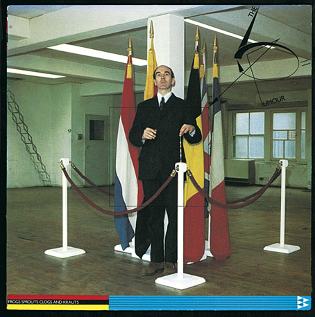
An important yet overlooked Barney Bubbles design project of the post-punk period sprang from an unlikely source: the album with the unprepossessing title Frogs Krauts Clogs And Sprouts, released by Graham Parker’s backing band The Rumour in March 1979.
The pre-PC name took its cue from the album track Euro. Bubbles chose a less prosaic route in realising a remarkable and thematically-linked design package predicated on the ceremony and colour schemes of EEC officialdom. This was very much in the news in 1979, ahead of the first European elections held that summer.
The result of a collaboration with Brian Griffin, this exercise in graphic and photographic abstraction is trademark Bubbles, in that it also draws in a range of coded references from heraldic and numeric to political and astrological.
Bubbles’ practice when working with photographers was to art-direct, but it is a mark of his respect for Griffin that he did not involve himself in the shoots; for this cover he gave over the entire floor of his Old Street warehouse studio and left Griffin to his own devices.
Griffin says that he “constructed a sculpture” using one of his regular models, Charles Woods. Rigidly posed behind velvet ropes and set against the national flags of the countries indicated by the title (France, Belgium, the Netherlands, Germany with the addition of the UK), Woods presents a soil sampler to the viewer.
“My idea was that Charles had plunged it into the earth and – like the grades of coloured sand I got in glass phials as a kid on holiday in the Isle Of Wight – produced a cross-section of the national colours,” says Griffin.
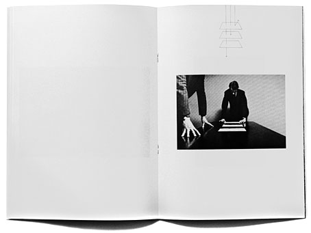
Obliterating the band’s pub rock scene roots (some of the members had been close to Bubbles for several years as part of Brinsley Schwarz), the angular band logo is constructed from straight lines and curves, further developing the symbols Bubbles provided for Griffin’s book of the previous year, Copyright 1978 (above).
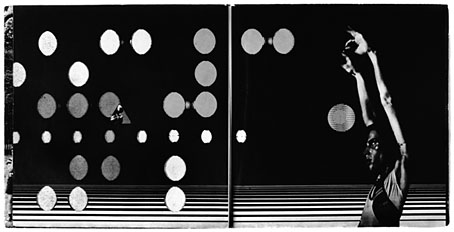
In Blissful Company album booklet.
Bubbles’ bespoke record label features the logo with the label copy enlivened by ellipses. These, which recur in Bubbles’ record sleeve designs, made their appearance on his very first, In Blissful Company by Quintessence (1969).
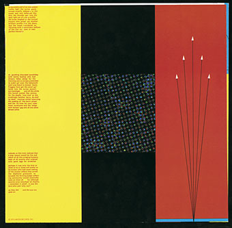
A graphic of five spear-points, which is repeated in variation across the campaign, bursts forth from the album title on the cover, simultaneously evoking an aerial display at an official occasion and the tips of the flag banners.
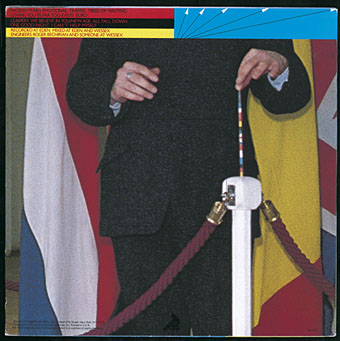
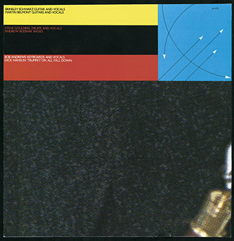
The arrowheads also zip away from the song titles on the reverse, where Bubbles enlarges a section of Griffin’s photograph, showing the soil-sampler in detail. A section is again enlarged on one side of the inner sleeve, and the reverse of that carries yet another enlargement (as well as an enigmatic short story), so that the image is driven to abstraction. “Barney took my photograph and went into it to reveal the basic dot structure, just like the sampler going into the ground,” says Griffin.
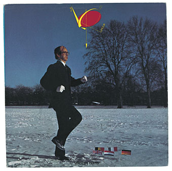
The cover of Frozen Years, the first single to be released from the album, shows Woods running on the spot on a snow-covered terrain, in front of five tiny flags stuck in the ground.
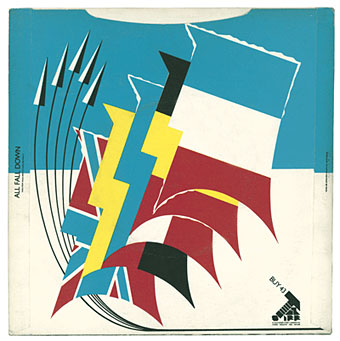
The reverse replaces photography with the spear-pointed fly-past and an illustration of the five flags created from the repeated silhouette of a face. These not only represent the five nations central to the functioning of the EEC, but also the number of members in The Rumour.
Some of the accompanying music press ads present unforgiving monochrome close-cropped portraits of individual band members, complete with oblique lines and arrows and information appropriate to the musician’s astrological sign.
The close-up of bassist Andrew Bodnar in the full-page ad in NME March 17 1979 is captioned: “Aquarius deals with democratic communication with human beings who look on each other as brothers; it’s ruler Uranus governs electricity.”

Such was Bubbles’ fascination with the cosmos and star systems; for example, a few years earlier as part of his set designs, he arranged on-stage performance positions for Hawkwind according to their star-signs.
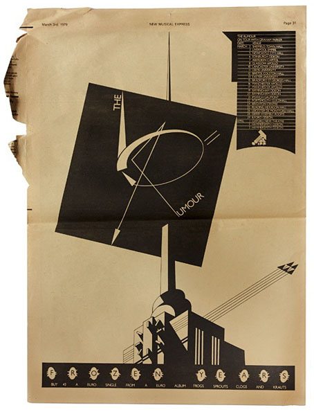
Another press ad (from NME March 3 1979) has The Rumour logo spiked by the tower of an industrial plant (similar in execution to the “vinyl factory” on the back cover of The NME Book Of Modern Music published a couple of months earlier). Five rows etched into the front of the building are reflected in another fly-past, while the tour dates are set in an elongated version of the silhouette from the back of Frozen Years.
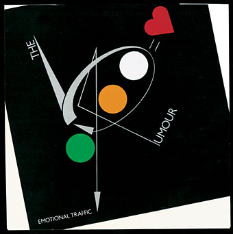
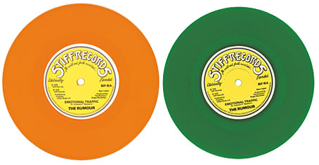
The sleeve for the second single from the album, Emotional Traffic, is relatively unadorned. Set in black on the front and white on the back with the addition of a love heart, traffic light roundels in red, green and amber indicate the three colours of vinyl in which it was made available. In each, there is a die-cut circle revealing the colour of the record contained within.
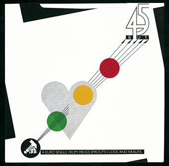

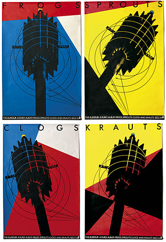
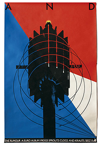
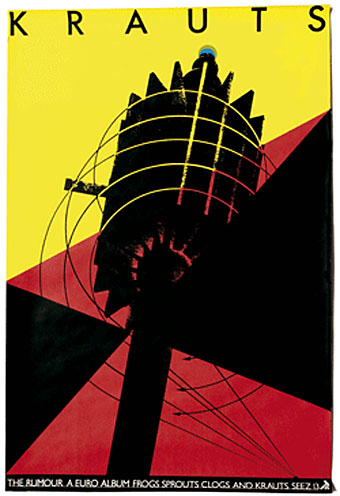
The campaign for Frogs included five collect-the-set album posters (each is headed with a word from the album title). On these a telecommunications tower/microphone head is seen from different perspectives and set against the colours of the French and German flags as the five arrows swoop and swirl. Cropped sections of the central image also appear at random in the press ads featuring band member faces, thus completing the cross-fertilisation of the design package’s main elements.
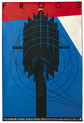
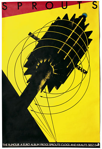
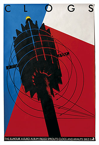
Bubbles’ visual progression and innovation of the original concept for the album cover remains a source of wonder to Brian Griffin.
“When it came to this album, I think Barney wanted me to give him something which he hadn’t been involved in, and then take it over,“ Griffin adds. “I didn’t care. My image was OK but what he did with it was incredible. Everything he did with my stuff improved upon it.”
This is an adapted extract from Reasons To Be Cheerful: The Life & Work Of Barney Bubbles by Paul Gorman, published by Adelita, £24.99.
Elsewhere on { feuilleton }
• The album covers archive

Thank you Paul and John — what a fabulous testament to BB. I must away and get me this book…
I’m finally picking up this book — thanks for the introduction to Bubbles! Last year I randomly downloaded the track “Frozen Years” from emusic, and then picked up this album (luckily on vinyl). “Frozen Years” is the keeper — when it gets stuck in my head I assume it’s the Strangers.
Thanks, Will, it’s a marvellous book, I hope you enjoy it.