
Image-heavy post! Please be patient.
Four designs for three bands, all by the same designer, the versatile and brilliant Barney Bubbles. A recent reference over at Ace Jet 170 to the sleeve for In Search of Space by Hawkwind made me realise that Barney Bubbles receives little posthumous attention outside the histories of his former employers. Since he was a major influence on my career I thought it time to give him at least part of the appraisal he deserves. His work has grown in relevance to my own even though I stopped working for Hawkwind myself in 1985, not least because I’ve made a similar transition away from derivative space art towards pure design. Barney Bubbles was equally adept at design as he was at illustration, unlike contemporaries in the album cover field such as Roger Dean (mainly an illustrator although he did create lettering designs) and Hipgnosis (who were more designers and photographers who drafted in illustrators when required).
Colin Fulcher became Barney Bubbles sometime in the late sixties, probably when he was working either part-time or full-time with the underground magazines such as Oz and later Friends/Frendz. He enjoyed pseudonyms and was still using them in the 1980s; Barney Bubbles must have been one that stuck. The Friends documentary website mentions that he may have worked in San Francisco for a while with Stanley Mouse, something I can easily believe since his early artwork has the same direct, high-impact quality as the best of the American psychedelic posters. Barney brought that sensibility to album cover design. His first work for Hawkwind, In Search of Space, is a classic of inventive packaging.
Update: BB didn’t work with Mouse in SF, I’ve now been told.
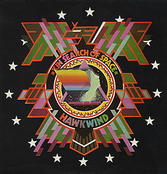
Hawkwind: In Search of Space (1971).
It’s fair to say that Hawkwind were very lucky to find Barney Bubbles, he immediately gave their music—which was often rambling and semi-improvised at the time—a compelling visual dimension that exaggerated their science fiction image while still presenting different aspects of the band’s persona. In Search of Space is an emblematic design that opens out to reveal a poster layout inside. One of the things that distinguishes Barney Bubbles’ designs from other illustrators of this period is a frequent use of hard graphical elements, something that’s here right at the outset of his work for Hawkwind.
This album also included a Bubbles-designed “Hawklog”, a booklet purporting to be the logbook of the crew of the Hawkwind spacecraft. I scanned my copy some time ago and converted it to a PDF; you can download it here.
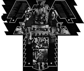
The In Search of Space sleeve unfolded.
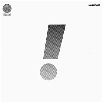
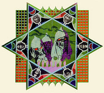
Gracious! by Gracious! (1970).
The shifting identity of Barney Bubbles means that many works such as this are omitted from listings. Gracious! was one of the first releases on the Vertigo label and the design was credited to “Teenburger”. The bold exclamation mark is printed on textured (bubbled?) card while the interior (below) featured a three-dimensional Richard Hamilton-style tableau. This band also connects Barney Bubbles and Roger Dean, another artist whose work was increasingly used by Vertigo. The second Gracious! album featured a Dean cover which kept the exclamation mark design.
Gracious! gatefold interior.
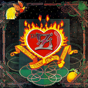
Dr Z: Three Parts to My Soul (1971).
In the 1970s even the most obscure bands could receive lavish cover treatment. This more typical design for the Vertigo label had two flaps that opened out from the centre with a heart-shaped hole cut in the middle.
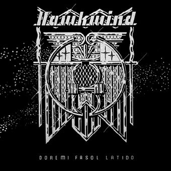
Hawkwind: Doremi Fasol Latido (1972).
I hadn’t realised until I started assembling these images how much Barney’s work seemed to go through phases of influence. For the third Hawkwind album he must have been looking at the kind of superhero comic art exemplified by Jack Kirby. The Doremi cover is a black and white drawing (printed in silver ink on the original sleeve) done in the style of Kirby’s familiar reflective metal strips. The inner sleeve was even more Kirby-like although less successful, a squadron of barbarians on horseback with a sacked city burning in the distance and flying saucers drifting overhead. The fold-out poster below was free with initial pressings.
Hawkwind: Star Rats—poster with the Doremi album (1972).
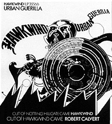
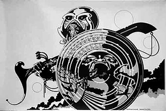
Hawkwind: Urban Guerilla single ad (1973).
This artwork in this ad design was part of a series of black and white posters all created around the time of the Doremi album that still exhibited the bold influence of Jack Kirby. This particular picture, however, is lifted directly from a Lone Sloan strip by French comic artist Philippe Druillet, Les Iles du Vent Sauvage (1970). (You can see part of the drawing on this page.) I later swiped from Druillet myself so I’m not one to criticise. In fairness, the comic strip figure only had the helmet and the shield, Barney adds an elaborate sword and a new background.
Update: thanks to comments from Rebecca and Mike below, I was reminded of the title of the picture above and so was able to find the poster version and its companions. You can see all five posters here.
Fanon—Dragon Commando.
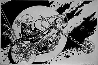
Prince Minksy’s chopper.
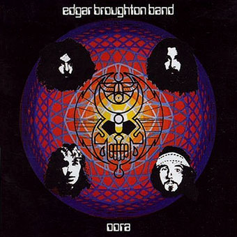
Edgar Broughton Band: Oora (1973).
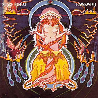
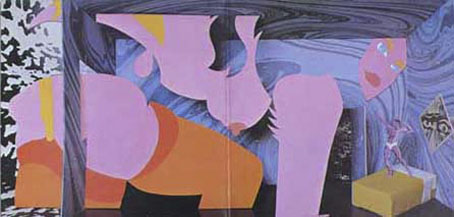
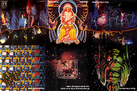
Hawkwind: Space Ritual (1973).
The definitive Hawkwind design and one of my favourite album covers. Barney’s work had now moved away from comic books into a kind of cosmic Art Nouveau with the band’s dancer, Stacia, here presented in the style of Alphonse Mucha. The lion heads were based on a head in Mucha’s L’Emeraude from 1900. Mucha also favoured a combination of illustration with hard graphics so it’s easy to see why Barney would respond to this. Much of the Hawkwind ad art of the time features Mucha-styled borders.
Space Ritual is justly celebrated for its poster sleeve which opens out to six panels. Barney’s graphics for the interior were developments of the work he created for the Hawkwind logbook, a blend of drawn or painted graphics with “significant” photos, in this case Edwardian erotica, atomic structures, a foetus floating among stars, etc. The example below is crudely composited from the CD reissue; it was too much effort to photograph the original sleeve and it doesn’t make much difference at this size anyway.
The Space Ritual tour programme also came as a fold-out poster, featuring a pulpy sf story and pictures of the band among the Mucha flourishes. Once again, I made my copy into a PDF which you can download here.
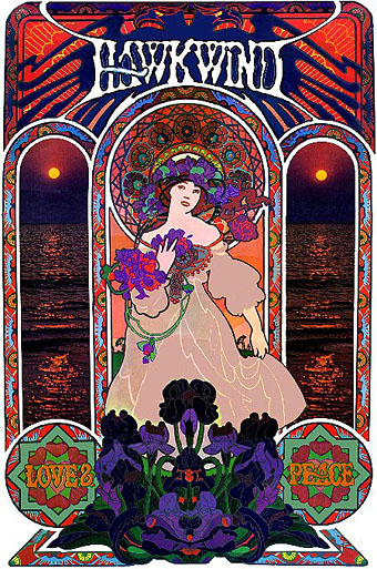
Hawkwind: Love & Peace poster (circa 1973).
The Mucha influence continued in this promotional poster whose figure and design is based on the Champagne White Star artwork for Moet & Chandon (1899).
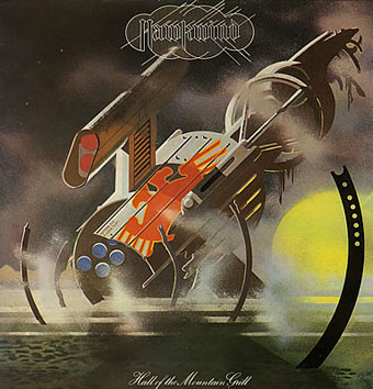
Hawkwind: Hall of the Mountain Grill (1974).
The most illustrational of all his Hawkwind sleeves and a picture that could easily have worked as one of his monochrome designs.
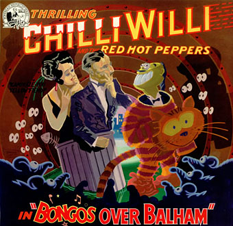
Chilli Willi and the Red Hot Peppers: Bongos Over Balham (1974).
The sleeve for Mike Moorcock’s Deep Fix album below was (according to Moorcock) a real wooden fairground booth that Barney constructed, painted then photographed.
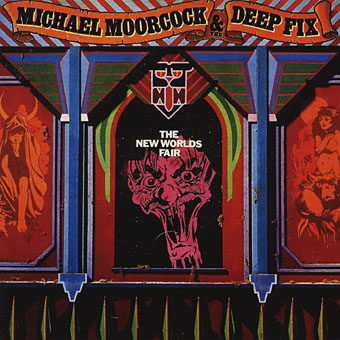
Michael Moorcock & the Deep Fix: New Worlds Fair (1975).
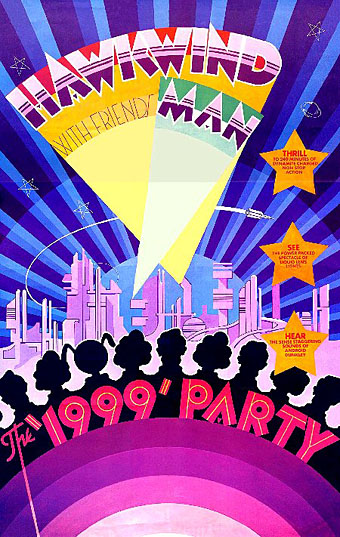
Hawkwind: The 1999 Party—tour poster (1975).
The shift of emphasis in the mid-Seventies was away from Art Nouveau towards Art Deco poster graphics, a style evident in all the 1999 Party tour artwork and the two sleeves that follow.
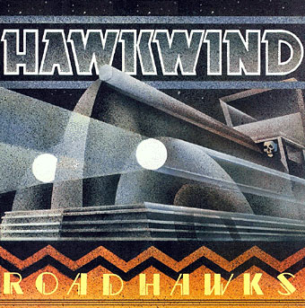
Hawkwind: Roadhawks (1976).
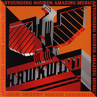
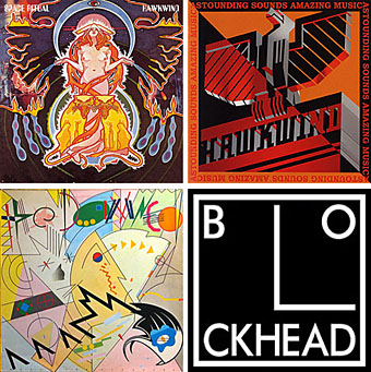
Hawkwind: Astounding Sounds, Amazing Music (1976).
The final Hawkwind design isn’t just Art Deco, it’s almost fascist, looking like a piece of Soviet propaganda art topped by a Nazi eagle. Hawkwind singer Bob Calvert spoke of the band being reorganised after this album along the lines of “a Stalinist purge” so maybe the design is appropriate.
1976 was the year of a Stalinist purge in British music as a whole. With the advent of punk Barney successfully made the transition from hippy designer to punk designer. If anything, punk gave him a new leash of life as his tremendous sleeve for the second Damned album demonstrates. His association with Stiff Records and Radar Records was the second major phase of his career after Hawkwind and gave him the opportunity to explore a range of influences from early 20th century design.
The Damned sleeve is a Kandinsky-esque portrait of the band with the group’s name spelled out using abstract shapes, an approach to album lettering he was to use for other artists as the decade progressed. I was especially taken with this album at the time and referred to it in an exam essay I had to write about album covers.
The Damned: Music For Pleasure (1977).
The very wide letter spacing used on the titles of these albums was a common feature of his Stiff designs, one of a number of habitual effects that became prevalent in work from subsequent designers.
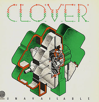
Clover: Unavailable (1977).
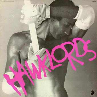
Hawklords: 25 Years On (1978).
Hawkwind became Hawklords for one album and a tour in 1978. Barney was commissioned to help create the stage show and develop the vague science fiction concept of Pan Transcendental Industries around which the album was based. The result was a very up-to-the-minute presentation which the band discarded immediately afterwards. This was Barney’s last work for Hawkwind. I’ve always found this cover distinctly erotic but I doubt you want to know about that here.
Nik Turner’s Sphinx: Xitintoday (1978).
Sax player Nik Turner was thrown out of Hawkwind in the 1976 band purge but he remained friends with Barney Bubbles. When Turner came to record his solo album, Xitintoday, Barney was asked to create the packaging. The album is a concept affair based around the Egyptian Book of the Dead but Barney’s design for the sleeve and accompanying booklet avoids hippy cliches with a use of abstract graphics or arrangements of lettering; the cover design, for example, features stars made up of the word “twinkle”. The pair continued to work together for Turner’s later band, Inner City Unit.
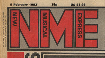
1978 was also the year Barney was asked to help with the redesign of the NME. His new logo remained in use up to the late 80s and forms the basis of the current (degraded) logo design.
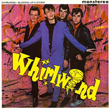
Whirlwind: Blowing Up A Storm (1978).
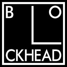
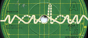
Ian Dury & the Blockheads: logo design (late 70s).
The association with Stiff Records led to one of Barney’s most famous works, the Blockhead logo. If he’s remembered for anything it should be for this simple, brilliant and witty graphic.
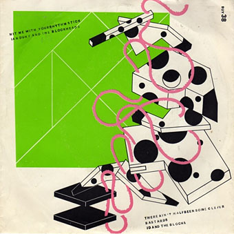
Ian Dury & the Blockheads: Hit Me With Your Rhythm Stick (1978).
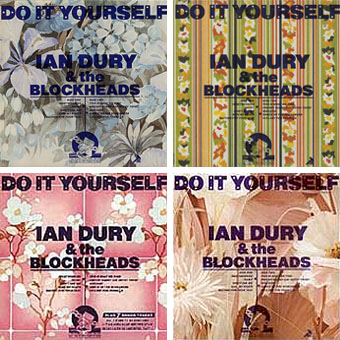
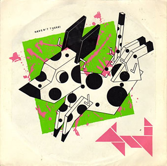
Ian Dury & the Blockheads: Do It Yourself (1979).
His inventiveness came to the fore again with his cover designs for Ian Dury. This sleeve was printed in twelve different versions onto real sheets of wallpaper. The design acts not only as a comment on the home improvement alluded to in the title but also a request for the purchaser to make a choice of their own among the different styles.
Radar Records logo (1978).
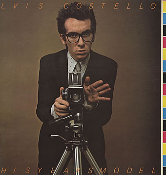
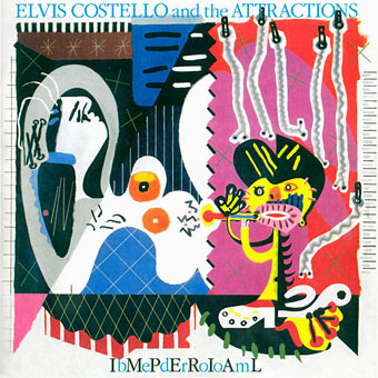
Elvis Costello & the Attractions: This Year’s Model (1978).
Initial pressings were made to look like deliberate misprints, showing CMYK colour bars and cutting off the letters of the artist name and title, a quirk abandoned on subsequent editions.
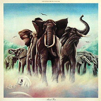
Elvis Costello & the Attractions: Armed Forces (1979).
The David Shepherd-style elephants on this cover do little to hint at the exceptional interior design, probably Barney’s most extravagant work since Space Ritual, and certainly its equal. The sleeve opens out to further extend the interpretation of the title and includes Mondrian and Jackson Pollock stylings among its animal-print abstractions. To save page-loading time there’s a page here where you can see the full effect for yourself. Thanks to LondonLee for the photos.
Update: Tim Niblock in the comments notes that this package was produced in association with Bazooka Graphics, France.
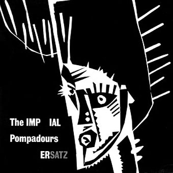
The Imperial Pompadours: Ersatz (1982).
Not many people know Barney Bubbles had a band. The Imperial Pompadours was Barney plus Nik Turner and other members borrowed from Inner City Unit. They recorded this one unhinged rock’n’roll album on a very restricted budget. Read The Seth Man’s review of it here.
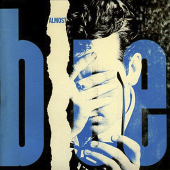
Elvis Costello & the Attractions: Almost Blue (1981).
Work at Radar continued with covers for all the early Elvis Costello albums. Almost Blue prefigures the look of many sleeve designs that came later in the decade while Imperial Bedroom featured a painting of Barney’s pastiching Picasso (“Snakecharmer & Reclining Octopus by Sal Forlenza, 1942”). Despite his increasing success and a growing reputation among younger designers these were to be his last works. Friends say he’d always been something of a depressive and late in 1983 he evidently reached some kind of crisis and took his own life. Roy Carr wrote an obituary for the NME.
Elvis Costello & the Attractions: Imperial Bedroom (1982).
Barney Bubbles’ work is continually featured in histories of album cover design but he was more than just a cover designer. We’re overdue a decent book-length examination of his work and his influence.
Update: The book is on its way. And David Wills’ new blog features his reminiscences about art school life with Barney. Good things come to those who wait.
Update 2: Reasons to be Cheerful: The Life and Work of Barney Bubbles by Paul Gorman was published by Adelita on December 4th, 2008. Paul Gorman writes about it here and I featured an extract here.
Elsewhere on { feuilleton }
• The album covers archive
Mike and Rebecca have suggested that I bring to your attention my – James Last Christmas LP that may be a Barney Bubbles effort-theory. The design is a 1970 or 1971 repackaging of his 1966 LP through the design partnership of Berney Wade Davis. The group seem to do a lot of work for B+C and Polydor. If I were to stake my life I would say its not BB, but the execution is superb, and has the confidence of BB with his strong angular style-nothing wishee washee here. There is a sticker that accompanies the LP, which has a Tesselated ‘wallpaper’ design on a dot screen – which is BB, but the sticker has all the geometric allusions that makes me want to investigate further. See http://www.flickr.com search Barney Bubbles .
The Chilli Willi LP of 1972 has a lyric sheet insert that I alluded to earlier, the paper is Glastonbury wove check out the watermark. Revelations were responsible for the Glastonbury triple LP, so this touch – hidden by BB may have bankcrupted them! Rev already on shaky finances. Martin Stone did not know this, but he reckoned the paper was very expensive to get in. So this could be an expensive BB joke. But its great though.
I remember now, having read the site again that Elvis Costello was on Tiswas discussing the Armed Forces cover with Chris Tarrant. The film needs to be dug out to see if any light is shed on the artist. Tiswas an ATV production – so Central TV may have the archive.
ATV logo designed by Lew ‘monte christo’ Grade based on CBS logo
Deepinder: that James Last design looks like BB to me, an Art Deco Xmas. That angular stylisation is already there on In Search of Space, isn’t it?
I added Bongos Over Balham to the pictures above, so this page is now even more unwieldy. I nearly met Martin Stone a couple of years ago in Paris where he now resides. If you need to speak to him, Paul, Moorcock’s yer man.
Thanks John
Michael and I have already been in communication and I’m talking to M Stone next week. I’m also visiting a few other people, one in particular who has never spoken before on the record about BB. He is key to the evolution of Barney’s work so I am excited but will keep schtum until that mission is completed.
And no it’s not James Last.
I’m not being deliberately mysterious – one of the reasons for this book is to widen out BB consciousness – just don’t want to jinx anything.
Strange and heartening to have such a public expression of interest (and goodwill) during the writing of a book. Usually this is a pitilessly isolated activity which alienates one from nearest and dearest, domestic pets, the postman, etc.
Thanks for the views on my flickr account (daevideo) regarding James Last. The work of Berney Wade & Davis is excellent, and I hope some definative evidence should emerge that will establish whether Barney worked with these fellows or not. In the meanwhile Paul I will not be laying down any heavy bets!!
Can I point readers to the first UK pressing of ‘In and out of focus’ by dutch band Focus on Polydor 2344 003. Its a Keith Davis or a Keith Davis / Grahame Berney sleeve (2 different credit variations) the gatefold has a coarse printers dots grid -and when viewed from a distance the word FOCUS in an angular form can be read – not obvious when held normally. The inside is silver foil on card with more Barneyesque patterns, and strong lozenge shapes – I wonder if this is barney, or some cross pollination occured between these sets of designers. Either way the sleeve is a masterpiece and a study of Berney Davis Wade is certainly required
Hullo David Wills!
The printers near Waterloo were Grove Hardy, yes it was Bert Hardy of Picture Post – I used them a lot – the best.
The photo I did of you and Barney painting Nikki the Witch was in Mike and Rebecca’s exhibition I believe.
Hello Phil (Franks)
Do you remember Eric Hayes the Canadian photographer? He would like to get in touch with you – I think his website is http://www.erichayes.ca Your name came in conversation when I was trying to find his Mothers photo’s that were published in Friends issue 1
Hi Phil,
Great to see you here. Yep, your recollections are correct, that pic was up in the exhibition we did. It is such a cool shot.
Hi Deepinder,
Of course I remember Eric Hayes, in fact I have a link to his website on mine.
I was in touch with him four or five years ago, I’ll email him again now.
Hi Deepinder,
I was in touch with Eric four or five years ago, I even have a link to his web site from mine.
I’ll contact him again, thanks.
Hi Phil
Ah, these are the days. Nice to chat. The web is like Portobello Road, there’s everything there there. What was the painted witch pix for originally? I used the pix in Curious, but that’s not what he designed her for. We were so chaste when we painted her up – carefully minding our fingers.
Talking of anonymity and the Bubbles – Bruce Connor died yesterday, he is the source of Barney keeping mum in the credits department. See my ‘log at DRG.
David,
The painting of Nikki the Witch’s body was done for her performance of a magick rite to celebrate a change in the law in the UK which for the first time in centuries allowed magick ceremonies to be held in public.
Nikki was a member of a coven which met in a house in Holland Park who’s chief was Alex Sanders, self-proclaimed “King of Witches”.
To celebrate the lifting of the legal ban on public manifestations of magick Alex, his wife Maxine, Nikki, and the coven, hired a cinema, in Hendon to do a public performance.
The first part of the show was an initiation ceremony, the second part featured Alex invoking The Devil in the body of Nikki, with the promise that The Devil would in fact appear.
I was there photographing it for the London edition of Rolling Stone. Nikki did indeed enter into an “altered state”, the performance was cut short and Nikki was attended to by the St. Johns’ Ambulance people who were there “just in case”.
While you and Barney were chaste I was chased by Nikki, with some success I admit. Alex also invited me to join the coven saying my witch name would be “Bacchus”
Info on Alex and Maxine:
http://www.controverscial.com/Alex%20Sanders.htm
http://en.wikipedia.org/wiki/Alex_Sanders_(Wiccan)
http://en.wikipedia.org/wiki/Maxine_Sanders
Ah-ha! Here’s one of my pics of Maxine in the dressing room before the show:
http://www.maxinesanders.co.uk/pages/ma_3.htm
Where is your “log at DRG”?
“My log at DRG,” – that sounds so impressive to this archaic pencil pusher.
http ://designresearchgroup.wordpress.com/2008/05/31/who-was-barney-bubbles-anonymity-and-the-design-canon/
Your detailed memory of the occasion is noted. We want more. If all of us wrote like that we’d have quite a story: The Bubbles Bible.
I think Barney and I figured you had a thing going on with Nikki.
Phil
Duh. Of course it’s not my ‘log at DRG, it’s my post at DRG.
I have been alerted to Curious magazine here on the blog – and by golly whaddaya know! I have the very issue in question. I was amazed I could lay my hands on it. The painting on Nicki the witch is amazing (its supposed to be the intertwining of the masculine and feminine and duality therof) . Its pure Barney Bubbles, it reminds me of the way how ‘Revelations’ is painted on the labels of the Glastonbury Fayre discs – a ‘flame’ motif starting yellow – red then green. This familiar trait of Barney is found in a circle in the middle of the die-cut ‘In search of Space’ hakwind sleeve. I may be wrong but is that Barney Bubbles himself admiring his handiwork on Nicki’s backside????? Good to see a fit healthy bird like Nicki took pride in a luxuriant bush – *sigh* – sadly lacking these days.
Nicki the witch is credited as photographed by ‘Count Divanovitch Alexei Kravetski’ good to see the good count wielding the camera, I hope the rest of the photo session still exists
the photo has been printed in reverse – the newspaper headline s are mirror inage
Phil caught us in the act, it is not a pose, that is Barney on the left (as reproduced), in the act of both painting and admiring Nikki’s bum.
Ah! so its Phil Franks – its a great photo session, I have scanned and posted the image on my ‘daevideo’ http://www.flickr.com account. Please use Barney Bubbles as a search term. I have also posted up the Glastonbury fayre label as designed by barney – so the flame motif can be compared to the painting. I reckon this could be one of less than 10 images of Barney Bubbles published in his lifetime.
Thanks again for the link, Deepinder, that’s a splendid photo. And yes, the “Myths and Man” reference would refer to Man, Myth and Magic which was still being published at the time. For my sins I have the entire seven-volume set which includes a number of photos of the aforementioned Alex Sanders (he was on the cover of one issue).
Wasn’t Barney in one of the photos inside In Search of Space? Top left with R Calvert I was always told.
it’s john trux who’s with barney in XISOS, not calvert. :-)
Thanks for the interest – Re Man Myth and Magic: There is a wonderful photo of Osman Spare as one of the plates in ‘Ideas and people’ author Clifford Bax published by Lovatt Dickson’ in the mid 1930’s. Bax pays a visit to Mr Spare in Borough and talks about a puiblishing venture they had called ‘Golden Hind’ in 1918/19 therabouts.
My friend looking over my shoulder thinks that ‘Myths and Man’ may be a reference to Lion the Witch and Wardrobe – a book on Mrs Beavers bookshelf. There are 2 or 3 photo’s from the issue of Curious that may be Phil Franks work I will post them onto my flickr ‘Daevideo’ account later.
Talking of published pictures of Fulcher, there’s a profile of him in the crowd at the Arts Lab, centered on page 114 of ‘I Want to Take You Higher’ (published by Chronicle Books) that was in the Rebecca and Mike show. Fulcher told me that Barry Miles (?) had said there was a “very important photograph of us at that would be in a book, real big, one day.” Fulcher is in a paisley shirt and a sensible hair cut, me on the opposite page – we’re all looking at a naked man crawling through the crowd. The book says it’s at the 14–hour Technicolour Dream, which Fulcher went to with his face painted in bubbles, and a mask, I got pix, so I’m fairly certain it’s at the Arts Lab in Covent Garden, 1967.
David I have that very book! I constantly surprise myself with what I’ve got – and especially regarding Barney Bubbles I didn’t realise I had images of him. The information from David Wills is gold dust. We are grateful to him.
There is no credit I discern – so is it reasonable to state that this (superb) photo was taken by Barry Miles himself.
I will try and put this photo on my daevideo account on http://www.flickr.com today – or flickr search “Barney Bubbles”
Deepinder, thanks for the encouragement, “Gold dust” no less. I have been writing up a storm lately on the subject and don’t want to hog this space, so I’m wondering what to do with it all, any suggestions? Paul Gorham is writing the book, but says he has enough early personal information on Barney now to meet his looming copy date. So for all you Bubbles fans out there I’ve got a mine of gossip, a pile of photo darkroom rejects, and even a piece of my aunt René the ironmonger’s old wall paper collection that I gave Barney sometime in ’69. I have knowledge of influences, early work, and tales of adventure and daring do. Somewhere out there, I bet, are collector recipients of Fulcher’s contributions to the ongoing mailothon between ex-Twickenham art students in the early sixties, in which we succeeded in ’embarrassing’ (the technical Post Office term) the postmen (all men then), much to their amusement. Colin sent me an altered Kellogg’s Corn (and did you know that’s maize not wheat?) Flake box with a stamp on it. (Irrelevant note for the design inclined: You may be interested to see that the ‘K’ in the Kellogg’s logo is taken from the ‘ic’ in Picasso’s signature.)
Hi Mr D. Rider. PAOLOZZI? Ah memories. This is such grand fun. At Twickenham art school we went to the Ideal Homes Exhibition at Olympia (?) in 1960 and there, incongruously amongst the dinette sets and wall paint brochures, was an exhibition of Paolozzi’s work, in all his graphic wildness. Mr Gould, our “display’ (read exhibition design) and silversmith teacher, back in our art school tower, ranted on about this “awful ‘modern’ art rubbish”, and Colin sitting on a stool at his bench, said quietly how much he liked the work.
Mr Rider, since your students are visiting this site maybe if you’re all good I’ll post some anecdotes about the ‘Colour Party’ of 1965. Fulcher and I sent an invitation (I still have one) to art students at Twickenham and elsewhere to come to Leigh Court to make a movie, and sew clothes from rags, and build an organ from their sortie to get Fulham Road Market rubbish, and have Ron Bowman play ‘Green Onions’ on it. Wizbang designer Pearce Marshbank, still at Ealing then, was there. We lined the entire flat, ceiling to floor in plastic. All the parties I give are always mentally referenced back to the archetype of the Color Party. Artist Cat Bell and I have a tea party every year on Haight Street during the Street Fair. Our Tea Party is a ‘Commercial Free Event’ with free tea and cookies and comfy chairs, carpets, an awning and the flapping flags of many nations. Everyone gets a sticker of their choice. Both the Street Fair itself, which I helped start, and the Tea Party are echoes down the road of Barney’s blazing creativity.
David: the Paolozzi connection doesn’t surprise me, as I mentioned above. BB’s early Hawkwind work reminds me a lot of Paolozzi’s poster designs from the mid-Sixties.
Regarding your historical material, if arranging a book is difficult, there’s always the web. Blogs are a great way of easily presenting words and pictures. I’d recommend WordPress.com which is free, open-source and possibly a better bet than Blogger.
Lastly, I’ve added numbers to the commenting to make the system (and this page!) more user-friendly. A quick hack, could do with being styled a bit more but the fine-tuning defeated me this evening.
Looks like the early life of Fulcher/Barney is an important and unexplored land. I’m sure that me and other Barney Bubbles fans – however tangentially interested – await a full exploration of Colin and BB the man.
note: If Eduardo Paolozzi severely tweezed Colin Fulchers brain, then a look at his Moonstrips series (I think 100 screen printed sheets) may prove instructive. Birmingham University has a full set in the entrance and up the stairs to the Law Library of the Hardy buliding ( in front of the ‘old joe’ Clock tower – a landmark and a half).
In 1976(?) at Barney’s echoing, large, bare bones studio, up on the second floor, with a view looking out onto Paul Street, I saw a set of Paolozzi’s someone had lent him. He showed them to me with great pride, while I waited for him to finish what he was doing on Elvis’s album cover. “Here, take a look at these.” But as you can imagine he had a vast range of influences. Barney was pleased with his Sfiff work, “…get to do all the things we ever dreamed of back then.” he said, referring to our wild times at Leigh Court. [In (or on) Avonmore Road, West Kensington.]
Somewhere in a sketch book I have a drawing of Barney leaning over his desk at work in the Paul Street studio as he worked on Costello’s checker-board art.
It is not without some wry humour that I recognize as true what painter Kathleen O’Neill, in Bolinas CA, said recently when I told her what I was doing, “You could make it all up.” But I strive for veracity – don’t mean I’m right though. I use single quotes if I’m not absolutely positive of his words.
The studio was at 80/82 (?) Paul Street Wc2, http://maps.google.com/maps?hl=en&tab=wl
that’d be EC2 (as in ‘E’lvis ‘C’ostello!) not WC2; wouldn’t want any tourists going to the wrong destination.
keep writing Mr Wills!
Apparently, so Rebecca and Mike tell me, I was on, or in, Paul Street, EC2, in the summer of 1977. Yes, I wore my 7:7:77 T-shirt, gave one to Barney.
*Our disclaimer LOL*
We didn’t quite say you were in Paul St EC2 in 77, just said that if you saw Barney putting together the Elvis checkerboard we sent you a jpeg of, it wasn’t 81 or 82, but would have been 77.
Maybe you did see it at Paul Street EC2… or maybe you saw it at Parker Street WC2 (aha… WC2 creeps back into the equation).
As one of Barney’s Boswells, I’m a bit confused in writing all this way-back-a-when, as to whether I was in England in 1976, ’77 and ’78 and what i did when. My passport is of no help. Maybe my sketch books would tell a story. It would help in to know and contribute to the Lore and Works of the Lord, to find the life behind the art. Get a taste of the Bubbles flavor of the month. (Don’t try this at home, kids.) So bear with me while I wing it here in the time machine.
•••
Lets see now. I could have been there three yearn running; my folks were slowly dying, it was a difficult time. I was definitely in England in 77, I saw the Elvis ‘checkers’ cover in production in the white washed office with the black stereo, where i saw the Paolozzi’s portfolio on Paul Street.
•••
76 (?)Arriving fresh from the Haight in san Francisco, one Saturday around 11 AM in early May, I coincidentally met up with the, ’til then untraceable, Barney, on Basset Road, Ladbroke Grove. Also coincidentally this was right outside my old apartment from the time when Teenburger was round the corner. Barney mentioned coincidences, said how he had met Higson in the East End. And how we had met Ed Moulton through the girls at the Carnival shop on Hammersmith Rd. How Ed had split with the money and left Barney fucked, and that was when he met Chris Higson – while wandering disconsolate, thinking to finish it all in the street. It was Higson who had told him about the contact for what would be Stiff. Radio Wales’, Dai Davies was involved. Just then Barney getting his new secret studio together. Last I had heard of Higson, was he’d been literally stoned (with rocks in Ethiopia) in a jeep driving on his way to get married in what was then Tangyanica, so that was a surprise just to find out he was still alive. There would be records down at the Burn Center in Salisbury.
Barney was fresh out from the asylum, up North somewhere, where he’d had a job in a warehouse to prove he was competent to his doctor. He said “I was pretty good at it.” and explained why, “I’d worked in that lolly factory.” Where he’d “pizzed in the vats.” We walked down onto Ladbroke Grove, Barney talking about a religion of shape, which came from the spiritual writings of Wassily Kandinski and the work of Malevitch. As we past a lorry with the FedEx logo on it turning into Basset Road, he said, “Look see what I mean – it’s everywhere.” I said I was going to visit the old Teenburger/Frendz office, asked if that was OK, would his protectors blame me if we smoked a joint? (I was right, Justin De B did.) Barney said that’s where he was headed anyway. On Portobello we visited the derelict studio over the record and dyed hippie clothes shops below. Tiny Tony did in fact proffer the joint.
We walked back to Ladbroke Grove railway station. Then, as we approached the bridges on Ladbroke Grove Barney said he was going to “end it” and he asked me to join him in the ultimate graphic event, the most extreme protest; death. I smiled said a bland, British, “Nah.” changed the subject, and caught the train.
77 One day, a sunny Sunday I walked back from Barney’s to stay at my old flat on Basset Rd. with the vivacious ‘Eleanor’ whom I had met one Saturday in the kaff on Portobello. That day I got busted, literally red handed, for stenciling a Street Lightnin’ Gang, World Teleport graffiti on a traffic control box, by Sgt. Bootsy Snudge (I kid not) in Notting Hill Gate Pollce, the guys who gunned up on Oz. As i was being questioned, I drew portraits of the handsome coppers in the station, as they looked up, in a big legal tome, a lesser offense… ‘Defacing a Pale.’ This was preferable to the ‘Malicious Mischief’ felony they were going to book me for. they offered tea and cherry sponge cake. The cop, Bootsy, who lived in Abinger, Kent, to save time for the first thing in the morning trial, slept in the cell and I went to sleep with ‘Eleanor’up in the loft, in what had been the LA antique restorer, Rita Gearge’s boudoir where I’d first been dosed. The arrangement were so that Bootsy got priority on the roster, and we could both appear in Marylebone Magistrates court first thing, early on Monday, to get Bootsy home for a ‘weekend’ break – as long as I plead guilty. They never got the Oz connection. I Never made the date with Alison. But I digress.
•••
77 (?) He didn’t mention how long he’d been painting, I got the impression it it was something he’d been doing awhile. We went to the Horniman Museum and he said, about a scenic tackily painted, dry brush, mural background there, “Boy, that’s cheap,” and I was surprised he thought that, made me think he’d been painting a lot. Our friend Lorry used to do background paintings for the Nat Hist Mus, so we had a particular interest in the subject.
Walking back, sitting on Parliament Hill looking out over London, Barney looks out over the city, and says in an open, and at the same conspiratorial tone, “Look at all that… we rule, its all ours… we can do anything we want… it’s easy… if we want to.” It was true. Honest megalomania, he was right. (The group noun ‘we’ was interesting. Maybe the ‘royal we’, but it was a buddy thing too.)
•••
78(?) I also saw the art for Hawklords in production – which would be in ’78. Barney at that time with a mullahs beard and huge hair, still wearing his pea coat and skinny Levis. I saw the cover and booklet, on Portobello with the late Tiny Tony. I wonder, could Barney have worked on it and brought it by to show Nick? Hmmm. I never did visit Parker Street Studio. Did I meet him in 307 Portobello Rd and did he bring the art with him? Yeah, could be. Yeah, and then I go visit our old friend Alison in Fleet, Hants., We went for a walk, very self consciously and incongruously holding hands as we walked round an alfalfa field on his “daily constitutional.” Later that day in the derelict water meadows, Barney tried to kill me as I jumped the weir.
•••
This is all a little nigly but I feel knowing what happened in the Bubbles saga is like documenting the trail of the messiah for all us apostles. He’s laughing.
David Wöllz
#116 posted by Deepinder Cheema
gravatar
Nicki the witch is credited as photographed by ‘Count Divanovitch Alexei Kravetski’ good to see the good count wielding the camera, I hope the rest of the photo session still exists.
Kravetski was my grandfather’s name and one of my aliases, along with “Pochettino Gaio” who is credited as doing the Adverts “One Chord Wonder” maxi-single sleeve.
All the originals still exist and I still own copyright – please ask for permission before publishing any more of my work, or indeed anybody’s work on the internet, or elsewhere.
for the people who read this with an eye for detail… and having looked at this blog for FAR TOO LONG (heh heh), it just dawned on us that the Space Ritual depicted actually has different typography to the Barney original, and the Astounding Sounds depicted is visually very ‘cleaned-up’ and again has border typography different to any Barney originals (although happy to be corrected if we’re wrong). presumably these are from CD re-issues that have gone through some re-working?
think we said before that the Roadhawks LP depicted was not Barney, neither the image or the type, but was a slightly different recreation by a totally different person.
and for more typo-nerdity (presumably there are some of that sort out there LOL)… check out the ‘k’ of ‘Moorcock’ overshooting the banner on ‘New Worlds Fair’!
Yes, I noted above that the Space Ritual sleeve was “crudely composited from the CD reissue”. When I was putting this post together originally I was too lazy to spend the time photographing the vinyl sleeve.
The Astounding cover probably comes from the Griffin reissue (I forget) since I sold my vinyl of that years ago (mea culpa) and probably couldn’t find a better example anywhere else. Roadhawks should probably be dropped or replaced with the BB original.
Hi Phil (re post 133), this is all a bit off the subject of Barney, but adds a little colour to his background. The originals of the Nikki shoot? The rest of the shoot? They would surely be with you, no? If you left them at Curious, they may have been subject to Kings’ Rules. Put in what the publisher, Gerald Kingsland, called “… the box of copyright free snaps and used as the occasion needs.” I used a cover picture of Michael Caine’s well dressed wife for a supposedly respectable issue to please the Lord Chamberlain. “Found therein in a rummage through the assorted situations depicted, your honour.” That’s why Mr. Caine sued. He won and closed Curious down.
The free-box may have been sold, with the effects, in auction. For more on this mind-set see the book, Castaway•. Gerald Kingsland of Curious became notorious for taking up my suggestion to become a King, he was given the opportunity by his publisher to be King of Barney Island (also known as Tuin) north of Australia in the Torres Straights, and write a book about it, but his Woman Friday underling beat him to the punch, wrote a hilarious book about her experience,
• From Wiki… “The story of our year on Tuin was told in my book Castaway (1983), which in 1986 was adapted into a film starring Oliver Reed and Amanda Donohoe. During long, hot nights when, due to the attentions of sandflies, we were trapped together in a small tent, Kingsland told me about his life before we met through his advertisement in Time Out magazine in 1980: “Writer seeks `wife’ for year on tropical island”.
John, all perfectly understandable of course! Infact, reproducing Barney’s work often pulls the gremlins to the surface. One of the most unfortunate that we have come across was in the big book that accompanied the ‘Communicate’ exhibition at the Barbican in London (and later in Japan too we recall) circa 2004/05. In the book, the original UK issue of the LP ‘My Aim is True’ is depicted, but it is shown without the printer’s colour bars and as a result appears without one of the main ideas of the piece, and as an oblong LP sleeve, not a square one! This type of thing of course, is all testament to the radical work of Barney, Jake and the rest of that crew, who deserve a massive big-up. And, whilst not shown here, the original release of ‘Parkerilla’ usually gets shown spun around the wrong way too…
Could I be correct in thinking the original Barney art for Nighthawks looks like it was,’air brushed’ with a Crest brand toothbrush and Dr.Ph. Martins good ink?
yes! (although you mean Roadhawks, not Nighthawks)
Re: #136 posted by David Wills:
David,
This isn’t the place for a discussion on copyright so I’ll simply say that there are some useful links at the bottom of my Copyright Notice for those who may not fully understand that nothing is in the Public Domain unless stated, that possessing a copy (such as a page from a magazine or an image downloaded from the web) does not confer ownership or rights to further distribute or publish.
Too often fans and enthusiasts allow their love for the object of their desire and admiration to run away with themselves assuming rights over and above those of the legitimate owner of that Intellectual Property.
Deepinder contacted me some time ago regarding my photos of Mighty Baby. I thought I’d explained my position on use of my work to him then, unfortunately I seem to have been mistaken.
I don’t want to abuse John’s hospitality so I won’t continue this discussion here, anybody who’s interested in doing so can email me at the address on my Copyright Notice.
Thanks to rebecca and mike for this link.
CORRECTION TO OUR POST #137
oh me gawd, and just when we were talking about gremlins too! the sleeve we refer to that appeared incorrectly in the book ‘communicate’ was NOT ‘my aim is true’ of course, but was actually ‘this years model’; that’s the sleeve that has colour bars.
Hi again everyone.
As John Coulthart has pointed out on this blog, Barney did the amazing artwork for DrZ “Three Parts to My Soul” on the Vertigo label.
There are some other gems Barney did for that label in the same period, and it is probably time we shared some info (!): one is Cressida “Cressida” and another is Gracious! “Gracious!”.
Both of these are fantastic gatefold sleeves. You can see the front covers on this page which is a good place to start: http://www.vertigoswirl.com/vertigouklp1.html
There is also a lot of technical info on that webpage too. (Teenburger was Barney Bubbles incase anyone is confused.)
The inside of Gracious! is a 3D pop-art style model Barney would have made featuring a scantily clad woman and a body-builder man stood on a bed flexing his muscles. The actual outside gatefold cover has a textured card sleeve made from thousands of… Bubbles! (or it could just be reptile skin LOL!)
The inside of Cressida is a drawing/collage of a dark, almost cathedral-like space, with a mysterious headless winged statue that works its way through the space and onto the back cover.
These are amongst our favourite Barney Bubbles sleeves.
What a great site, thanks for the link! I’m pretty sure that place wasn’t around when I was searching for stuff earlier. Vertigo had some great album covers, invariably (for me) superior to the turgid prog lurking on their discs.
And the Gracious! info is fascinating since that connects BB with another obsession from my teenage years, Roger Dean. When the Gracious! album was reissued they replaced the original sleeve with new artwork by Dean. He mentions in Views that he kept the exclamation mark from the original design:
http://sometimeworld.blogspot.com/2007/08/gracious-this-is-gracious-1971-256.html
I just came across a b&w dark room test of the Muleskinners, c1963, photographed by Fulcher up against what I think may be three Paolozzi prints.
Related to the Gracious pop up body builder man: The Muleskinners were included in a set of dark-room rejects, given by me by Barney in June of ’83. He said.”They’ll want to see these.” There is also included, on a torn piece of test paper, a print with a Fulcher collage on hardboard in the background, constructed in 1962(?) and destroyed by Barney in ’68. The decimated fragment shows wood letter type torn from wrestling posters, that covered, in the original, two 4 x 8 foot panels, and was dotted randomly with blue and red torn musclemen parts in the manner of Kurt Schwitters (sp?).
Please tell me if this is too personal for your delicate sensibilities… Colin Fulcher mailed a coupon in 1958 to that ad on the back of the comix for a muscle building course. Art students jived him about that sort of thing and sent him, and others, random mailings as part of a widespread stamped artmail campaign.
Gracious! sleeve art added above. And I should note that my comment at #143 about Roger Dean doing the art for a reissue wasn’t quite correct, Dean’s art was on the sleeve of their second album.
I have just come back from India – and noticed that there has been a lot of activity here about Barney Bubbles.
Gracious – it is a very clean design, I am reasonably certain that Barney was inspired by the Vertigo Logo – which has its roots to the early ’60s when the head of Vertigo was a marketing man with a Tobacco company on the books for the Ad agency he worked for – they sponsored an Art competition where he met Bridget Riley – he must have recalled her work when he got Linda Glover who was a brilliant designer for Philips – to execute the logo that is still being used by the current owners (Universal). I think Marcel Koopman has written about my observations to him on his Vertigo history website that has been cited a few comments ago
I wonder if Barney and Linda knew each other – barney may have been aware of the young turks of the ‘This is tommorrow’ exhibition of the mid-50’s at whitechapel – the Gracious LP has a strong Paolozzi – Riley feel, yet barnified – once one has decoded the Teenburger obstacle that has stumped many.
I’ve been wondering if the boldness of the Gracious! cover was an influence on the first Neu! album, also about the only other band I can think of with a ! in their name. The Neu! covers usually seem a continuation of the first two Kraftwerk covers–Neu! having evolved out of Kraftwerk–but there’s also a material connection with Gracious! since Vertigo repackaged Kraftwerk 1 & 2 as a double album in the UK.
And just to show the kind of convoluted associations I can often make…that first Neu! album was released on UA in Britain with sleeve notes by Hawkwind’s Dave Brock. Aaaaaand Hawkwind became the first band to plunder the familiar Neu! beat with Opa-Loka on Warrior on the Edge of Time.
Here’s my Barney-related memories, for what they’re worth.
Mike Krage (hi Mike!) calls me out of the blue and asks me in to design the Demon Records catalogue, for ’94 (here’s the finished result: http://www.devicefonts.co.uk/cgi-bin/device2.cgi?action=bigpic&pic=illustration/101.png)
I go to the Demon offices, which turn out to be walking distance from my then flat, on an industrial estate just off the Great West Road in West London (near the by-then-demolished Firestone factory, Wallace Gilbert and partners second-best building after the Hoover Factory – but I digress). In the reception I am greeted by a Barney desk, a cross between a giant plug and something by Memphis, all strange angles and playful references. Mike and I talk Barney for hours, and he shows me some unused versions of well-known sleeves – versions that presumably had been rejected at proof stage. This, of course, is like someone playing you some previously unheard outtakes from Rattus Norvegicus IV. Mind-boggling. Seeing all the marked-up overlays and printer’s notes, all those experiments in overprinting and darkroom technique – this being the year I first started using the Mac in earnest – was already like print archaeology. (I hope we can see some of these in the book!) Mike wondered what Barney’s work would have evolved into had he been around to play with the possibilities of the Mac… we can but dream. (Mr Garrett managed to carry that torch forward with consummate style, in my opinion).
For me, I tried to produce a catalogue cover that tried to grasp some small amount of Barney’s graphic wit. His work looks fresher now than it ever has. Good luck with the book!