
This new Savoy volume was an exhausting task, 608pp with illustrations on nearly every page. The book is another study of Savoy’s long career as publishers with many digressions examining the various maverick and often unsavoury characters that have fuelled David Britton’s books and the wider Savoy corpus, from real and imagined fascists to pulp writers, movie cowboys, PJ Proby and sundry rock’n’rollers. It forms a loose trilogy with two earlier books, Robert Meadley’s A Tea Dance at Savoy and DM Mitchell’s A Serious Life.
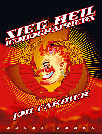
For the design I wanted to avoid the obvious that the title would imply and play around with a different brand of totalitarian imagery, namely the iconography of Soviet Russia and its accompanying propaganda. We used Jonathan Barnbrook’s Newspeak font for all of the titles and headings, a great design that has the right look while still being contemporary. The cover and interior chapter spreads borrow elements of the Soviet style, with some nods towards the general Bauhaus and Art Deco designs of the 1920s and ’30s. It was an enjoyable project even if it did seem interminable at times.
Love the face and those laurle wreaths remind me of Julius Ceasar in Asterix. There’s a girl at work from Columbia who’s studying interior design and she was all excited to be learning about Bauhaus which she’d never heard of before.
Oh to be young and still have so much fresh knowledge to be acquired.
The wreaths (actually wheat, I believe) are from the Soviet Coat of Arms whose design I adapted somewhat:
http://en.wikipedia.org/wiki/Image:Coat_of_arms_of_the_Soviet_Union.svg
The version on the book spine has the Savoy logo replacing the hammer and sickle.