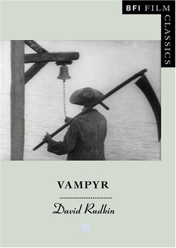
Vampyr, Der Traum des Allan Gray (1932) is one of the founding and defining works of psychological horror cinema, adapted from Gothic stories by Sheridan Le Fanu, a disturbing narrative of vampirism, obsession and posession of the soul. But it is also a film directed by Carl Theodor Dreyer, the revered and legendary Danish director of La Passion de Jeanne d’Arc (1927). Shot in France with private money and a largely nonprofessional cast and primitive sound equipment, Vampyr is to some extent a ruin. There is no definitive print and English versions are marred by poor image quality and subtitles. And yet it is unquestionably extraordinary, a vivid and haunting manifestation of Dreyer’s power to make visible on screen the inner human state, and to convey a dreamlike imagery of textures of nature amidst which transient, solitary human figures pass, some illuminated by an inner light, others threatened by a malign or demonic presence. In relation to Dreyer’s long but often frustrated career, Vampyr is often thought of as an uneven or disappointing film. But, according to David Rudkin, this is to misunderstand what it sets out to do, which is systematically to set the spectator adrift in a mysterious world. In a meticulous formal analysis of Vampyr, Rudkin expands on this contention, pinpointing the sources of the film’s uniquely disquieting effect. And yet, however strange it is, Vampyr remains a profound and troubling artwork concerned at the last to communicate human meanings—and none more so than the essence of death—in remarkable filmic imagery.
David Rudkin is a dramatist and screenwriter of forty years’standing. His theatre work is mainly associated with the Royal Shakespeare Company. Having collaborated with Tony Richardson, François Truffaut and Fred Zinnemann, his recent screenplays include Testimony (1987), for which he was awarded the New York Film Festival Gold Medal for Screenplay.
Month: February 2006
The lost art of sleeve design

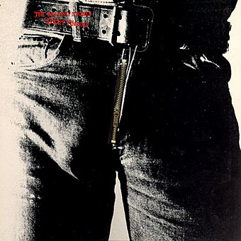
Listening to the Rolling Stones’ Sticky Fingers recently had me musing about the great cover design by Andy Warhol, probably his most well-known after the first Velvet Underground album. The music may sound better than it ever did in the Seventies but CD reissues can’t reproduce the brilliant sleeve which included a real metal zipper on the front of the jeans. The Seventies were the golden age of cover design, popular music had evolved considerably since Sgt. Pepper and the “album as artform” meant that bands were searching continually for new ways to exploit the medium of the record sleeve. Gatefold sleeves became commonplace, then expanded into multiple foldout affairs; expensive gimmicks like the Stones’ zipper arrived pretty swiftly and there were other striking novelties like the first Faust album, a clear vinyl record, in a clear plastic sleeve.
Significantly, Warhol’s Velvet Underground design was also a) gimmicky, with its peel-able banana skin, and b) similarly phallic-oriented, as the banana beneath the skin was a pink one. (Original copies of this album are easy to spot in shops since they’re nearly always missing the skin). Joe Dallesandro is supposed to be filling out the trousers on the Stones’ album, a refreshingly homoerotic moment in the often resolutely sexist world of rock graphics. Nice of the Stones to be so daring but then Jagger at least didn’t mind dancing along the boundaries of sexuality in Performance and it was about this time that they were playing their scurrilous rent boy song, Cocksucker Blues. It’s also quite a macho image, of course, and aggressively sexual, so they get to have their cock cake, and eat it, as it were.
Fancy album sleeves fell out of fashion somewhat when punk came in but there were still things like the first Durutti Column album with its sandpaper sleeve intended to destroy the records it was stored with. I was fortunate to be able to do some vinyl design when I was starting out in the early eighties, even if I wasn’t allowed to design anything quite so elaborate. Some of the designs for the Alan Moore and Tim Perkins CDs take advantage of different booklet arrangements but it’s not the same as having all that space to play with. Now that music is thoroughly digital the visual component is reduced even further. A 300 x 300 pixel image in iTunes is a poor substitute for the tactile (and erotic…) pleasures of the album as artefact.
Elsewhere on { feuilleton }
• The album covers archive
Seawards by Sickoakes
“One measures a circle, beginning anywhere…”
Robert Hughes writing in The Guardian about Rembrandt this weekend had this to say about one of the painter’s later works:
He had done pictures of himself that fairly radiate a gloating success, but the deepest was saved for the last decade of his life, when he painted himself as a painter at work, holding brushes, palette and maul-stick. He has his back to a wall, or perhaps a large canvas. On the canvas are two large arcs, incomplete circles. What are these abstract forms doing there? They come from Rembrandt’s reading of a well-known and indeed exemplary story in Pliny. The great Greek painter Apelles, so Pliny’s story goes, went to visit an equally famous ancient master, Protogenes, on the island of Rhodes. But Protogenes was out, and so Apelles, rather than leave him a note, drew on his studio wall a perfect circle, freehand. Protogenes would realise that only an artist of Apelles’ skills could possibly have done this. So Rembrandt places himself before the message that compares him to Apelles, king and ancestor of his art. Old age has at last freed him to make an incontrovertible, utterly simple proof of mastery.
This may be an artistic equivalent of one of those ideas Borges discusses in essays such as The Fearful Sphere of Pascal, where he plots the recurrence of the concept of “the circle whose circumference is everywhere and whose centre is nowhere.” The artist version emerges again with the pre-Renaissance painter Giotto:
According to a story related by Vasari, Pope Benedict XI wanted to employ Giotto and sent an emissary to visit the artist. The messenger asked Giotto for a drawing he could submit to the pope, to prove the artist’s worth. Giotto smiled and took a sheet of paper, dipped his brush in red paint, closed his arm to his side, and with one twist of his wrist drew a perfect circle freehand. Giotto handed this drawing to the messenger, who stared back in disbelief. ‘Is this the only drawing I’m to have?’ asked the messenger. Giotto answered, ‘It’s more than enough. Send it along and you’ll see whether it’s understood.’
Several hundred years later, Tom Phillips painted Fifty attempts to draw a freehand circle inspired by Giotto’s example. I remember being told the Giotto story in school art class and we all had a go at drawing freehand circles. It is indeed a difficult business but after a while your arm starts to get used to the motion. Like many things in art, practice is the key.


